Contents
- Introduction
- Inclusive content
- Plain language
- Colours
- Directional content
- Headings
- Links and buttons
- Image alt text
- Charts and graphs
- Transcriptions, captions and audio description
- Adjusting content for screen-readers
- Form content
- Wrap up
Introduction
Content is the first building block of a website, so it is crucial to how accessible the final product will be. If a user is unable to access or understand the content the rest of the page will fail along with it.
When writing accessible content we should favour clear messaging and understanding over anything else.
Inclusive content
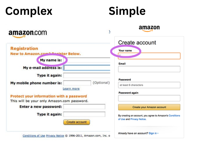
One of the important aspects of accessibility is making all our users feel considered and welcome in the end result. Writing inclusive content is a large part of this. Content should be free of bias and exclusionary or discriminatory language. This is especially important when it comes to asking users for personal information.
Think about how we talk about age, disabilities, ethnicity, religion, gender and sexuality. But this also means thinking about the way we ask questions to allow a wider accepted answer. For example rather than asking for “First name” and “Last name” simply asking for ”Full name” can make entering this information easier and less of a barrier.
A wide audience
Writing accessible content is not just writing alt text for images and copy for screen-readers. It is making content easy to understand for as many people as possible.
For example, short-term memory conditions (such as dementia) might mean the user loses their place when reading a page. In these cases reducing the cognitive load can help. A well written page broken up into sections reduces the cognitive load and helps the user find their place again. This guide to writing better for those with dementia (PDF) also includes some very good general accessibility content guidance.
More reading on inclusive content
- NHS Inclusive Content guidance
- Inclusive language: words to avoid when writing about disability - Gov.UK
- Inclusive Language guidance - Atlassian
Plain language
Content construction is at the core of writing accessible content.
As well as being easier to digest for all users, plain language can be essential for some groups such as
- those for whom English is not their first language (including some British Sign Language users)
- those with cognitive conditions such as dyslexia which make reading more difficult
Especially for online content, we should be looking at a reading age of around 9 years old. Lengthy sentences should be avoided where possible. Long sentences can slow down reading speed and make it more difficult to understand what is being said.
Other things to avoid are:
- acromyns - if needed then they should be written out in full with the acromyn alongside when first used on a page (for example "Pay As You Earn (PAYE)...")
- jargon - even when writing for a professional audience, using simple terms rather than jargon can make things easier to understand
- slang, metaphors and similies - these can be confusing for people with certain cognitive conditions and for those for whom English is not their first language
Tools such as Readable and Grammarly can be used to test our content for any potential issues and help aim for the right reading age level.
Plain numbers
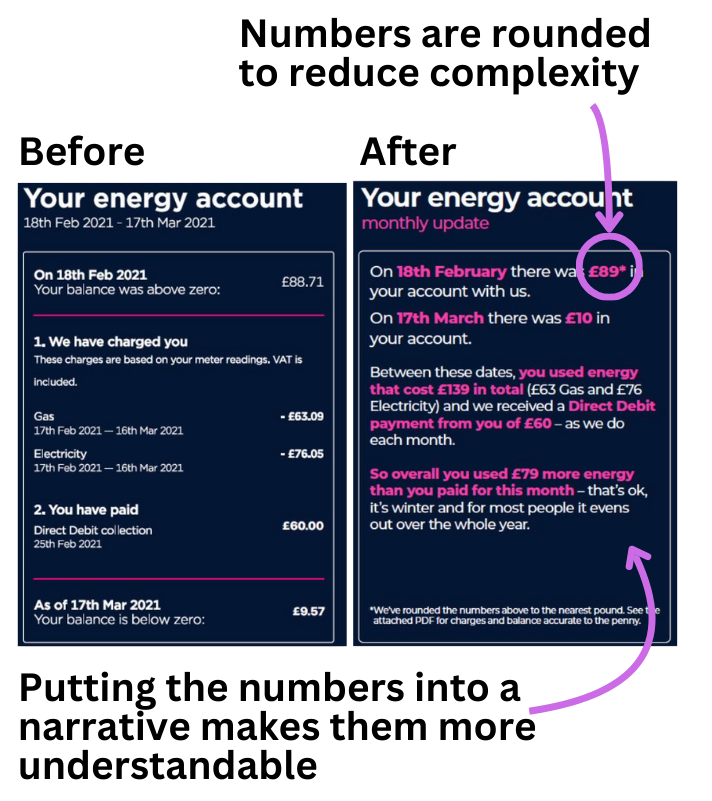
If the content deals with numbers in any way we should look at how to support users who have may have difficulty with them. This includes conditions such as dyscalculia (which is a difficulty in dealing with or understanding numbers) and low numeracy skills in general.
Simplifying and explaining numbers and calculations can help. We should also avoid asking users to do calculations themselves (including things such as rounding up a figure).
More reading on writing with numbers
Colours
We should not rely on colour alone to convey information. For example using green to signify success and red to indicate an error, or phrases like “pending applications are shown in blue”.
Users with visual conditions such as colour-blindness as well as screen-reader users will be unable to perceive the connection. We should ensure that the information is communicated in an alternate way such as a text label. Other visual differentiators such as a shape or pattern can be used, although we should ensure the same information can also be perceived by screen-reader users.
Tools like Color Oracle can be used to simulate how colour-blind users might see a page.
Directional content
Screen-readers consume content in source-code order which may be different from the visual layout. Bear this in mind when assuming a user has seen or read content from elsewhere on the page.
As screen-readers linearise the page for the user (as they read the source code), we should not use language which refers to a "left" or "right" direction when referencing other content. For example avoid saying "the image on the left shows ...". Using "above" or "below" is ok, but make sure to check that the visual position also matches the source code order and that the visual layout doesn't change depending if the page is viewed on mobile or desktop.
Headings
Breaking up content with section headings as already mentioned goes a long way to improving accessibility for many users.
Screen-reader users employ similar scanning techniques to how visual users do, just using elements instead. For example they may read all the headings first to determine if any of the sections might contain the information they need. Headings are one of the main ways screen-reader users navigate around busy pages.
The hierarchy of the content should be reflected in the headings used. Heading hierarchy moves down from h1 (level 1) to h6 (level 6). A page should only have one h1 which should be the principle headline or purpose for the page. Other headings normally follow the h1 and it is important that they are marked-up correctly as these are announced by screen-readers to help users understand how content is related.
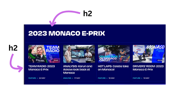
h2 despite the ones below the images being sub-sections of the main heading. Not presenting a clear hierarchy in the code means it is much more difficult for non-visual users to find information. The sub-headings should be h3 so they sit under the h2 in the hierarchy and reflect the relationship between content.Providing an annotated screenshot with each heading level indicated is one way to communicate the hierarchy to developers. This can be especially useful where areas of a page use different font sizes for the same heading level.
Links and buttons
It is useful for all users that links and buttons are descriptive of the thing they link to or the action they will perform.
Magnification users
When using high magnification a user might not have clear view of the surrounding context for a link or button. Making them descriptive can add confidence and avoid the user having to go back through the preceeding copy to confirm.
Screen-reader users
Screen-reader users can extract lists of elements from the page to examine in isolation from the rest of the page copy. This includes links. Because of this all link copy should be both unique and give some indication of the destination, ideally even when taken out of the context of the page. It might be that adding this kind of information might make the page overly cluttered. In this case we can add additional copy which won't be visible but which screen-readers will still pick up.
For example we can use a visually-hidden CSS class to hide the additional content but which still allows it to be picked up by a screen-reader. To a visual user both links below will read “Change”, but to a screen-reader user they will be announced as “Change your name” and “Change your address”. The same effect could also be achieved using aria-label - read more about ARIA.
- Your name
- Bob Hoskins
- Change your name
- Your address
- 128 Spring Gardens, London, SW1 8ER
- Change your address
<a href="...">
    Change
    <span class="visually-hidden"> your name</span>
</a>

<a href="...">
    Change
    <span class="visually-hidden"> your address</span>
</a>
Speech-recognition users
Speech-recognition users use their voice to click buttons, links and inputs and need to know what they need to say to perform that action. So if a button contains the text "Send", then they would expect to be able to say "Click send" to action it. This is why having a visible label for each is important.
Speech-recognition software is also affected by hidden copy like we used in the example above, just like screen-readers, but users of it can only see the visible copy.
<a href="#">Change<span class="visually-hidden"> your address</span></a>
In our example above, the user might say “Click Change”. In this case, even though this is not a full match, the software should do a partial match on that phrase to both links and the user will be able to choose from either.
It is important that any visually-hidden content such as on links this is added to the end of the visual copy. As speech-recognition software pattern-matches the spoken word to elements on the screen, adding copy before or between it can interfere with this.
However, if we add the hidden copy before or inbetween the visual copy (as below) it might make it much more difficult for them to trigger that link. This is because the user will say “Click Edit account”, but the software will not find a match to the spoken phrase.
<a href="...">
    Edit
    <span class="visually-hidden">Bob's</span>
    account
</a>
Speech-recognition software varies in their pattern-matching skills, so results can vary. The aim is always to make it as easy as possible for users to trigger the command they want.
Telling a user about context-change
Finally, if opening links in a new tab it is advisable to tell users this as part of the link copy. Studies have shown opening a link in a new tab without warning can disorientate users. We add the text to the link to be sure screen-reader users get this information too. For example:
<a href="..." target="_blank">
    View our guidance (opens in new tab)
</a>
Image alt text
Some users cannot see the images we use and so it is down to us to make sure they are not missing out. This means being thoughtful about what alt text we use on those images. Because alt text is literally out of sight it is often thrown in just as a filler without much thought to what the user might need.
Types of image
There are several types of images when it comes to alt text:
Utilitatian
For these the alt text may often not be a description of the image, but an indication of its function.
For example, icons which need to communicate functional meaning like a "menu".

Of course where these functional images are used we need to ensure that the words we use are going to be the words the users would use. After all a speech-recognition user is going to need to use these words to activate it. If in doubt it can be best to add visible text to the control and leave the alt text blank:

<a href=""><img src="/i/my-account.png" alt=""> My Account</a>
Note we don‘t start alt text with “image of” as screen-readers will already get this information from the element.
Informational
This is the typical image you might think of when adding alt text. They are images which add information to the wider content, perhaps to illustrate a point or give further clarity. The idea here is to describe the image to support the surrounding content. Care should be taken not to add information which is not available in the image as users who cannot see the alt text will not have access to it.

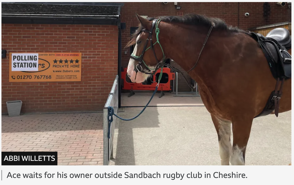
<img src=".." alt="A classic 2-door yellow sports car with a roof-rack. On the roof rack is a christmas tree tied down with bright green straps.">
Emotional
These are images which can sometimes be thought of as decorative. Occasionally an image may be added to a page to impart a certain feeling. Screen-reader users should also benefit from this as it may change how they read surrounding copy. Try to put across a sense of this emotion in the alt text as you describe the image.
Decorative images
There are cases where an image should not have any alt text (although they should always have an alt attribute). For example it could be that the image is purely decorative. In these cases it might be that not adding alt text is the right thing to do.
Consider context
The important thing to consider when adding alt text is the context. The image is often trying to put across a specific message to support the surrounding content rather than just being placed there in isolation. This could mean that the same image used in several places across a site may have different alt text in each use-case. It may also mean that you need to take the audience and their level of knowledge into account.
What is the important information?
A screen-reader can only do one of two things with alt text. Listen to the whole thing or stop listening part-way through. There is no way for them to skip through, so if you put important information at the end one of two things can happen - they will have to listen to the whole thing each time, or they might even miss it, moving on once they think they have got the gist.
For this reason look to front-load alt text where possible by giving the important information at the start.
Avoid repetition
There is a reason we might want to use an empty alt attribute on what would otherwise be thought of as an informational or utilitatian image. This is where adding alt text would cause immediate repetition for a screen-reader. This can also make a link more difficult for speech-recognition users.
Alt text vs image captions
Alt text is very different to a figure caption and the two are not mutually exclusive. Alt text as has been discussed is about describing the image for those who cannot see it and it does not add any more information than what is in the image. A caption can add more context to the image.
More reading for alt text
Alt text seems simple but is deceptively difficult to write well. Here is some more reading to help:
- Dungeons & Dragons taught me how to write alt text - Eric Bailey
- Your Image Is Probably Not Decorative - Eric Bailey
- Writing great alt text: Emotion matters - Jake Archibald
- Text descriptions and emotion rich images - Léonie Watson
- My Approach to Alt Text - Adrian Roselli
Charts and graphs
These can be tricky as some of the content may be available to screen-readers, but because graph and chart output can vary so much depending on the technology used it needs to be tested properly by the team. If we cannot make the output accessible to all, then we need to consider alternates which could convey the same information.
A written version of the data can help the all users understand the visual whether they can see it or not, especially if they find working with numbers difficult. We might add a curated summary of the content if the data is static or easily adapted. If the data is more dynamic and precludes a summary written in advance, one option is to look at using AI to provide one, using a well-crafted prompt, to highlight trends in the data.
If the data is more complicated and the user might want to look at all the data points then offering a tabular version means a screen-reader can access the data on-screen. An optional downloadable version (for example as a spreadsheet file) would mean any user could open the data in their accessible app of choice.
Transcriptions, captions and audio description
Just as with images, not all users can watch video content or listen to audio. The difference with audio and video is that the audience is even wider. They allow users who cannot consume the original to follow along but also help users who may have trouble understanding the original for whatever reason.
Transcriptions
Transcriptions are a written version of the audio which can optionally be synchronised to the original. As well as making the content available to those who would otherwise miss out, it makes that content more easily consumable and findable. They enable users to skim, search or review the transcript to see if it contains the information they are looking for without having to sit through the entire original. In addition to this it can make the content easier to follow for someone who has difficulty keeping up with captions. Transcriptions should be placed alongside the player so they are easy to find and can be followed as the video plays.
Captions
Captions are placed over the video and allow the user to follow along without the audio. They include any dialog but also noises and other audible information. In this regard they differ from subtitles which are intended to be consumed by those who can hear the audio and which contain purely the voice content - for example they are used where languages are being translated. Ideally videos should use a platform which allows captions to be adjusted to a size and colour which suits the user.
Audio description
Audio description is an additional audio track laid over a video describing what is happening on-screen for those who cannot see it. At its most complex this can be found on tv shows and movies. But even short videos for the web can benefit from an audio description if there is on-screen information which is not verbalised in the video.
Adjusting content for screen-readers
It can be tempting once we hear content read out by a screen-reader want to change how some of it sounds.
For example a reference number might be read out differently to how we might expect or desire:
"QQ123456C"
might be read out as
"Q Q one hundred and twenty-three thousand four hundred and fifty-six C"
Resist the urge to ask developers to change how this sounds by manipulating screen-reader copy or adding various attributes to it. Screen-reader users are listening to content all day and know how things sound. They can also adjust how their screen-reader reads out this kind of content and if they want can also read it out character-by-character.
Trying to adjust content purely for a screen-reader can also have knock-on effects for other users such as braille and speech-recognition users.
However, sometimes it might be that changing how our content is written can improve understanding.
This could be removing some repetition, such as we have already discussed around image alt text. But it could also be about making our content more understandable when removed from the visual context. By listening to the content in isolation we can sometimes find improvements because our brain is not visually filling in missing words or fixing spelling errors.
What screen-readers don't announce
Styling
Screen-readers do not generally announce formatting. For example, if some content is using a larger font size than other content, this is not conveyed to the user. Some screen-readers can provide some styling information to the user, but the user needs to request this specifically each time and would need a reason to.
This is why using the correct semantic HTML elements and using the correct heading hierarchy is important. If we just made the text look like a heading by making it larger this information does not make it to the user (and it's so Microsoft circa 2006).
<div class="heading-xl">Heading</div> /* do not do this */

<h2 class="heading-xl">Heading</h2> /* do this instead */
This obviously also means screen-readers do not pick up on colours, so where colour is used to convey information it needs to be supported by some sort of text labelling.
Some formatting elements
Formatting such as bold or italics is not announced by default by screen-readers. Whilst users can enable this in some screen-readers, as it is not on by default it is not something we can expect to be available. This means that we should be careful that content which uses this type of formatting should not be reliant on it to highlight content. That is not to say we should not use it as visual readers will find it beneficial.
Form content
An accessible form makes entering the correct data as easy as possible for the user. We want the user to understand exactly what they need to enter and avoid having to revisit the data due to errors.
Clear labels
Make it easy for the user to understand what they are supposed to be entering in a field, or which option they should choose if using checkboxes, radios or a select input. Use a label which is succinct but explains clearly what information is required.
Making the desired data clear it means the user can complete the task quicker, thanks to less cognitive load, and is less likely to result in an error. For some users this can mean the difference between finishing a task and not. When an error does occur we want to make sure the user understands what went wrong and what they need to do to fix it.
Placeholders
Placeholders are a light grey text which sits inside a form field. They were intended as a way of indicating to the user an example. However they have always been a poor solution.
Mobile viewports, the user zooming the interface or increasing the font-size will all mean the placeholder runs the risk of getting cut off.

This can also cause issues when content is auto-translated into a language which results in longer wording than the original.
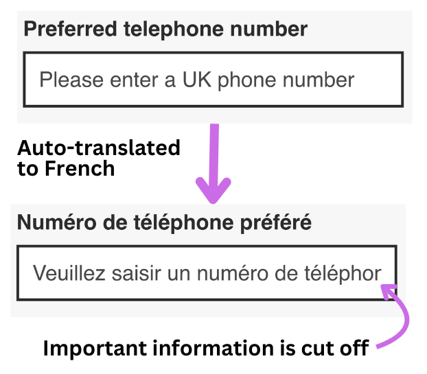
As the placeholder disappears when the field receives focus, the information it provides also disappears. If this was formatting information then it means the user does not have it to reference as they type.
Placeholders are sometimes used as a replacement for a visual label element to save space, but this only makes the issues worse.
There are other issues with placeholders too. Some user interface libraries use the placeholder location for the label and then animate it to above the field. These so-called floating labels has also been shown to be an anti-pattern.
Hints
Hints can also be used to help remove any ambiguity about how the user should answer a question.
Where the form field is asking for a specific format it is worth telling the user upfront, usually in the form of some text between the label and input. This can include a general format such as “10 digits” or an actual example such as “12 34 56 78 90”.
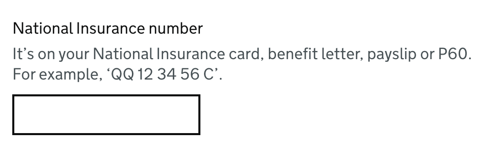
Hints are, when coded correctly, programmatically associated with the input they relate (typically using ARIA). This means that they will be read out after the label. Avoid putting anything in a hint more complex than a plain sentence as semantics are removed when using aria-describedby. This means a link in a hint will only be heard as plain content - the fact that it is a link will not be announced.
Error messages
When it comes to writing accessible forms, having well-written error content can make all the difference. Error messages should be as specific as possible - one field can have multiple error messages written for it and the relevant one shown based on what caused the error. They should also be straight to the point and avoid blaming the user.
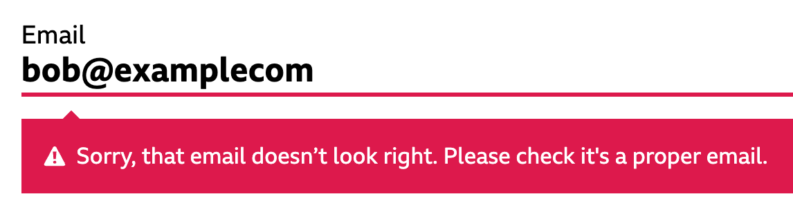
Just as with hints, error messages should be programmatically associated with the input they relate to. And as with hints any semantics will not be announced when read out, so avoid adding links and similar to error messages.
It can also be useful to present an error summary at the top of the page, especially where more than one field may have an error message.
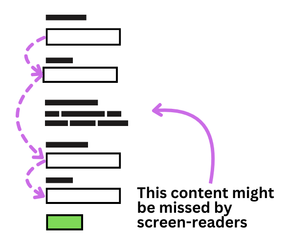
Other content in forms
Avoid adding any non-form content between form inputs. Effectively, from the first form element to the last there should only be content which is directly associated with the fields - that is labels, hints and error messages. These three types of content, coded correctly, should all be exposed to a screen-reader when the user lands on the input.
Because screen-reader users are likely to jump directly from input to input, any other content is in danger of being missed. This behaviour can also be seen on mobile devices which have a "next field" button on the virtual keyboard, and with screen-magnification users who use the tab key to move from field to field. In both these cases the user may skip past additional content between the fields.
Wrap up
Writing accessible content is complex, but by considering the users at each step we can ensure the content can be understood by as many people as possible.