Contents
- Introduction
- Aria and accessible names
- Accessible name computation
- Manipulating accessible names
- Potential issues
- Guidelines
- Wrap up
Introduction
An accessible name is the name of an element in HTML and is what is exposed to assistive technology. Not to be confused with the name attribute on form fields.
In practical terms, it is what is read out to a screen‐reader when they navigate to the element. If the element is interactive, it is what a speech-recognition user would need to say to click on that element on the page.
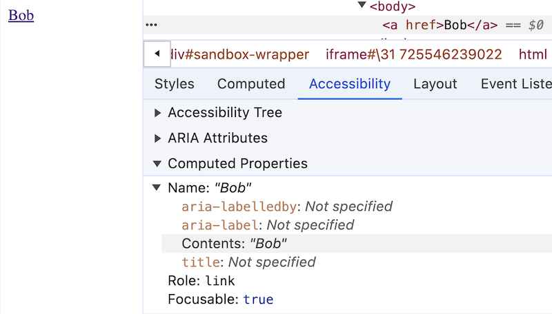
An example is the accessible name of a link. This can be, at its simplest, the content enclosed by the link tags. For example, the accessible name of the link below is "Bob":
<a href="...">Bob</a>
You can see the accessible names of elements in most browser developer tools by inspecting the element and checking the accessibility panel.
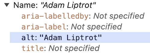
Accessible names can also be supplied by some attributes. For example, an alt attribute can provide the accessible name to an image:
<img src="/assets/images/logo.jpg" alt="Adam Liptrot">
Derived accessible names
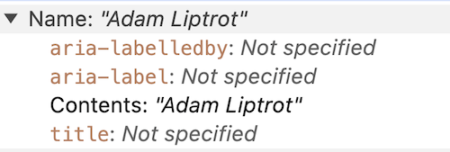
But that same image's alt text can also supply the accessible name to a link wrapping it, just as the text in our first example did. This is because the link's "contents" include elements inside it and their accessible names.
<a href="/">
  <img src="/assets/images/logo.jpg" alt="Adam Liptrot">
</a>
Accessible names from relationships
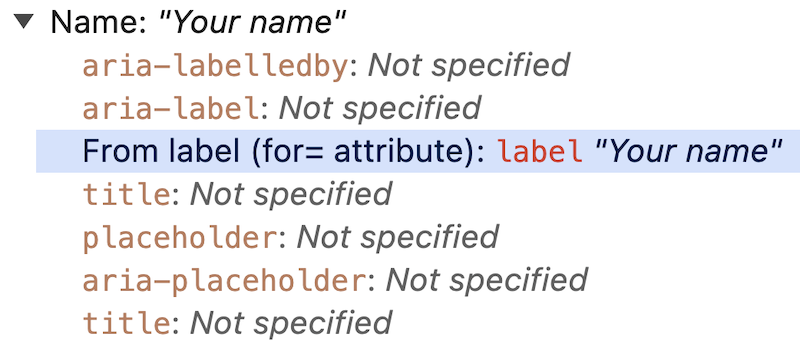
But an accessible name can also be created from other things, like the relationship generated by a for attribute. The following input's accessible name is generated by the label. The accessible name for the input is "Your name" and this is what will be announced to screen‐reader users when they land on it.
<label for="name">Your name</label>
<input id="name" type="text" />
Aria and accessible names
The ARIA specification also has a couple of attributes which can assign accessible names:
aria-labelaria-labelledby
aria-label
This attribute will override any default accessible name with the contents of the attribute.
For example, we can use an aria-label instead of content to supply the accessible name to a button:
<button aria-label="Search"></button>
This will be announced to a screen-reader as:
"Search, button"
aria-labelledby
The aria-labelledby attribute takes a list of IDs from elements on the page and those element's accessible names will be used to create the accessible name.
Here we are pointing the attribute to the heading, whose accessible name is "Search" (from its contents), and so the accessible name of the button becomes "Search".
<h2 id="search-copy">Search</h2>
<button aria-labelledby="search-copy"></button>
These will be announced to a screen-reader as:
"Search, heading, level 2"
and
"Search, button"
And if the h2 copy was updated this would also change the accessible name of the button.
We will look at more complex uses of this attribute shortly.
Accessible name computation
So we know accessible names can be assigned using a few different methods. Because of this we need some way of deciding which one wins out, especially as we can use several of these on one element.
How an accessible name is computed is subject to a hierarchy of checks against the existence of various attributes, each one potentially overwriting the others. You can even see this order represented in the devTools display as in the examples above (the items appearing in each list vary depending on the element type, for example alt will only be shown for images).
The order is in descending order of priority (so ARIA attributes win over everything else). For example:
- aria-labelledby
- aria-label
- contents (not form elements)
- derived from the label relationship (only form elements)
- placeholder (only form elements)
- title
I included placeholder and title in there for completeness, but please don't use these. Both placeholder and title attributes have usability and accessibility issues.
So if you take the link from our first example and add an aria-label attribute:
<a href="" aria-label="Tom">Bob</a>
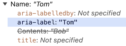
that will overwrite the contents and the accessible name is now “Tom”. Note that the visible text will still be “Bob” as we are only changing the accessible name.
Similarly if you take that link and add an aria-labelledby attribute it will trump all of the others:
<a href="" aria-label="Tom" aria-labelledby="name">Bob</a>
<div id="name">Kim</div>
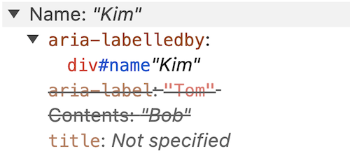
The link’s accesible name is now “Kim” despite the other changes still being present.
You may be thinking, "if I can reference other elements and they use aria-labelledby too, how far will this go?".
Well, aria-labelledby will only go one level down. If the element you reference also used aria-labelledby then that will be ignored for the purpose of generating the accessible name of the original element.
Let's consider this example:
<button aria-labelledby="search1">Btn</button>
<button id="search1" aria-labelledby="search2">Btn1</button>
<button id="search2">Btn2</button>
You may think that the first button might have the accessible name of "Btn2" as it points to Btn1 which itself gets its accessible name from Btn2.
But whilst Btn1's accessible name is pulled from Btn2, the referencing via aria-labelledby only goes one jump and then further aria-labelledby are ignored, so the content of Btn1 is used instead.
<button aria-labelledby="search1">Btn</button> <!-- "Btn1" -->
<button id="search1" aria-labelledby="search2">Btn1</button> <!-- "Btn2" -->
<button id="search2">Btn2</button> <!-- "Btn2" -->
Manipulating accessible names
Occasionally it can be useful to have a different accessible name from the visible one.
If you have a number of links which have similar functionality, but where adding unique visible text to each item might make the interface cluttered or confusing for other users, you can use certain techniques to provide different values to different groups of users.
The issue with identical links is that a screen‐reader user would not be able to distinguish the purpose of the links when viewing the links in isolation (this is one way screen‐reader users navigate a page - for more on this take a look at my guide on the JAWS screen-reader).
For example, a page where you have lots of editing options, each with a “Change” link.
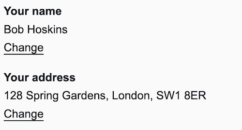
A screen-reader user navigating by links or using an element listing will see a list of "Change" options and will have to go into the content to find out which one they need to follow to get to the article they want:
Change
Change
But making the links more contextual by adding more text to them like “Change your address” would make the interface overloaded and repetitive, helping one group to the detriment of another.
We need a way to satisfy both and one way to do this is with an aria-label to override the content-derived accessible name, like so:
<a href="#" aria-label="Change your name">Change</a>

<a href="#" aria-label="Change your address">Change</a>
or we can add copy which is only available to assitive technology which combines with the visual copy to again adjust the accessible name:
- Your name
- Bob Hoskins
- Change your name
- Your address
- 128 Spring Gardens, London, SW1 8ER
- Change your address
<a href="...">
    Change
    <span class="visually-hidden"> your name</span>
</a>

<a href="...">
    Change
    <span class="visually-hidden"> your address</span>
</a>
Here I am using a CSS visually-hidden class to hide the extra content visually, but still allow it to be picked up as part of the accessible name (and so communicated to the accessibility tree).
Either option keeps the visual the same but makes the links make sense to screen‐reader users as they will see a list of links like this:
Change your name
Change your address
As we have kept the visible label at the start of the accessible name, the user can still say "click 'change'" and the software will place a number next to each link to allow them to pick the one they want.
This works for (most) speech recognition users. However Voice Control on iOS has issues with the difference between visible and accessible name, so users may find they need to use alternate strategies (such as numbering all controls on the page) to access the links.
For this reason it is always best to avoid having the visual text differ from the accessible name if at all possible.
Using multiple sources
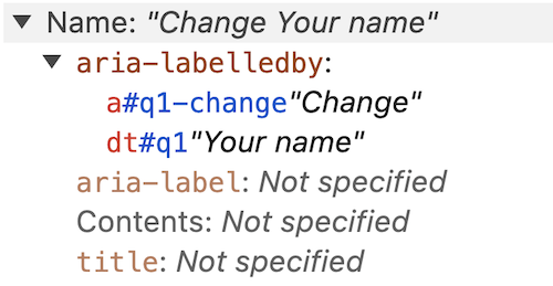
You can reuse existing content to build an accessible name by using aria-labelledby. This takes a list of IDs of elements and constructs an accessible name based on the order of the IDs.
This allows you to re‐use content, which removes some of the hidden aspect of the accessible name. But care must be taken that the content used does not later change and inadvertently mess up the accessible name.
In the example below I'm creating the same accessible name as we have just done ("Change your name"), but using the dt and link content via aria-labelledby to concatenate them into one phrase.
<dt id="q1">Your name</dt>
    <dd>Bob Hoskins</dd>
    <dd>
      <a id="q1-change"
        aria-labelledby="q1-change q1" href="#">
        Change
      </a>
    </dd>
Bear in mind that any use of ARIA requires more testing with screen‐reader and voice-recognition software to ensure it works as expected. If you can get away without using ARIA, that is often the better option.
Potential issues
Accessible names pose a number of opportunities for us to break things and introduce barriers for our users.
Trying to name an unnameable role
Some roles such as generic cannot have an accessible name assigned. Check out the other "roles which must not be named". The elements span and div are the two most common elements with this role
This means that even if you try to assign an accessible name to something like a plain div, that will not be communicated to assistive technology (or at least not in any sort of robust way).
Missing accessible names
Where none of the ways of assigning an accessible name are present, the browser cannot calculate an accessible name and nothing is returned.
This is most commonly found where form inputs are missing the connection with their label, or the one I see most often is on buttons.
The most common example is where a button doesn't have any content because a background image, an icon font, or an image with no alt text is being used to display a visual-only message. You might have seen this yourself in a mobile menu (“hamburger”) icon, or a carousel control like the one below:
<button><img src="rightArrow.png" /></button>
To a screen‐reader user this will just be announced as "Button" so they will have no idea what it does.
For a speech-recognition user they could try a few words based on the visual appearance but will likely give up and resort to other means.
If you happen to have used an embedded SVG for that image, you might have inadvertantly provided an accessible name (in the SVG title attribute for example), and it could even have the opposite effect to the one you might have wanted, like the example below:
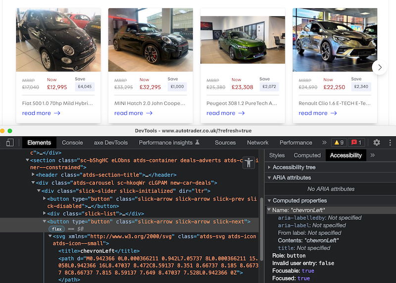
On Autotrader’s homepage they had a carousel which uses an SVG icon inside the directional buttons.
<button type="button" ...>
  <svg xmlns="http://www.w3.org/2000/svg" ...>
    <title>chevronLeft</title>
    ...
  </svg>
</button>
Unfortunately on this page an accessible name was not provided for the button. However because the SVG had a title attribute, this is what is exposed as an accessible name (as it counts as Contents as far as accessibility is concerned). The “chevronLeft” title from the SVG whilst meaningful to the designer who exported it, is not of any use to the end-user, not least because it suggests the arrow points in the opposite direction when it has been rotated using CSS for the right-facing button.
For those wondering, yes the left button uses the same SVG and the image rotated for the opposite direction, so both left and right buttons on the carousel had “chevronLeft” as their accessible name.
What they should have done in this case was hide the SVG from assistive technology using aria-hidden and provided a suitable aria-label on the button itself.
<button aria-label="Next" type="button" ...>
  <svg aria-hidden="true" xmlns="http://www.w3.org/2000/svg" ...>
    <title>chevronLeft</title>
    ...
  </svg>
</button>
Update (July 2025) : Autotrader have since updated their carousel and now use an aria-label on the button.
So accessible names are very important for users to understand what the various controls on the page do and having the wrong ones can even cause the user to do something they didn't intend.
Overriding the visual label
This does mean that you can do things like override the visible contents of the element with a different accessible name, which can lead to issues.
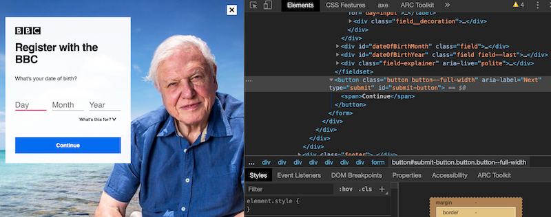
The following example is the code for the button from the BBC screenshot above (since I took this screenshot it has been fixed, although it took a redesign for this to happen).
<button aria-label="Next">Continue</button>
The visible content is "Continue", but the accessible name is "Next" as the aria-label has overridden the content‐derived accessible name.
For a screen‐reader user who can see (many screen‐reader users are not fully blind), this can be a bit confusing as the visible and audible messaging is different.
For a speech‐recognition user it is frustrating as they will try to say "Click 'continue'" which will not work because the software has been told the accessible name for this button is "Next". In this situation the speech-recognition user will (probably after a few tries) resort to asking the software to number all the controls on the page to allow them to select the correct one and continue. This is not good as it is asking the user to do a step which is completely unnecessary and especially so on the first step of a registration process.
Undoing good work
This next example shows how a misunderstanding of how accessible names are computed or how ARIA works can lead to good work being undone.
Below we can see a product card with an image of the product and a button to add it to the basket. The button has had hidden content added to allow screen-reader users to understand which item they are adding to their cart. This was done using the visually-hidden technique outlined above. However an aria-label attribute has also been added to the button to replicate the visible label. This means the hidden copy (and the context it provided) is lost. The accessible name computation states that an aria-label will overwrite the content of the element. The button is no better off than if it had just been coded as a button with "Add to basket" as the contents.

<button aria-label="Add to basket">
  Add to basket
  <span class="visually-hidden">, Matthew Williamson Ombre Cone Ceramic Base Table Lamp</span>
</button>
This will be announced as:
"Add to basket, button"
So, despite all the good intention, the above code is equivalent to:
<button>Add to basket</button>
Visual not matching the name
The most dangerous issue is where the meaning of the visual label is completely different to the accessible name. For example using an aria-label of “cancel” on a button with the visual text of “continue”.
<button aria-label="Cancel">Continue</button>
This obviously could have a major impact on a screen-reader user as they could potentially submit data when they wanted to cancel an application.
This is an extreme example (but one I actually saw in production), but we should always ensure that any visible text is part of the accessible name (ideally at the start).
WCAG even has a criterion to cover this called “Label in name”.
Overloading an accessible name
Accessible names are meant to be short - a few words long at most. Remember a screen-reader user will listen to an accessible name to understand what the element's purpose is. A long accessible name can confuse matters and leave a user wondering what the element is.
This is especially something to be aware of when wrapping content with a link (or button). As we have seen, the content inside the link will be used as the link's accessible name.
We can often see this where a card component is used:

In the above image the whole card, from image to price, is wrapped in a link, as can be seen in the simplified markup below:
<a href="...">
  <img src="..." alt="GoodHome Mulanje Industrial Matt White Wood effect Floor light">
  <p>10 people bought this in 48 hours</p>

  <p>GoodHome Mulanje Industrial Matt White Wood effect Floor light</p>
  <p><span class="sr-only">5 stars</span>(3)</p>
  <p>£48.00</p>
</a>
But this has the effect of utilising the entire card as the accessible name for that link, as it constitutes the 'content' of the link.
So the accessible name of the card link becomes:
GoodHome Mulanje Industrial Matt White Wood effect Floor light 10 people bought this in 48 hours GoodHome Mulanje Industrial Matt White Wood effect Floor light 5 stars (3) £48.00
This is a lot to digest for a user! This method of card markup should be discouraged in favour of only using the primary name as the link (in this case that's the product, but it could be a blog post title). The card click action could then be added with javascript. See more information on this approach to cards on the Inclusive Components site.
There are other issues with the card in this example. For example the product is plain text when it could be useful to have it marked up as a heading. The image is also just the product name, which as well as adding repetition does not really describe what the product looks like to the user. See more on writing accessible content, including alt text.
Placement of extra copy
The critical thing with speech recognition users and editing an accessible name to add context is that only added to the end of the visible label. Speech recognition software varies in ability to search for content and most do not respond well to the visible content not being the first content in the accessible name.
For example if you have a link like this:
<a href="/">change name</a>
and you want to add some context, don't do this:
<a href="/" aria-label="Bob change name">change name</a>
or this
<a href="/" aria-label="change Bob's name">change name</a>
as most speech recognition software won't make the match when a user says “Click ‘change name’”. Remember speech-recognition users cannot see the aria-label content, but the software can (it needs to for a variety of reasons).
Instead add the new content to the end of the visible label:
<a href="/" aria-label="change name for Bob">change name</a>
Guidelines
Here are a few pointers to help reduce the amount of issues you may have with accessible names.
Prefer visual labels
Where possible keep accessible names visible, especially where the item is interactive, such as a link, button or form control. This will ensure people who do not use software which exposes hidden accessible names to them will still be able to determine the purpose.
For example if we provided an accessible name to a button with just an aria-label and image:
<button aria-label="Open menu"><svg>...</svg></button>
then it would be more difficult for anyone not using a screen-reader to determine the purpose of the button than if the button contained visible text:
<button><svg>...</svg> Open menu</button>
The second option makes it much clearer to all what the button does, and also lets speech-recognition users know what they have to say to activate it.
Follow the ARIA rules
As some of the techniques we have discussed use ARIA attributes, we should always look to follow the rules of ARIA.
There are two which particularly apply to accessible name ARIA attributes:
- If you can achieve the same by using an HTML element rather than aria then do so. For example, do not add
aria-labelto aninputwhen you can use alabelelement instead. - All interactive controls need to have an accessible name, whether this is achieved using ARIA or not.
How should this element be named?
As a general rule assume only landmarks and interactive controls such as links, buttons and form controls can have attributes like aria-label or aria-labelledby applied.
Elements such as span, p and div have what is called a generic role by default and fall into a group which cannot have these attributes applied.
For which aria roles can have accessible name and how they can be set, see the W3C naming guidance
Do not overuse aria
It can be tempting to add accessible names via aria-label attributes to lots of elements, such as sections in a bid to help the user. But this can just add noise for the user and make maintenance more problematic. Instead consider the above guidelines - use HTML elements where possible and visual labels - perhaps using visible headings instead. Only add it where you know it will help - and test it in a screen-reader.
Wrap up
Accessible names are how you communicate the meaning of the interface to your users and getting it right is really important.
If you have any doubt as to what the accessible name is for an item, most browser developer tools now have an accessibility panel which shows you the computed value. However testing with screen‐readers and speech recognition is still necessary to ensure the correct meaning is conveyed.