-
if using compiled css / tailwind etc provide the user with some stable, constant, non-changing css hooks (like readable class names), so they can use third party overrides to change how your site looks
-
Different kinds of adaptations
-
Colour (incl. colour contrast, WHC) - Eric on WHC
-
Browser zoom
-
Magnification
-
Font size
-
Common issues
-
Select to speak / Spoken content
https://yatil.net/blog/non-text-contrast-in-detail-ui-components
Visual appearance of text content
Good content forms the basis of good interaction.
We should work to ensure that the effectiveness of the content is not diluted or impeded by the user finding it difficult to read or the design not accounting for variations. We need to take care of our content all the way from writing it to go-live and beyond.
Some of this may be out of our control due to restrictions - for example the font used may be restricted due to a style guide (although poor font choice should always be challenged where it poses an obstacle to users getting tasks completed).
But even if there are imposed restrictions, there are still choices which fall to individual designers.
Alignment
Avoid any text alignment other than standard left-aligned (for left-to-right reading languages) and ensure lines are well-spaced. Right-aligned text makes it difficult for users to find the start of the next line and fully-justified text can result in odd spacing which may interrupt reading patterns.
Similarly avoid placing content into columns as this makes online reading more difficult due to the user‘s eyes moving across columns at the end of each line.
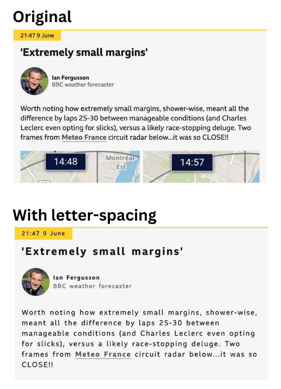
Letter spacing
Users, such as those with dyslexia, may wish to increase text-spacing to help with reading. Make sure the content can accomodate this without breaking the layout. You can test letter-spacing using a browser plugin.
Line length
When looking at blocks of copy lines should typically contain around 50-75 characters for optimum reading speed. Shorter and the line breaks makes it difficult to mentally connect lines into sentences; longer and it is harder to pick up the next line due to the distance between the end of one line and the start of the next. This is also another reason why columns are to be avoided as they rarely allow this ideal line length.
Longer lines impact readability as they make it more difficult for the user to find the start of the next line when they scan back. For those using screen-magnifiers this issue can be exacerbated due to the small amount of screen they can see at any one point.
Typeface
The choice of a typeface can have a great impact on how easy it is to read your content, although it might be that you have little choice over what is used in a project. Simple fonts are best with many studies suggesting sans-serif fonts are best for legibility.
Font size
Great content is no good if half your audience can't read it, so make sure the contrast is good between the text and the background. When font-size is set too small it affects how well a user can read our content and it might even result in them abandoning the task. An aging population makes the need for easily readable text an even wider issue.
Whilst a user has some control over the font-size themselves via browser settings, we should always avoid users having to adjust it as not all users know how. Set the font size to be at least 16px (or equivalent) for body copy and never smaller than 12px.
Avoid reducing font-size just to fit more content in a given area - this is not the correct reason to adjust size. The design or content itself should be revisited if you find this happening. Similarly, content which might be felt to be necessary but unwanted, such as terms and conditions, still needs to be legible and readable so should not fall below the above recommendations.
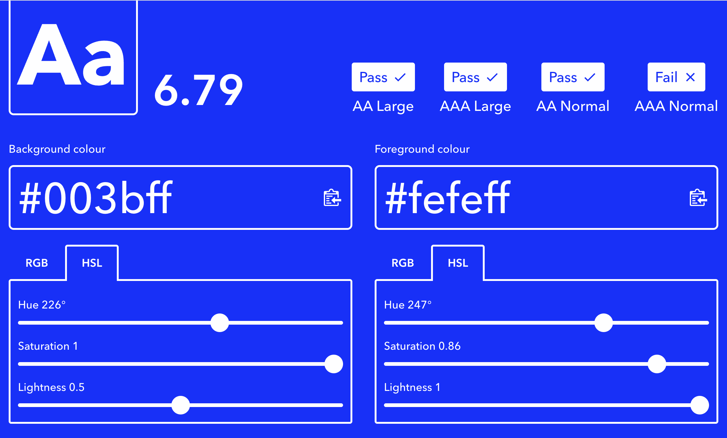
Contrast
Perceivable contrast is lower for some vision deficiencies and can also be impacted by colourblindness. By having a good contrast we can make sure all of our users can see the content.
For this reason we should also avoid laying text over the top of an image or gradient. Even if the contrast looks ok, when the size of the window changes the relative position of the text and the background may shift and the contrast will change.
You can check contrast in one of the many colour contrast tools online. For normal body copy you are looking for at least a 4.5:1 contrast ratio between the foreground and background colours.
Avoid all captials
Keep use of all capital letters to a minimum and avoid if possible. The shapes produced by all capitals are not as distinctive as those created by normal casing, so reduces reading rates and pattern-recognition.
All caps can sometimes also be read out by screen-readers differently to how you might expect as they can be interpreted as acronyms.
Don’t rely on visual formatting to convey meaning
Whilst text formatting such as bold and italic can aid visual users follow content, this type of formatting is not conveyed to screen-readers (even if using semantic elements like strong or em).
For this reason, be careful in how these are employed. By all means use them to assist visual users, but check that removing them does not mean important information is lost.
Visual positioning
Not all users have the same view of the screen. Some may be using screen-magnification software which can mean they only see a small portion of the page at any time.
When designing elements which trigger some on-page update, try to keep the trigger and result in the same location. Otherwise the user may be unaware the trigger activated successfully or be unable to find what effect it had.
Designing for adaptation
The page you are designing is going to be subject to a range of environmental variables imposed on it by the user and the devices it is viewed on.
Viewport size and orientation
How will the page look on anything from a small mobile to a widescreen desktop? Even if you don't expect mobile users, browser page zoom will trigger mobile viewport sizes even on desktop.
What about on a mobile in landscape mode? Some users may be using assistive technology which requires their device be fixed in landscape mode.
If designing for mobile screens, don't be tempted to prevent pinch & zoom as this removes a very basic accessibility option for users.
Font size increase
Whilst page zoom is one option for users to increase