Contents
- Introduction
- What can it be used for?
- The rules of ARIA
- What is ARIA not?
- Support vs the specification
- Roles to avoid
- Things to consider when using ARIA
- Wrap-up
- Further reading
Introduction
ARIA stands for Accessible Rich Internet Applications. It is a set of attributes which are applied to HTML elements to provide additional information to users of assistive technology. There is an entire specification for it (W3C).
What can it be used for?
ARIA has a lot of different uses but the main theme is to improve a user's understanding of the page.
Let's have a look at some examples of some of the more common use-cases of ARIA which you might come across.
Providing accessible names
An element's accessible name can be modified by using one of a couple of ARIA attributes, aria-label or aria-labelledby.
For example, it can help provide an accessible name to a button which may just have an icon:
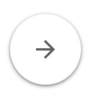
A button like this might be coded like this, where the image is applied using CSS:
<button class="icon-arrow-r"></button>
This is an issue because whilst there is a visual affordance to what the button does and what we might expect if we click on it, a screen-reader user may not be able to benefit from this. To a screen-reader user this would just be announced as:
"Button"
Not very useful. This is because the button has no current accessible name - it has no contents and no attributes which would provide one.
By using the ARIA attribute aria-label we can make sure it has a meaningful accessible name:
<button aria-label="Next" class="icon-arrow-r"></button>
To a screen-reader user this would now be announced as:
"Next, button"
Much better.
As well as providing an accessible name where one is missing, we can also override the current accessible name. In the example below we are overriding the one provided by the content ("Change"):
<a href="..." aria-label="Change name">Change</a>
Now instead of "Change" the link has an accessible name of "Change name" and will be announced to screen-readers as:
"Change name, link"
The aria-label attribute takes content directly - you place the content in the attribute itself. The aria-labelledby attribute is different in that it takes one or more ID references. This means we can re-use existing content as the accessible name.
The accessible names of the elements with the referenced IDs will be used as the accessible name. You need to add the IDs to the attribute in the order in which you want them to be announced by the screen-reader.
You can self-reference the element the aria is on to include its own natural accessible name in the computed one. For example, the link below has an accessible name of "Continue reading Travelling to Newcastle" because it is referencing the preceding h2 as well as itself to construct a compound name:
<h2 id="article-title-1">Travelling to Newcastle</h2>
...
<a href="..." id="article-link-1" aria-labelledby="article-link-1 article-title-1">Continue reading</a>

Potential mishaps
Getting reference IDs out of order
As mentioned, the order of IDs in aria-labelledby matters and getting it wrong can have bad consequences, from changing the meaning of an accessible name to making a control difficult to target for speech-recognition users.
Misunderstanding of the impact
Using either of these attributes will override any natural accessible name of the element. So the text content of a button will be overriden by these attributes, as will the association with a label for a form input.
Not understanding the impact of this and how accessible names are calculated (W3C) can lead to the wrong accessible name being delivered to the user.
Limits of aria-labelledby
Using aria-labelledby will only "hop" once. So you can reference another element and its accessible name (even if created using an aria-label) will be used. However if the element you target uses aria-labelledby then that attribute will be ignored and other accessible name sources will be used. This is to stop circular references.
Fragile ID references
Because aria-labelledby uses IDs it is possible to inadvertently end up with an incorrect accessible name.
For example if you mistakenly have more than one ID with the same reference (they should be unique) the browser will pick the first matching one it finds. This may not be the one you expected and you can end up with a different accessible name to the one you wanted.
Similarly if the target ID is removed or changed this will affect the accessible name of the element with the attribute, potentially removing its accessible name entirely.
For this reason I recommend developer teams only ever use IDs for ARIA so their purpose is clear. If you use IDs as testing hooks I recommend you use data- attributes instead - for example data-test="card1". This separates concerns and reduces the potential for mistaken altering or deletion of IDs.
Hidden names
It can be too easy to add aria-label to an icon button (as above) without thinking if the name is obvious to all users.
Speech-recognition users will not know what name you used so have to try to interpret the image - does the arrow mean "right" or "next" or something else?. They need to use the accessible name in order to target that button using speech Whilst there are fallback strategies they can use we should always strive for the simplest option. For this reason I'd recommend using visible text alongside the icon instead of ARIA.
Not having the visual copy at the start
You should also be careful to always have the visible content as the start of the accessible name. This makes it easier for speech-recognition users to interact with it as some software will only match the connection when the accessible name starts with what the user says.
For example doing the following will cause an issue as the speech-recognition user will not be aware of how you have manipulated the accessible name and will say "Click change address" to access the link:
<a href="..." aria-label="Change Bob's address">Change address</a>
Instead do this which places the entire visible text at the start of the computed accessible name:
<a href="..." aria-label="Change address for Bob">Change address</a>
What we don't want to do is make it better for one group (screen-reader users) whilst making it more difficult for another group (speech-recognition). This is one of the balancing acts we need to make with accessibility.
Maintenance slip-ups
Finally, because aria attributes are less visible it can be possible for the visible copy to get updated and the ARIA attributes to be forgotten about. This can lead to a mismatch between the two.
Take this example which works for screen-reader and speech-recognition users:
<a href="..." aria-label="Change address">Change</a>
Then some updates are made to the copy and the link text is updated to "Edit", but the aria-label copy is missed (as it is not readily visible):
<a href="..." aria-label="Change address">Edit</a>
Now a speech-recognition user will not be able to action the link by saying "click Edit" (the visible text) because that is no longer a match for the accessible name.
Providing additional information
The aria-describedby attribute operates in the same way as aria-labelledby in that it takes one or more ID references, though in this case the result affects the element's accessible description. The accessible description is announced after the accessible name and a short pause and is there to provide some supporting information.
You might be wondering about aria-description.
If aria-labelledby works like aria-describedby, then surely there must be an aria-description to work like aria-label?
There is but this attribute is still in the draft stage of the specification so it should not be used as support is patchy or non-existent.
Potential mishaps
Just as with aria-labelledby, aria-describedby can suffer from the same issues with having to reference another element.
Semantics are stripped
Another thing to note is that the content referenced will be stripped of any semantics, so if it includes something such as a link or a heading only the text will be carried over.
Take this example:
<label for="ref">Order reference</label>
<div id="order-hint">
    Your order reference is 10 digits,
    <a href="...">find my order</a>
</div>
<input id="ref" type="text" aria-describedby="order-hint">
The accessible description will be announced as:
"Your order reference is 10 digits, find my order"
Note no mention is made that there is a link present.
For this reason avoid referencing anything other than simple text with these attributes.
Complex markup can be truncated
More complex markup can also result in the screen-reader stopping after the first part, despite the entire block being referenced. For example:
<div id="app-hint">
    <p>Tell us if one of the following is true:</p>
    <ul>
        <li>You have moved house in the past 3 months</li>
        ...
    </ul>
</div>
...
<fieldset aria-describedby="app-hint">
...
Whilst other screen-readers may read out all the referenced content this will be annouced by MacOS Voiceover as:
"Tell us if one of the following is true"
This is a good example of why we test with multiple screen-readers.
There is a delay in announcing a description
Finally, as already mentioned there is a short delay between announcing an accessible name and the accessible description. For this reason you need to be careful of using aria-decribedby on a submit button to reference things like terms and conditions such as in the example below:
By clicking submit I agree ...
<p id="t&c">By clicking submit I agree ...</p>
<button aria-describedby="t&c">Submit</button>
Because of the delay between announcements, a user is likely to hear “Submit, button” and activate it before they hear the description.
It may not be heard at all
An accessible description is categorised as a "hint" to screen-readers. Some screen-readers allow users to turn off hints (which cover a wide variety of announcements) to reduce noise. Unfortunately this can mean that some users may never hear the accessible description.
For this reason avoid putting important information in an accessible description. Where possible ensure accessible descriptions can be accessed as part of the normal document flow so users can find them when hints are turned off.
Providing update notifications
Sometimes we might update content on a page without refreshing the page. Think of "success" or "error" notifications, or when just part of a page is updated such as search results.
This can be difficult for screen-reader users as they may not be aware that the content has been updated. We don't necessarily want to place their focus on the new content as this can be very disorientating and unexpected.
So how do we tell the screen-reader user that something has changed without moving their focus? This is where ARIA live regions come in.
A live region is a part of the page which we mark with ARIA to tell the screen-reader that this will be getting updated and it should monitor it. Any new content will then be announced to the user.
For example in the screenshot below we see an ecommerce site with a grid of search results and a set of filters.
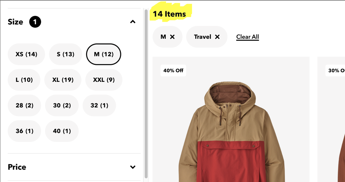
Each time the user changes a filter the grid updates, but a screen-reader user will not know this (or know how many results were returned). This means a screen-reader user will need to figure out that the page is doing this and then will need to explore the page to see how many results were returned.
By using an aria-live region on the result count (highlighted in the screenshot) we can ensure a screen-reader user is told how their filter selection is affecting the number of results. They get this information as a discrete announcement without them having to navigate to the results themselves.
An aria live region is marked up using the aria-live attribute. The value we pass to that attribute is very important as it indicates whether we should interrupt whatever the user is listening to (assertive), or wait until they have finished (polite). By default you should always use polite unless it is something the user really needs to know right now (for example if they don't push a button in the next 30 seconds they will lose some data).
For the ecommerce example above we could wrap the result count in a live region like this:
<div aria-live="polite">
    14 items
</div>
Note that we do not want to wrap the entire product result grid in a live region as this would cause the entire contents to be read out. ARIA live region announcements should always be short, maybe a sentence at most.
We want to provide the user with a short announcement to tell them enough to provide the information they need. In this case the number of results is ideal.
If you expect the live region to have several updates in a short period (as our filter example may have) then the shorter the announcement the better.
The default is for an aria-live region to look for text being added to it. By using the aria-atomic attribute we can instruct whether it should just read out the change or re-announce the whole live region.
Whilst we can theoretically ask it to also look for content being removed by also using the aria-relevant attribute, support for this can be hit and miss so this information should be communicated directly. The best way to do this will depend on the situation, but an example might be another live region only visible to screen-reader users.
Some ARIA roles have an implicit aria-live and will act as live regions but with added semantic meaning. These include role="alert" (defaults to "assertive" announcements), role="progressbar" and role="status" (both default to "polite" announcements). They should only be used where their semantics make them appropriate.
Potential mishaps
Not triggering the announcement
Because live regions only get reliably triggered with new content, you should always add a live region to the page first and then add the new content (a split second is normally enough). Otherwise you may find the screen-reader is seemingly ignoring the live region entirely.
This behaviour can vary between screen-readers and is why we need to test in more than one.
Providing too much information
A common mistake is to include an entire component or section as the live region. This will be overwhelming to hear as all the content will be read out every time. This will also make it difficult to identify what has changed, negating the purpose of the live region.
A live region announcement is normally not there to tell the user all the changes, just to make them aware that something has changed - in our example we tell the user the number of products returned, not which products.
Make sure the live region only contains a short piece of text to tell the user what changed. If the page has been laid out well the user will know where to go to explore the actual changes.
Not considering other users
Whilst live regions help screen-reader users they do not assist screen-magnification users. If the notification or updated content is remote from their position on the screen these users can still miss the updates. Best practice is to try to place updates as close to where the user is as possible to make them obvious to visual users. This will often be the place where the update was triggered from.
Skipping testing
You should always test a live region with multiple screen-readers to make sure it is doing what you expect it to, especially when using roles with implicit live regions.
If you use an assertive live region you can inadvertently make a page or component unusable by a screen-reader as the user will not be able to hear feedback from other actions as they are constantly getting bombarded by live region updates.
When using assertive be careful that is it only going to be providing occasional updates.
Providing a sense of place
Often we may use a visual indicator to tell our users that a page in a menu is the one they are looking at:
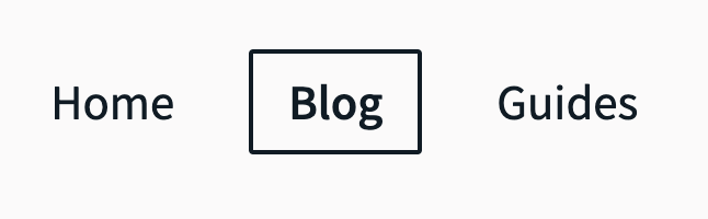
But screen-reader users who are relying just on the code will not get this purely visual information. The blog link will be announced as any other link:
"Blog, link"
This is where the aria-current attribute helps.
<li><a href="/">Home</a></li>
<li><a href="/blog/" aria-current="page">Blog</a></li>
<li><a href="/about/">About</a></li>
By applying this attribute a screen-reader will now announce the link as:
"current page, Blog, link"
In this way ARIA has conveyed the information which was previously just visual. This attribute has a few different options for values besides "page" and can be used to indicate the current item in a range of things, from the current day in a calendar view to the current step in a journey.
Potential mishaps
aria-current is quite low risk and the only issue can really come from poor implementation. This could lead to it not announcing at all or not being updated as the interface updates and the user being told they are somewhere they are not.
Providing state information
ARIA can help us provide additional information to a user about a component's state which might be difficult to convey in normal HTML.
aria-pressed
As the button below acts like a toggle, either on or off, we need to indicate when the button is pressed (on).

We can use an aria-pressed attribute to communicate the state of the element which will also mean this information is passed onto screen-readers:
// Off state
<button aria-pressed="false" aria-label="Mute"></button>
"Mute, toggle button, not pressed"
// On state
<button aria-pressed="true" aria-label="Mute"></button>
"Mute, toggle button, pressed"
You can also see that by adding this state information the button role announcement has also changed to a toggle which helps a screen-reader user identify how they might expect it to behave before they use it.
aria-expanded
Just like the aria-pressed example, aria-expanded allows us to provide more information to a user which would otherwise only be available visually.
The most common use-case for this is with menus where clicking a button opens additional options, like in the example below.
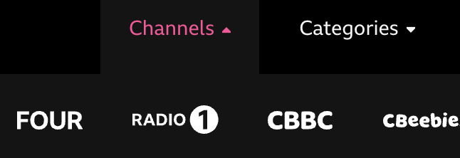
Without ARIA a screen-reader user would not know if the button had done anything or not.
However with ARIA added the screen-reader user is told:
<button aria-expanded="false">Channels</button>
Channels, button, collapsed
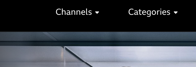
when they land on it, which immediately tells them that clicking this will open something. When they click it, javascript is used to update the attribute and the announcement changes to:
<button aria-expanded="true">Channels</button>
Channels, button, expanded
so now they know there is new content for them to access.
There is a related ARIA attribute, aria-controls which can be placed on the button too. This is intended to indicate, via an ID reference, the thing which is revealed. However real-world support is pretty much non-existent (only JAWS has support but it is off by default and is hidden in settings) but it can be added for future support.
Potential mishaps
Discoverablility
As you may have guessed it is all very well adding in more content, but how will the screen-reader user know where it is?
This is the reason why new content should always be added immediately after the thing which triggered it in the source code. This ensures the next move the user makes will put them in contact with that new content.
Keeping on top of state
As with all ARIA state attributes (such as aria-pressed) the key is keeping on top of the current state so the announcement is correct. So when the menu in our example is closed, ensure the attribute is updated to indicate that. This will require javascript to be written to do this.
Overriding a role
HTML elements all have their own impicit role. This tells the accessibility tree what kind of thing it is, what the user might be able to do with it but also what attributes can be applied to it and some other rules which apply.
You can view the roles provided for each element as part of the detail in the accessibilty inspector in Chrome.
Most of the time a role is derived from the element type and its semantic meaning and while it appears in the accessibilty tree it is not normally defined on the element itself in the HTML. So a button element has a role of button, whilst a ul has a role of list. As you might expect listitem roles (such as the li element) need to be placed as children of a list.
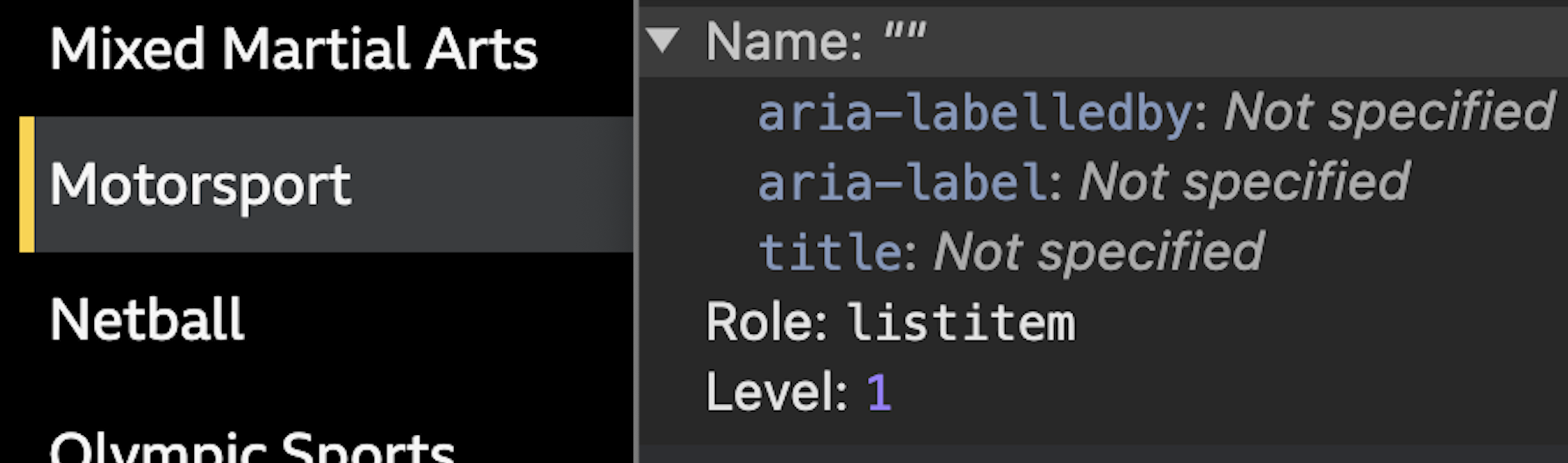
li is shown as a "listitem" in the Chrome Accessibility Panel.Some elements like div and span do not have any semantic meaning, so these have what is called a generic role.
Where it gets interesting is that roles can also be explicit. We can set it by using the role attribute. As doing this is essentially changing the element's semantics we need to be very careful when we do this.
For example we can change an a element's role from link to be a tab using the role attribute. As there is no native HTML element for a tab control this is a common use-case:

Here is the code for the first tab (note the use of some of the other attributes we have already discussed)
<a
    href="#past-day"
    role="tab"
    aria-controls="past-day"
    aria-selected="true">
    Past day
</a>
Bear in mind that tab roles require other roles to also be present (tablist and tabpanel) as well as some javascript to handle functionality.
Potential mishaps
As mentioned, we need to be super-careful when doing this, not only because we can make interfaces confusing for assistive technology users (and potentially future maintainers!), but also as we need to keep track of the requirements for the role we applied, both to the element we changed but also its children.
Changing an element's role is normally only a last-resort - in reality you are often better off changing the element itself if possible.
Roles to avoid
There are some roles - namely application and menu - which you should generally avoid using in web pages. These require you to add all the interactivity and focus management which are expected when using these roles.
When they encounter one of these roles, screen-readers which use single key navigation will pass their normal navigation keystrokes straight to the browser, so as a developer it is now your responsibility to have them do something. For example the menu role needs you to add key commands (arrow) to navigate up and down the items.
Also bear in mind that whilst screen-reader users may get some idea of what to expect via the role announcement, keyboard-only users will not. This can leave keyboard users wondering why their normal navigation modes are no longer working.
TL;DR - using these doesn’t help the user (often the opposite) and makes life harder for you.
More about role="application"
This is because when using the web screen-readers typically capture all the users keystrokes and only pass some along directly to the browser. This allows the user to use keys to perform actions within the screen-reader rather than on the page - for example, pressing down arrow in NVDA or JAWS will read out the next block rather than scroll the page.
When we set role="application" this tells the screen-reader to send all the keystrokes to the browser. So now you are responsible for supplying all the navigation for screen-reader users and keyboard users. Even if done well (and it is very easy to not do this well), your users may still get confused especially if they were not expecting it.
More about role="menu"
As with application it is rarely implemented correctly. The menu role in particular has a strict nesting hierarchy of required related roles which increases the liklihood of poor implementation and an unusable interface. Even if done well, the different way of navigating will disorient users and most likey cause some to abandon the site thinking it is broken.
The one place you really don't want to have access issues is in your navigation - use a nav element and normal links and buttons instead.
Special mention - role="grid"
However grid is more of a “be careful” rather than “don‘t” as it can be very useful in certain situations where a different keyboard navigation might be expected or be advantageous. For example a calendar date picker could be marked up as a grid to allow the user to move around a month of dates but still quickly navigate via tabbing to the other controls without having to pass through all of the days.
The rules of ARIA
ARIA is really powerful and can be crucial to the accessibility of an interface when correctly used. However the flip-side of this is that you can absolutely make a page less accessible, or even totally unaccessible, if you just throw ARIA at elements without knowing exactly what effect they will have.
With ARIA more than anything else you need to test with multiple screen-readers to make sure what you think it does will actually happen.
The power of ARIA has led to a set of rules you must follow when considering adding ARIA to a page:
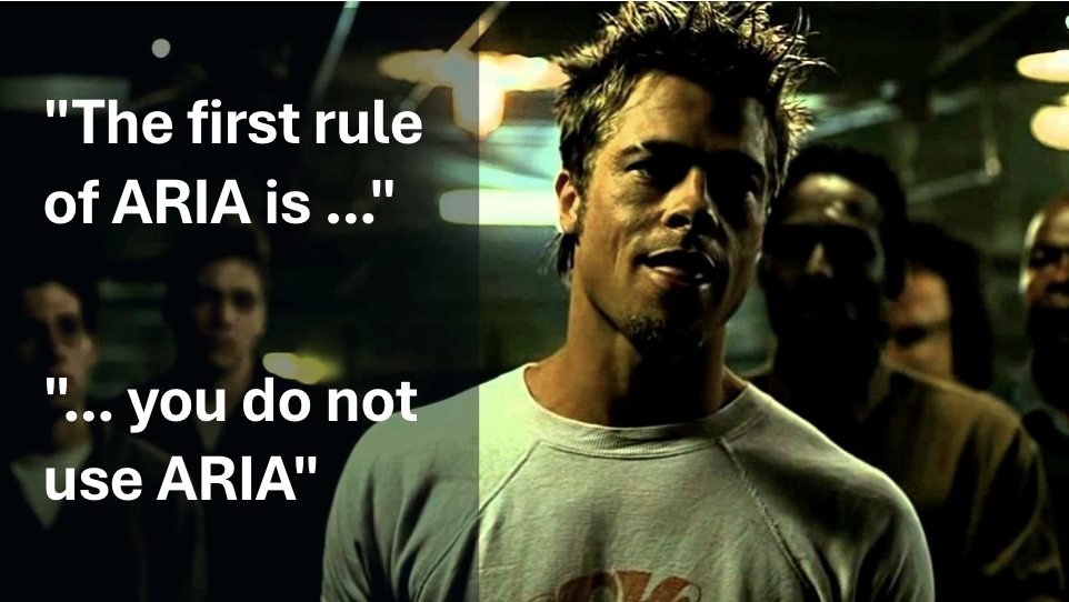
Rule 1 - don't use ARIA if you can use HTML instead
This is sometimes mis-quoted as The first rule of ARIA is do not use ARIA
. Whilst a little off the actual meaning of the first rule's wording it is still a good mantra to use as a guide and the Fight Club (IMDB) reference makes it stick in people's minds.
The issue with ARIA is that it is sometimes the first thing developers reach for when trying to make a page accessible. In reality it should be used very sparingly and only when there is not an existing HTML way of achieving the same result.
ARIA is often used without fully understanding the impact it will have, often it seems also without testing the output with screen-readers or other assistive technology.
When WebAim performed their survey of the top 1 million homepages they found those with ARIA present had 34.2% more detected errors than those without. Whilst this undoubtably has some relationship to the complexity of those homepages, there is certainly some evidence to suggest that ARIA is not always used wisely.
If you can use a native HTML element instead of building a component using ARIA, do so. ARIA is great for sprinkling on helpful touches or even for creating interctive components which don't exist in native HTML, but all too often ARIA is used to do work which can be done better with plain HTML.
Native HTML elements include a lot of functionality which you might not even be aware of. If you are trying to replicate an HTML element without using the actual HTML element you will likely miss something. You will also save having to write a lot of javascript.
As an example of native HTML element functionality which is unknown by those who don't use it all the time, buttons have a feature where a user can cancel a spacebar trigger using the keyboard.
Just like you might cancel a mouse-click by pulling your mouse away before releasing it, keyboard users can hit the tab key whilst the spacebar is still pressed.
So to avoid using ARIA where we can, instead of writing:
<div role="button">Save</div>
and then having to add a stack of javascript to handle the different kinds of input the user might use (touch, mouse, keyboard etc) and more javascript to cope with all the native options you didn't know existed, you can write:
<button>Save</button>
You just saved yourself a lot of effort and potential for things to break.
Rule 2 - don't change semantics
Unless you really need to you should avoid changing the sematics of an element.
This example shows a developer trying to assign a region to a list.
<ul role="region" aria-label="my list">
    <li> ...
However by assigning the region to the ul it has overridden the native ARIA role, meaning it will no longer be seen as a list and the list items (li) inside will be orphaned.
Because there are rules around how roles interact, such as listitem roles being direct decendants of a list role, this will generate errors on those li elements, but more importantly the list will no longer be announced as a list to screen-readers.
Instead you could wrap the ul with the region:
<div role="region" aria-label="my list">
    <ul>
        <li> ...
Rule 3 - interactive elements must be keyboard friendly
This goes for any interactive element, no matter how it has been built, but care should especially be taken when building components with ARIA.
Remember that adding ARIA attributes just adds semantics and information to the element, not any functionality (including being able to interact with it with a keyboard), so we need to add that ourselves.
Rule 4 - don't hide focussable elements from screen-readers
Sometimes we might see something like this:
<button aria-hidden="true">
    Am I hidden?
</button>
The aria-hidden="true" attribute tells the browser to exclude this item from the accessibility information sent to assistive technology. Essentially this hides the item for screen-reader users and those using speech-recognition - but does not hide it visually.
This means speech-recognition users and some screen-reader users will be able to visually see the button. Removing it from the accessibility information will prevent them from using the button they can see which will be confusing.
Screen-reader users will also still be able to focus on the button using the tab key (as this does not hide it from keyboard users) but when they navigate using the screen-reader key commands the button will not be exposed. More confusion. A quick test is that if a keyboard user can still focus on something, then so can a screen-reader user.
Rule 5 - interactive elements must have an accessible name
If a user can do something with an element, then that element needs an accessible name. Without an accessible name it is like having a link with no text, the user will not know what it is or what interacting with it might do.
Ideally all interactive components will have an accessible name which is also visually presented so speech-recognition users can see what they need to say to trigger it.
See more about accessible names
Rules about what you can use where
As well as rules around when you should use ARIA, there are also a lot of rules around which ARIA attributes you can use where (W3C).
- you can only use some aria attributes on certain
roles - some
rolesrequire otherrolesto be nested as children (think of lists and list items - a list item without a containing list does not make sense)
For example, you cannot add an aria-label to an element with a role="generic" - which includes elements such as span and div - as this is one of the "Roles which must not be named (W3C)". So this is not valid:
<div aria-label="About you"> ... </div>
When we talk about not being valid with ARIA, this means it can have either no effect, some odd kind-of-works effect, or a plain-just-unwanted effect. So it is best to stick to valid usage, but then test with actual screen-readers for real-world support.
Invalid use of ARIA is normally caught by the various automated browser plugins (such as AXE or Wave) as it is syntax based and easy to check for automatically.
What is ARIA not?
What it does not do is provide any functionality beyond the announcement of the attribute.
For example the HTML button below has ARIA added to tell the user that clicking it will expand additional content such as a navigation menu:
<button aria-expanded="false">Menu</button>
However as it stands it won't tell the user that the menu state has changed after the button has been clicked. To do that we will need to add javascript to toggle the ARIA attribute (to aria-expanded="true"). There are a few ARIA attributes which deal with state so for these javascript is necessary to help us improve accessibility.
If we created that button entirely with ARIA (which is possible but not recommended):
<div role="button" aria-expanded="false">Menu</div>
then we would also need to add things like some way of that button getting keyboard focus (as div elements don't get focus), and provide event handlers for both keyboard and pointer (mouse and touch) users.
ARIA is also purely for users of assistive technology which uses the accessibility tree. That includes screen-readers and speech-recognition. But not all assistive technology makes use of the accessibility tree and these will gain no benefit from ARIA. For example Windows High Contrast will not highlight links and buttons created using ARIA in the same way as it will native HTML links and buttons.
Support vs the specification
ARIA support can be somewhat patchy. This is a combination of the complexities of implementation and communication between the various involved parties and conflicting demands on screen-reader development teams.
To correctly support a feature the correct information needs to be passed from the browser into the accessibility tree, which needs to be communicated via an accessibility API to the assistive technology.
All the following can have an impact on whether a feature is available:
- different browser support and interpretation of spec
- different accessibility APIs used
- different assistive technology vendors
- regression issues or bugs in any of the above
- different support depending on browsing modes (for example tocuh vs keyboard, browse mode vs forms mode)
- assistive technology vendor heuristics (where deviations from spec are deliberately introduced to improve user experience)
This means that just reading and following the spec may not guarantee that the user will get the result you expect. Developers just following the spec and either not fully understanding it or assuming it is fully supported (not an unreasonable thought) are the main reasons why ARIA implementations can cause issues.
Even if you test with a screen-reader and browser and get the result you want, a different screen-reader and browser might mean you get a very different result.
There is an ARIA-AT project (W3C) which is trying to standardise how assistive technology announces or reacts to ARIA, but this is in the early stages.
For now, use the specification to guide what might be possible and within the rules of ARIA, but then test robustly in multiple screen-readers and speech-recognition software. If what is in the specification does not work then you will need to look for an alternative solution.
As an example, I was consulting on a webchat project, but the per-specification role="log" which should have been a perfect fit, worked poorly and inconsistently with different screen-readers and browsers. Instead I used a solution which generated dynamic aria-live regions to achieve the effect we wanted in a robust and consistent way.
The APG - a warning
The W3C produces something called the "ARIA Authoring Practices Guide" or APG. This on the face of it is a useful guide to different patterns and practices for using ARIA.
However, this guide is written to the specification. The patterns it showcases are idealised solutions which are intended as guidelines for browser and assistive technology vendors to aim at for support (a bit like the old Acid tests for CSS). They do not claim to be real-world usable nor to support mobile or touch interfaces.
Whilst these can be used by teams building sites as a starting point, they should not be just dropped into production without extensive testing with different assistive technology.
Things to consider when using ARIA
There is another phrase which is often used:
“No ARIA is better than bad ARIA”
What this means is that in many cases an interface is still usable without ARIA, but if ARIA is added in a poor way it can make it truly inaccessible. So it is worth double-checking any time you are looking at adding ARIA that what you are doing is necessary, is done in the correct way and has been robustly tested.
Here is a short checklist to use when looking at adding ARIA into your codebase.
- What is the problem I am trying to fix? Is ARIA the right tool?
- Can I do this without ARIA?
- Would a small redesign solve this instead?
- Am I adding content only for screen-reader users? Will other users benefit?
- Can a speech-recognition user understand what they need to say?
- Will this make the interface audibly noisy?
- Have I followed the rules of ARIA?
- Is this supported in the real world?
- Do I have a robust testing structure in place?
Wrap-up
Whilst ARIA is a very powerful tool in making our sites more accessible to users, it is one which needs careful handling. You need to know exactly the reason why you are adding ARIA and what effect you want it to have and then confirm it.
ARIA is simple to add but tougher to test, but not testing can really mess up your site's accessibility if not done.
If you add ARIA to your page or component, you must then test it with multiple screen-readers.