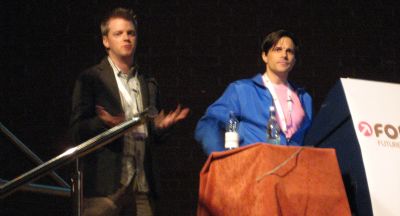
I came away from FOWD with mixed feelings. One the one hand it was pretty different from what I had envisaged as a practical “design” focussed event (grids, typography etc), being more a mix of case studies of marketing/web firms projects (games and fashion sites), broad strokes of how to engage with your users and some more specific design threads about language and workflow.

Overall, whilst very enjoyable it came across as a bit confused as to its aim, probably not helped by my internal assumptions tying to it last year’s Carson Summit. Despite that, all the presentations were engaging and well delivered and as always the organisation was flawless, so congrats to all involved. Even the sponsors contributions were more than the normal out-of-sight variety - Microsoft’s crash-out zone with bean-bags, XBox360s and live feed from the stage and Adobe’s provision of the after-event drinks.
For me the highlights were:
- Brendan Dawes‘ examples of small touches can make huge differences to a user journey (though I dispute his idea of Deal or No Deal as a work of genius)
- Ryan Singer‘s form improvement - must try to get to one of his workshops in the future.
- George Oates‘ use of urls to plan workflow
- Andy Clarke‘s cool wall
- Ryan Freitas‘ Buddhism concept of web apps and also his use of cartoons to describe user interaction with a site.
- Florian Schmitt and Jeff Croft demonstrating Flash as a de facto web standard
Lots to think about. More photos on Flickr.
