Whilst this is a simple check to do, it actually covers several WCAG criteria because is such a core accessibility concern.
Mac users
If you are a Mac user, oddly tabbing to navigate links and form controls in a webpage is turned off by default. This affects Firefox and Safari.
How to enable tab navigation on Mac
Firefox
To fix Firefox you need to go make a change in the Mac system settings.
Before OS 13 it is in System Preferences > Keyboard > Shortcuts and check “Use keyboard navigation to move focus between controls”.
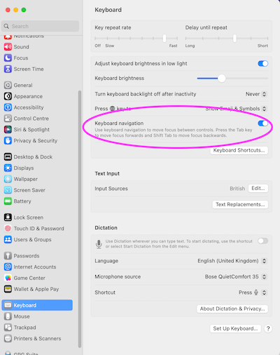
For OS 13 on it is in System Preferences > Keyboard and toggle on “Keyboard navigation”.
Safari
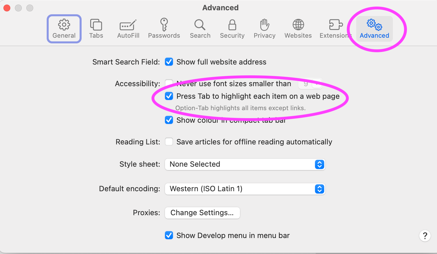
For Safari you need to make a change to Safari's own settings. In Safari > Settings > Advanced, check the option “press Tab to highlight each item on a web page”.
Navigating
Use the tab key to navigate around just the interactive elements on the page. You can use enter or space to activate buttons and enter to activate links. Some components might require arrow keys - radio button groups show focus on tab and then you can use space to select that radio or use arrow keys to move up and down the list.
Check if there is a skip link - an in‐page link at the top of the page which takes you to the main content and means you don't have to tab‐key your way through all the primary navigation on every page.
Do all the things which allow interaction (link, buttons, form elements etc) get focus when you tab to them?
Can you reach everything you can interact with using a mouse with your keyboard instead?
Seeing where your focus is
Keyboard use relies heavily on being able to see where the focus currently is. If this is taken away by css or obscured (or just forgotten about) it can make it very difficult to work out where you are on the page. Making focus states really obvious (and importantly contrast well against non-focus states) helps as focus can jump across large sections of the page.
Is there a good focus indicator for all the interactive content? Something which catches your eye easily so you can find it on a page.
If you can't see where the focus went, you need to check if this is just down to a poor focus state or because the focus has gone to content which has been hidden from view - something you will often find when content has been hidden off-screen until triggered (like a menu).
Make sure you check the page in both desktop and mobile/tablet view. External keyboards are commonly paired to smaller devices and desktops can display the mobile view when the page is zoomed. Keyboards are often ignored when designing for mobile unfortunately.
Logical order
Does the order in which the links, buttons etc get focus make sense? It is all too easy to use css like grid to change the visual order of content, or use html like tabindex to force the focus order without checking how this affects other users. A focus indicator jumping around a page haphazardly can be confusing or frustrating for a user.
Keyboard traps, where you find you cannot tab out of a component are not something you normally want. But occasionally they are desirable, like in the case of a modal dialog (often visually indicated by a dimming of the page behind it). With a dialog like this you want to keep the user within the dialog until they make some sort of decision and not to be able to break out and navigate the page behind.
Testing order with Firefox
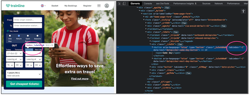
You can test focus order visually using Firefox’s tab order option in developer tools. This will overlay numbers on the page showing where the focus will be placed.

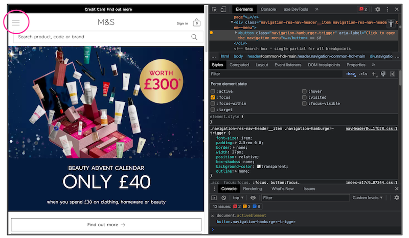
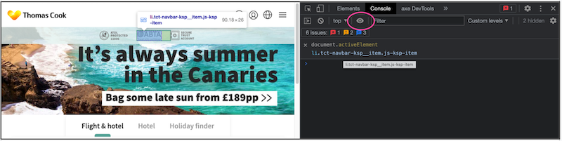
Testing order with activeElement
Overlays like Firefox’s are good but it can be tricky to track down a disappearing focus, especially in a crowded interface. You can be more targeted by using activeElement in the console. In Chrome’s console select Create live expression (the eye icon) and add document.activeElement. This will create a snippet which will follow focus in the page and allow you to both see where the focus is and what elements it is actually focussed on.
Managing focus
By this we mean, when focus is moved (not by the user), how is it handled? For example, clicking on a close icon in a dialog means you will be removing that icon from the page (as it is part of the dialog), so where does the focus end up? Browsers do try to help with this when an element is removed, but as this doesn't account for screen‐readers, the focus needs to be managed to make a better user experience.
Screen-magnification users can also set their view to follow the focus, so ensuring focus is managed well is also very important for these groups.
In our dialog example we'd want focus to be returned to the thing which triggered the dialog, or if the dialog wasn't triggered by the user clicking something, back to whatever the user had focus on when it appeared. The trick is to try and be logical about it and keep it close to where the user's attention is.
The more dynamic the page the more focus management will be needed and the more important keyboard testing becomes.
Checking everything works
As most developers build and test with a mouse it is all too easy to forget that not everyone can (or wants to) use one. So you can find buttons which only respond to a mouse click, effectively blocking a user from continuing.
So, can you complete the task with just a keyboard? At the most basic level this means can the user activate all the links, buttons and other interactive elements (including things like video players) on the page and complete any forms.
If you have any scrollable areas then make sure these can gain focus themselves to allow a keyboard user to be able to scroll the content, otherwise the content inside might not be reachable.