I thought it would be interesting to see how the new Whitehouse website did on accessibility, so here are a few places where I think it falls short.
Contents
- Auto-playing full-screen video
- Not respecting user preferences for reduced motion
- Alt text
- Not updating ARIA
- Menu dialog issues
- Headings
- Inaccessible links
- Use of title attribute
- Poor contrast
- Missing programmatic information
- Other issues
- Verdict
Auto-playing full-screen video
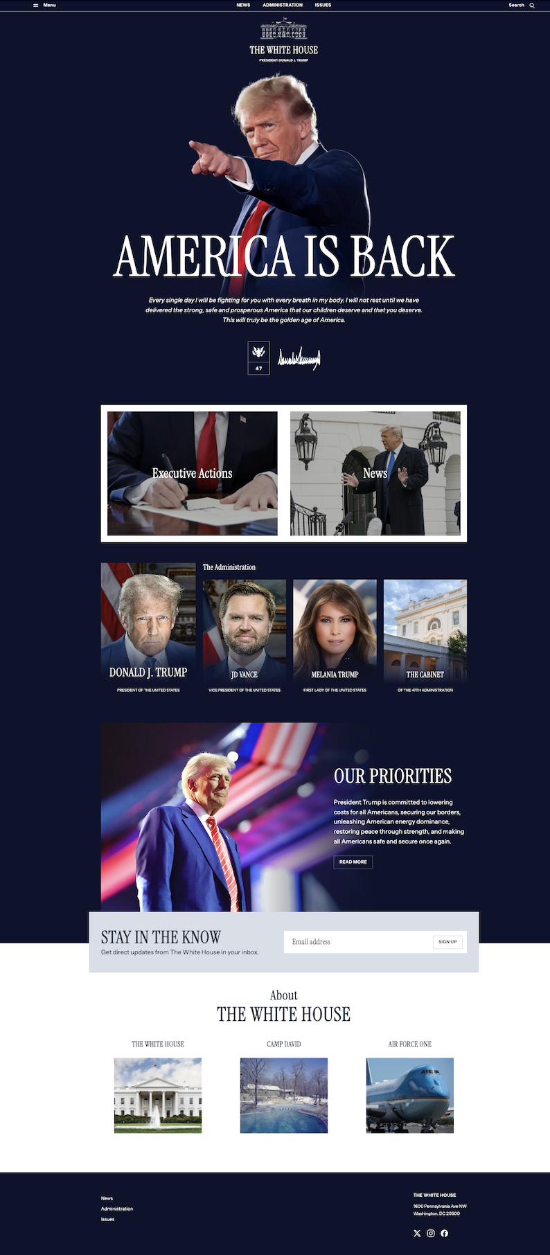
The Whitehouse website has a full-window video auto-play when you first visit the site (edit 18 Feb 2025 - it looks like this may now have been removed).
Having a large video auto-play on page load is an issue for some users - we can’t assume users will know how to set a preference so we should always avoid this kind of addition.
It is also not great for first impressions as on slower connections it can stumble. At 8.4MB it is also a heavy load for users on data limits. Disabled users in general have lower disposable incomes due to employment issues and additional expenses, so this is an accessibility issue.
On the plus side at least the sound is muted and the user can dismiss the video immediately (although even doing that allows 4.2MB of video download). On 3G I ran out of patience before the video even loaded.
Thankfully you only see it on first visit as a local storage flag is set.
Not respecting user preferences for reduced motion
Related to the first point, the website does not respect where a user has asked for reduced motion in their settings.
The auto-playing video, the heavy use of zoom effects in hover states and animation of the carousel on smaller viewports can all trigger issues for users.
There are simple mechanisms for websites to check for this setting and adjust the interactions based on it.
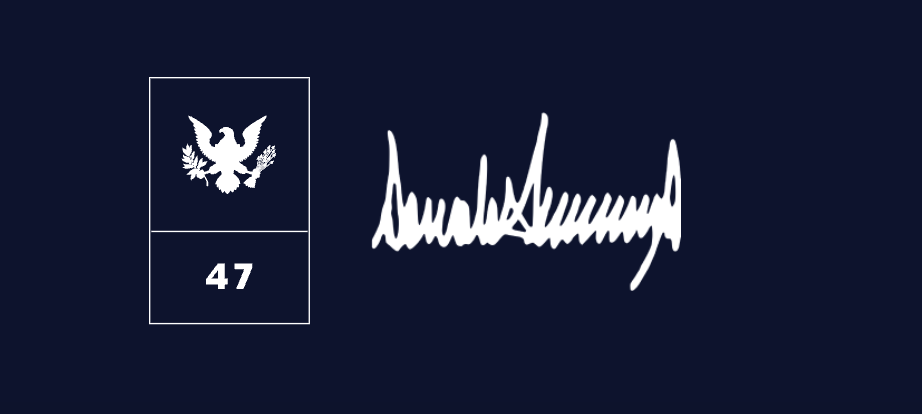
Alt text
Missing alt text
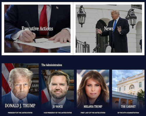
There are a couple of places where alt text has been left blank. For example the 47th president logo and adjacent signature. These could have been given explanatory descriptions as they do mean something.
Repetition caused by alt text
Elsewhere alt text has been used and created repetition where a better pattern would have prevented it, such as the 3 links to "White House", "Camp David" and "Air Force One" towards the bottom of the page:

Here the images are the links and the text above is unlinked. The images each have alt text which repeats the text above. So a screen-reader will get repeated content as they move through - it will be announced something like this:
“Camp David, Camp David link”
A better solution would be to use a card pattern which would use the text as the link and add a click-handler to include the image. This would allow users to click the text (as well as the image) and also allow us to add proper descriptive alt text to the images. For example:
<div class="wh-card"> /* js click handler added to this container */
  <a href="...">The White House</a>
  <img src="wh.webp" alt="Exterior of the White House on a summer's day" />
</div>
Overly basic alt text
Finally on images, the two large images of Trump have very basic alt text of “Donald J Trump“ which whilst true does not put across any of the emotion I am sure the designers are intending to convey with those images.
Not updating ARIA
The search button in the top right has an ARIA attribute applied to indicate that it triggers something which is currently closed:

<button aria-expanded="false" title="Open search">Search</button>
But when the button is pressed the ARIA is not updated which then conflicts with the information the user is now getting from the accessible name (which has been updated):
<button aria-expanded="false" title="Close search">Close</button>
Oddly the team managed to do this correctly with the menu dialog.
Menu dialog issues
Keyboard
When the user opens the menu dialog keyboard users are not restricted to the modal. A keyboard user can tab to the page behind the dialog which can mean their focus becomes obscured.
Screen-readers
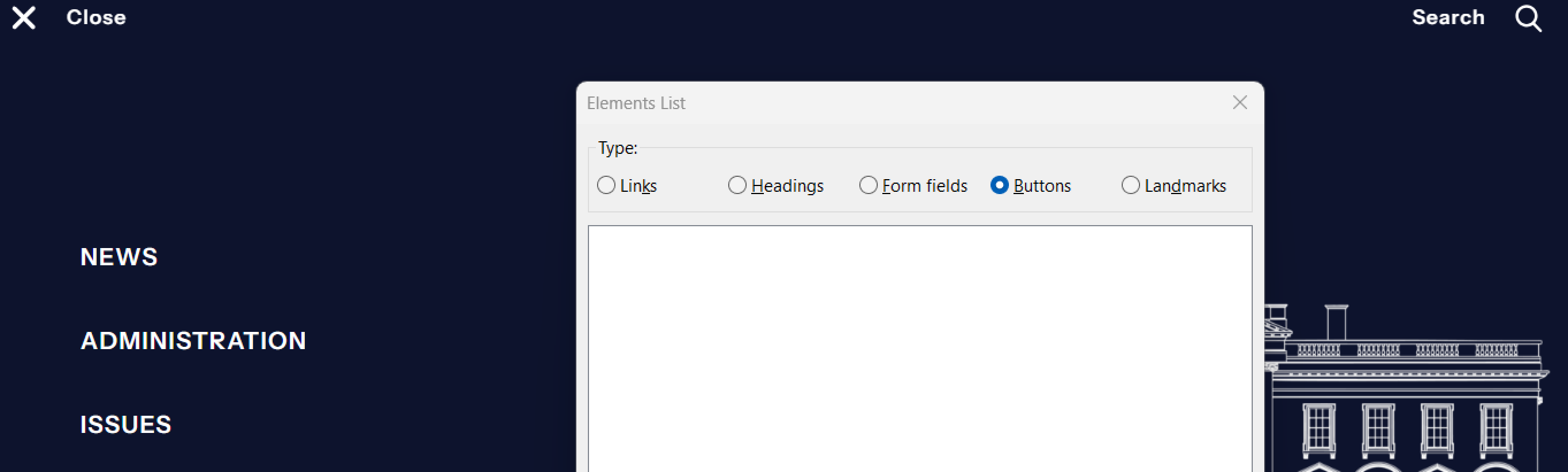
Screen-reader users don't fair much better as once the modal has opened the close button is unreachable as it sits outside the dialog bounds despite being visible.
We can see the issue when we look at the elements list for NVDA and see the buttons are there when the dialog is closed:
But the same elements are missing when the dialog is open, despite being visible:
Fortunately the dialog has been hooked up to be closed via the Esc key so both users can close it if they are aware of the shortcut.
These issues are most likely a result of using role=”dialog” instead of the dialog element and not thinking through the impact of doing this. The dialog element brings with it some functionality, such as making the rest of the page inert and trapping focus. Using role=”dialog” is the equivalent of using role=”button on a div - you need to bring the functionality yourself.
Missing accessible name
Using a role=”modal” also requires that you give your modal an accessible name, for example using aria-label. This is not present here so adds another issue.
Headings
It is important that headings are correctly applied as they are one of the main navigation methods for screen-reader users on longer pages. They also give an indication of grouping of content and provide an important introduction to the content the user may find next.
Missing semantics
On the homepage "The Administration" text which introduces the photos of the president and others is just marked up as plain text:

<div class="wp-block-whitehouse-front-administration__headline">
The Administration
</div>
So if we take a look at the HeadingsMap browser extension (which lists all headings on a page and constructs a tree diagram) we can see that the first heading we will encounter after the h1 is actually below this group:
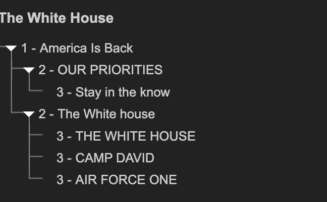
Non-unique headings
Another issues is that we can also see from this list that despite the h2 further down the page visually saying "About the White House":
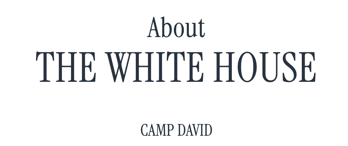
This is not what is communicated as the "About" is actually sitting outside the h2:
<p>About</p>
<h2>The White house</h2>
This then means we have two headings adjacent to each other with the same content, but with different levels and with different meanings. The word “about” needs to be included in that h2 - something which should happen even if it didn’t cause the non-unique error.
Inaccessible links
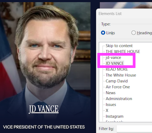
While we are looking at the Administration section, the links for the 4 items are unreachable for both keyboard users and screen-reader users. This is also the case for the "Executive Actions" and "News" links above. This constitutes the majority of the content on the website.
Looking at the code it looks like there has been a decision made to not wrap the link element around any content, but instead use CSS to position it above the content:
<a href=".../jd-vance/" aria-hidden="true" tabindex="-1"></a>
<img src=".../jdvance.jpg" alt="" />
<p>J D Vance</p>
The lack of accessible name on the link is obviously one concern, but the link also has an aria-hidden attribute (which hides it from screen-readers) and a tabindex="-1" attribute which removes the link from the focus order. Both are very conscious decisions and suggest they are attempting to implement a card pattern.
The card pattern would normally have included making the main call-to-action (in this case the name) a link and letting keyboard and screen-reader users discover that and then have some positioned area as a mouse/touch option covering the whole card.
Looking at a fix
So the first step in fixing this would be to link up the main text for each item:
<a href=".../jd-vance/">J D Vance</a>
This works, however we still have our odd, heavily attributed and nameless link. Adding aria-hidden to a control such as a link is never a good idea as it causes a slew of odd behaviours.
For example if we just left it like this, then screen-readers suddenly start picking up both links (the initial one is now showing as the document name from the href):
For this to work as we want we need the card link to be removed and instead replaced by a click handler on the container. This is ok as without js we still have the new link to fall back on.
<div class="container"> /* add click handler to this using the link href as target */
<img src=".../jdvance.jpg" alt="" />
<a href=".../jd-vance/">J D Vance</a>
</div>
We can improve this further by swapping the position of the image and link and adding alt text to the image. We could even include the secondary text as part of the link.
But at least now the content will be usable!
In short, never use aria-hidden on interactive things.
Use of title attribute
The title attribute has been used a lot on images and controls across the site. The title is problematic because it has a dual nature. It is really an accessible name source of last resort - so if there is no 'standard' accessible name provided (via content, alt text, labels or aria) then this would be used. However where an accessible name is provided the title is demoted to an accessible description, which means it will be read out after the given accessible name.
For example, the White House logo at the top of the screen:

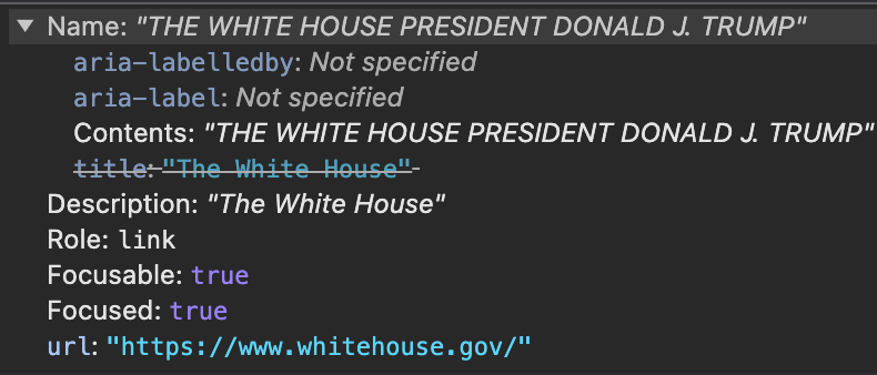
<a href="..." title="The White House">
<img src="..." alt="" />
<span>The White House</span>
<span>President Donald J Trump</span>
</a>
Will be read out by a screen-reader as
"The White House President Donald J Trump The White House"
Whilst not a major issue this repetition can become confusing and is unnecessary.
Poor contrast
It wouldn't be a list of accessibility issues without at least one for poor contrast. While the text overlaid on the images on the homepage could potentially cause issues, I am going to look at one of the subpages for a more clear-cut example:

Here we can see the sub navigation has poor contrast with the exception of the currently active page. The contrast here is 4:1 which is below that required for AA conformance.
When the contrast is so close to passing it is not going to require a full re-think of colour choices. Here the non-selected links are set using a 0.42 opacity of the white colour. If we tweak it to 0.62 opacity instead:

We now get a 7.4:1 contrast which is a pass. However we are left with another issue.
The original 0.42 opacity gave us exactly a 4.5:1 contrast with the selected option and increasing the opacity has made this worse. I think here we should be looking at adding an extra visual indicator for the current page, such as the underline used on other pages:

Missing programmatic information
Another issue with this navigation is that whilst it is showing the current page visually through the colour change, this is not being reflected programmatically.
This is simply done through the use of aria-current=”page” on the currently active link:
 <a
  class="is-current"
  href="https://www.whitehouse.gov/presidential-actions/"
  aria-current="page">
    Presidential Actions
  </a>
We could even use this as a hook for CSS to help us improve our accessibility right at the start and get rid of the is-current CSS class entirely:
[aria-current]{
  ...
}
You could try to argue that the h1 does this job (and I suspect this is what the thought process was with this as the aria-current attribute is used elsewhere), but we cannot assume screen-reader users navigate sequentially or understand the relationship between these two components.
Other issues
These are just the main issues which jumped out at me after a quick look and only picking up a screen-reader. But there are other issues, such as poor error messages on the email form (along with a lack of error announcement for screen-reader users) and missing autocomplete on the same (although this is likely not to be an issue as most broswers will do a decent job of figuring this out in this instance). This administration has also removed the Spanish language version of the site, which in one move has made accessing information more difficult for a huge group of users.
This does show however that just a few simple checks can expose some quite major accessibility issues.
Verdict
I think it is good to say what a team have done well, so here are a few accessibility areas where they did ok too:
The dialogs are dismissable with the Esc key - without this the other issues would be more serious.
Landmarks are being used which will help screen-reader users. They have used several nav elements and whilst the footer ones do not have accessible names, where they have been using in-page such as for pagination controls, these have been given meaningful names.
Skip to content link is present and most importantly actually works, taking keyboard users beyond the main navigation.
In the main the team have used semantic elements. This goes a long way to improving accessibility, although they have shot themselves in the foot a couple of times.
ARIA has been used but not massively overused. Yes they have made some mistakes but you can see the thought process and adding some testing will help with these.
This goes to show that regardless of how your stakeholders view accessibility, there are accessibility wins which you can bring to a project just as part of doing your job.