Contents
- Introduction
- Choice of code framework
- Versions matter
- Designing for native apps is different
- Applying accessibility best practice
- Checking apps for accessibility
- The need for closer team collaboration
- Wrap-up
- Further reading
Introduction
Mobile app accessibility has some similarities with web development, but it is also important to be aware of the differences so we can account for them during development.
This article assumes some knowledge of how websites manage accessibility and is mainly aimed at web developers and designers who have made the jump to app development.
Choice of code framework
The official frameworks are SwiftUI on iOS and Compose on Android. These will give you access to the best accessibility features to use when coding your interfaces as they use the native languages for each platform. Frameworks which allow you to code once and then deploy both iOS and Android apps from the same codebase (such as React Native) can end up sacrificing accessibility in order to do this.
The choice of framework may only be found to be an issue when an accessibility issue is raised and you find that the one you are using cannot support the code you need to write.
Using native languages is perhaps the ultimate “shift left” for accessibility. Yes it is extra work writing to those two codebases but it means you can ensure you are likely to be able to support most accessibility improvements. But it is not without tradeoffs in speed of delivery and consistency.
Versions matter
Just as different browser versions support different features of CSS, different versions of iOS and Android support different accessibility features. This may require conditional logic within the app to determine if these features can be used.
Designing for native apps is different
If you are used to designing responsive web-based products, there are differences in how native mobile apps should be approached. A native app needs to be considered in a different way to a mobile view in a browser.
Websites have a lot of accessibility features they can use to help users understand content. HTML is heavily semantic at its core and ARIA allows designers and developers to be really explicit about how accessibility is translated to the user.
On native mobile this is not as clear or as well developed. We need to keep native mobile interfaces simple and avoid complex components. For this reason just porting a responsive website's mobile view to a native mobile app is potentially going to introduce accessibility pitfalls, especially for screen-reader users.
Tools for designers
Applying accessibility best practice
The first thing to appreciate when designing or building native mobile apps is that WCAG still applies. Whilst WCAG was not directly written for native apps (it was originally written before they existed), most of the criteria can be applied to them as WCAG is platform agnostic.
The W3C created a guide to help teams understand how WCAG principles apply to mobile. Whilst this concentrates on mobile versions of websites it does contain some useful reminders for how small screens and predominantly touch-based devices can affect a design.
Let's have a look at some specifics of things which should be considered when designing or building a native app.
Checking apps for accessibility
We will be discussing some visual adaptations and assistive software but in particular what we need to think about when looking at native apps.
Roles
Just as on the web, native apps can communicate some semantic information in how the components are coded. On the web this is done using particular HTML tags or explicit role attributes. On native these are done by using accessibility traits.
These can be checked using tools (see below) or a screen-reader.
Accessible names
Images should in most cases have good alternate text descriptions as you would normally do. Form inputs should be correctly labelled, and links and buttons should have accessible names. On native apps these are referred to as accessibleLabels but are just as important.
These can be checked using tools (see below) or a screen-reader.
Headings
iOS supports different heading levels, but Android does not, so whilst iOS users can determine hierarchy from the different levels of headings this is not something Android users can benefit from.
Frameworks which compile down to both iOS and Android such as React Native look to have devolved to the Android state. This means even when iOS supports an accessibility feature this can be prevented from being used by the framework.
Colour contrast
Checking colours on-device can be tricky but if you can mirror the device to your development computer screen it makes it easier. Otherwise you may need to screenshot the app and export it to somewhere you can use a contrast checker with a colour picker, such as the TPGi Colour Contrast Analyser.
Dynamic content
On the web where we have dynamic content we can use ARIA live regions to keep screen-reader users up-to-date with changes to page content.
We need to do the same with our native apps, whether this is error messages or other notifications.
Touch target size
With the small size of mobile screens we can find we have scaled down controls too much in an effort to squeeze them all in.
Touch targets need to be a minimum of 44 by 44pt on iOS, and 48 by 48dp on Android.
Larger font sizes
Many users will adjust the font-size on their devices to make it easier for them to read content. Native apps should support this by using responsive fonts (on iOS this is known as Dynamic Type and as Scalable Pixels on Android).
Whilst using responsive fonts is the first step, you also need to ensure the text is allowed to expand as it grows. Otherwise text can be cut off or truncated and become unreadable.
We are firstly wanting to check that the font actually increases in size in response to the user's preferences.
Once we are happy that is happening then we also want to check that all the text is still readable and none of the previously readable content has been cut off or otherwise truncated.
On iOS there is a “Larger Accessibility Sizes” toggle which gives access to 5 larger font sizes than those in the standard display settings. These should be tested too. Apps may have areas where these larger fonts cannot be displayed (such as in the tab bar). Where this is the case the app should make use of the iOS “Large Content Viewer”. This allows the user to long press on the item to see a zoomed version of it on-screen.
Note the Large Content Viewer should only be used where sizing text is not possible - such as the tab bar where sizing the tabs up would obscure the main content. It should not be used for body copy or where layout changes could allow larger font sizes.
Larger display size
Android also has a setting called Display Size. This increases the size of UI elements (such as icons) which just increasing font sizes does not.
Larger display sizes should also be tested in conjunction with larger font sizes as it likely these will both be used together.
Orientation
This is something often overlooked on native apps. Take a look at some of the apps on your phone. How many of them rotate their view when you turn your phone to landscape?
Orientation is a user preference and so should be respected and supported just as we do on the web. Some users may not be able to use their devices in any other way other than landscape.
The app should be viewable in both portrait and landscape. Crucially here we also want to check that not only has the orientation switch worked but also that nothing in the layout has broken as a result, and content can still be read.
For example Audible on Android does not switch orientation until you have selected and are listening to a title when it does present a landscape mode.
Larger viewports
We can forget to review designs for how they present on larger viewports. For mobile apps in particular we need to think about tablets and how that extra real-estate can affect accessibility.
For example a button attached to the right side of the screen on mobile may not cause any issues, but on a tablet not adjusting the design can lead to that same button being very isolated. This could cause issues for some users such as those using screen-magnification.
Also be aware that other components may change between these device types. For example on iOS main navigation will be shown in a tab bar at the bottom of the screen, but on iPadOS it will move to the top of the screen or even as a sidebar. These different versions will need to be checked for contrast and keyboard accessibility in both versions.
Voice Entry
When users are being asked to enter data into fields not all users will want to type an answer. Virtual keyboards allow voice entry now by using the microphone option. We need to ensure input fields which we present to users do not prevent this type of entry, but also that we are forgiving of simple issues this may create.
Switch control
We can set up an external keyboard (see below) to act as our switch input, just as we might on a laptop.
Switch control can work slightly differently on native apps than it does on websites. By segmenting our screens we can present groups of controls which a switch control user can navigate in sets to reduce time in making a selection.
Another thing to consider is avoiding reliance on gestures to control the interface. Whereever gesture controls are added it is best to have a non-gesture option.
External keyboard
Just as with websites, keyboard access is often overlooked, but this happens a lot more with native apps as the assumption is users will be using the touch-screen.
The easiest way to test is by using an external bluetooth keyboard.
On iOS in order to move through an app using a keyboard you will need to turn on “full keyboard access” under Accessibility in Settings.
On iOS you also have the option of using “keyboard gestures” by using the Tab + G command. This then allows you to make swipe gestures. However bear in mind that not all users will be aware of this and Android phone users do not have this option. It is always best to provide keyboard users with buttons to accomplish what other users may do with gestures.
Navigating within the app will be a mix of tab and arrow keys, but arrow keys will be the primary way. This differentiates native app testing from website testing and can take a little getting used to.
Other than how you navigate, we are looking for largely the same issues we might with websites - can we reach and activate everything and can we see where our focus is easily?
Screen-readers
Screen-readers work largely as they would on websites. In fact it is easier to test on mobile apps because there is one less complexity - the absence of the browser. We are also only going to need to test with the native options - TalkBack on Android and VoiceOver on iOS and iPadOS.
One thing to note is that native apps may not announce roles (or traits) in the same way as websites do. For example a button may just announce the label and “Double tap to activate.”
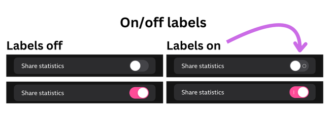
On/off labels
This is an iOS-specific user setting. It adds an "on" or "off" text label to switches within the app to help users who may have difficulty determining the state of the switch. We should verify that any toggle switches are correctly updated when this option is set.
Other tests
These tests will work very much as they would with websites:
- text-to-speech - Select-to-speak (Android) and Spoken Content (iOS)
- speech-recognition - Voice Access (Android) and Voice Control (iOS)
- colour filters - Simulate Colour Space (Android) and Colour Filters (iOS)
Testing tools
On native apps we don't have access to code in the same way as you do with websites and browser developer tools. However there are a couple of tools which can help with some basic checks.
Android accessibility scanner
This is an app which you install on the same device as the app you are testing. It then appears as a floating button which you activate when you are on the app you want to test. You can choose to snapshot test the screen you are currently viewing, or set it to record and it will check as you move through the app.
With either method it will generate an interactive overlay where you can zoom in on particular issues. You can then export this set of results via email.
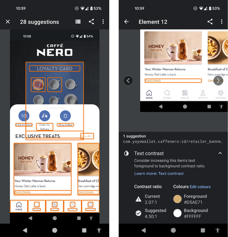
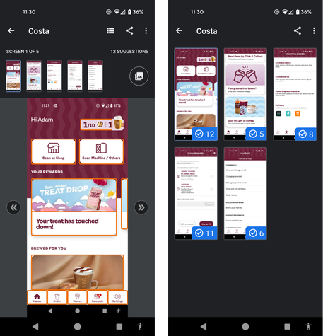
Issues this scanner may find include:
- using height or width restricted containers for dynamic text sizes
- colour contrast issues
- touch target size
- missing labels on elements
- duplicate labels or descriptions
- unexposed text (visible text which has been hidden from assistive technology)
XCode Accessibility Inspector
By connecting the device running the app to a Mac with XCode this will allow you to inspect the various elements on the screen with the Mac's “Accessibility Inspector”.
The inspector has 3 modes: “Inspection”, “Audit” and “Settings”.
Inspection
This is useful for spot-checks on specific elements or helping with debugging an issue you spotted with something like VoiceOver or Voice Control. It allows you to pick an element and see a bunch of information such as traits.
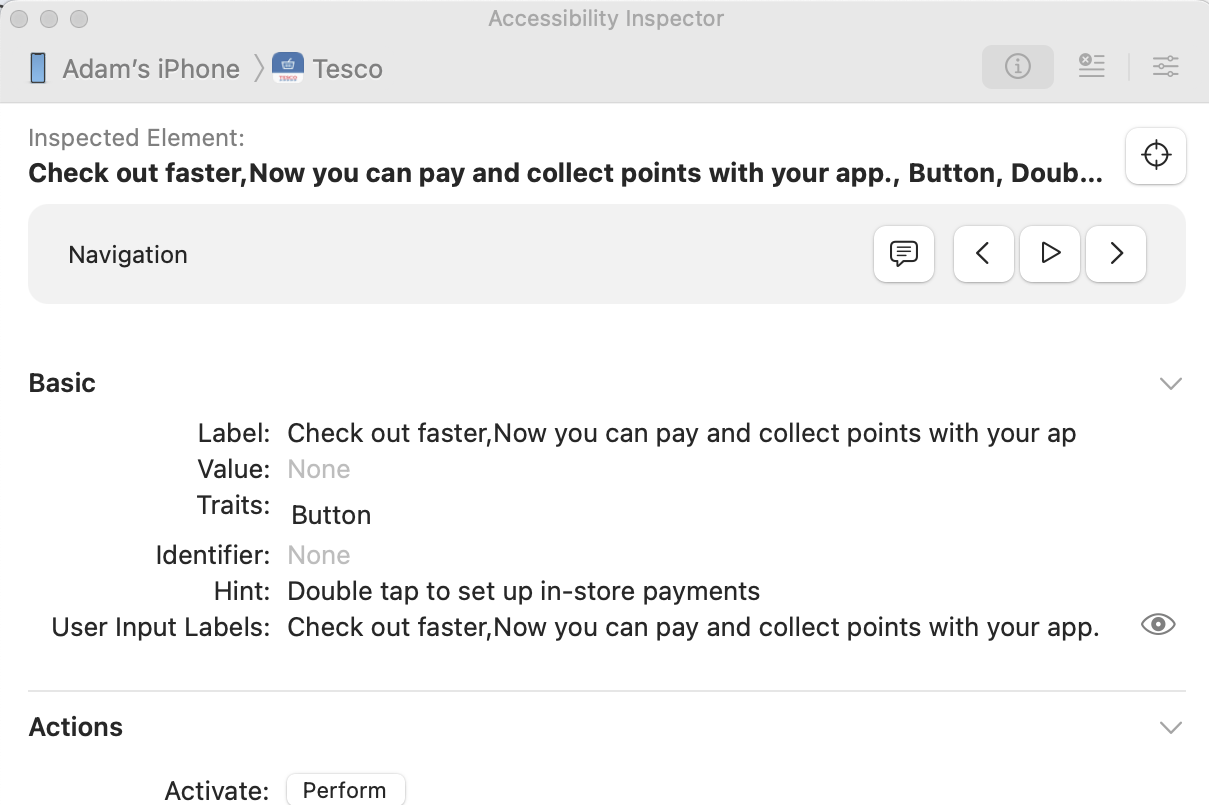
It also has a VoiceOver emulator which allows you to hear the elements read out (through the Mac) as a VoiceOver user might hear it. This can be handy for some quick checks but should not replace testing with VoiceOver on the actual device.
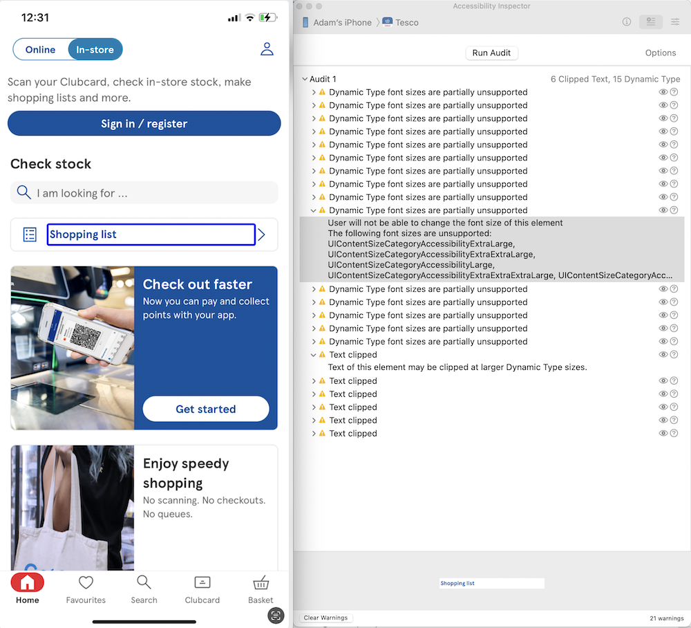
Audit
This allows you to run a scan on the current screen and get a list of potential issues. You can also bring up a screenshot of the screen with the item being talked about in the issue highlighted.
Settings
This allows you to control certain OS-level preferences such as font-size, reduce motion and more. This feeds off the device settings so it will display any existing state of these settings here. Updating one of these will also show immediately on the attached device, so it is a good way to check some settings quickly.
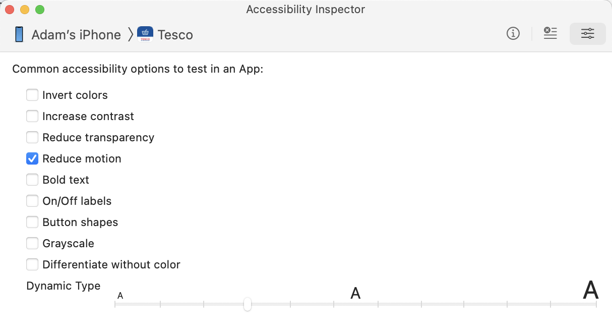
Note that the upper half of the font-size slider here equates to the “Larger Accessibility Sizes” toggle on the device. So the maximum setting of the slider in the Inspector settings is equivalent to having the Larger Accessibility Sizes setting toggled and the font-size slider on device all the way to the right.
The need for closer team collaboration
HTML is a fairly easy to understand language. Even if a designer is not comfortable with writing it they can follow along as it is a succinct set of tags which are largely readable. When it comes to native app development it is much more akin to using javascript to create DOM nodes from scratch and assign attributes. This abstraction coupled with the need for more specialist software to build apps and the associated learning curve means it is more difficult for designers to engage directly with the code.
As such it is vitally important that designers and coders of native apps work closely together to develop accessible solutions.
Wrap-up
Just as with websites, native mobile apps need to consider accessibility and implement a range of checks to ensure we don't leave users behind when we move from the web to native.
Further reading
General guidance
- Intro to mobile app accessibility
- Appt guide for making apps accessible
- Evinced mobile app accessibility guidelines
- Mark Steadman on BlueSky
- Dani Devesa on BlueSky
iOS references
- iOS Human Interface Guidelines - accessibility section
- iOS developer guidelines - accessibility section
- SwiftUI Accessibility Fundamentals
- CVS Health iOS SwiftUI