Content
Introduction
Forms are a key part of accessibility as they are often the reason a user will interact with a page - whether that is to buy a product, post something on social media, contact a company or communicate with their bank or government.
With so much of the daily interactions moving to digital, having accessible forms is essential for living today. Consequentially having a form which does not account for the needs of users can lead to those users being excluded from crucial services or aspects of daily life.
Whether it is a simple single field newsletter sign-up or a multi-page application form there are things we need to get right to ensure everyone can use it.
Considering users
Before we start to think about designing a form we need to consider our users.
Interaction modes
Different users may interact with our form in different ways so we need to be careful that our form design does not get in their way or make it difficult to understand what we are asking for.
For example:
- Some users cannot use a mouse so more complex input types will need to be checked to ensure they can be used with just a keyboard.
- A screen-reader user is going to rely more on programmatic relationships between form fields and content to understand what is being asked.
- Speech-recognition users will use visual labels to place their cursor in a field. Labels need to be both visually and programmatically associated with the field.
- For screen-magnification users we need to be sure that the form is easy to follow when perhaps only one field can be seen at a time.
Reduced typing
Some users find it difficult to enter data by typing. Perhaps a physical condition makes it difficult or painful to type; they find thinking about and constructing answers difficult or they are not confident in how their answer may be interpreted. These users may benefit from answering questions with a simple yes or no, instead of having to type an answer in a field.
Memory conditions
Users may have conditions which affect memory so designing for recognition rather than recall will help. Reduced typing solutions can help here too. For example picking an option from a list rather than asking for them to type in a field.
Similarly avoid asking the user to remember answers from previous pages. Instead provide the information the user needs on the same page where you are asking the question about it.
Numbers
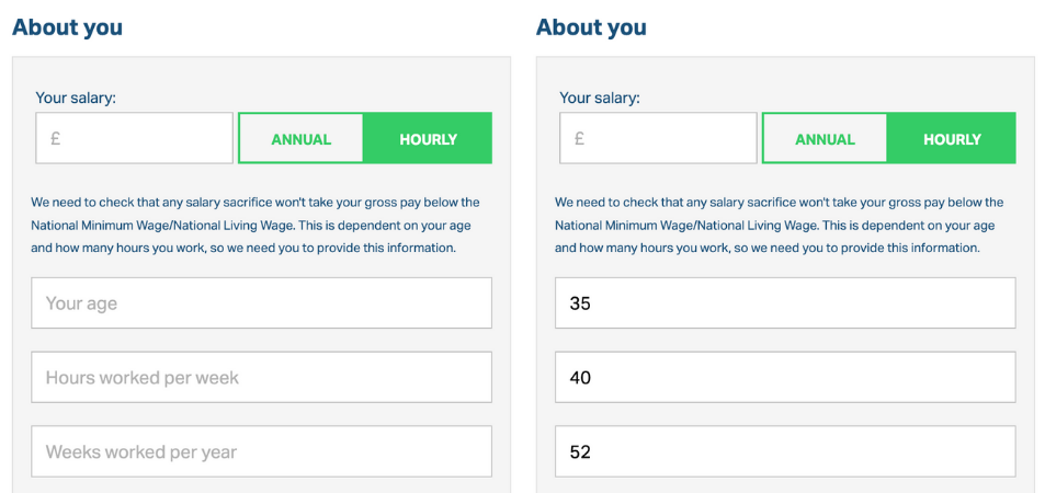
Some users find it difficult to work with numbers. This can be due to low numeracy or conditions such as dycalculia. Where possible we should avoid asking users to make calculations, instead we should be doing this for them.
This can be a particular issue when digitising a paper form as these tend to ask the user to do calculations. If we are not careful we can just duplicate the paper form instead of looking at ways we can make the user's life easier.
Avoid redundancy
When we are building our form design we want the user to have to do as little work as possible. The easiest way we can do this is by not asking the user questions in the first place.
We should avoid asking the user any questions which we do not need in order for them to complete the given task. For example, don't ask questions which don't provide value for the user (such as demographic information for metrics) or ask questions which you can get the answer to via other means (such as querying your own databases or APIs).
Similarly do not ask the user to enter the same data more than once. If the task requires the user to enter their address for shipping and then they need to enter a billing address, allow them to pick the shipping address if they are the same.
Save progress
Conditions and disabilities can make interacting online very tiring, moreso if it involves having to think about answers or typing. It might be that users are unable to complete multi-page or lengthy forms in one sitting. To help users we want to save progress as they go and give them the option of exiting the form and coming back later.
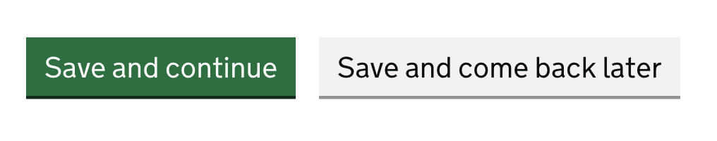
In order for this to be effective the option should be clearly signposted so the user is not uncertain if their data has been saved. When they return they should be able to pick up where they left without having to revisit all the completed pages.
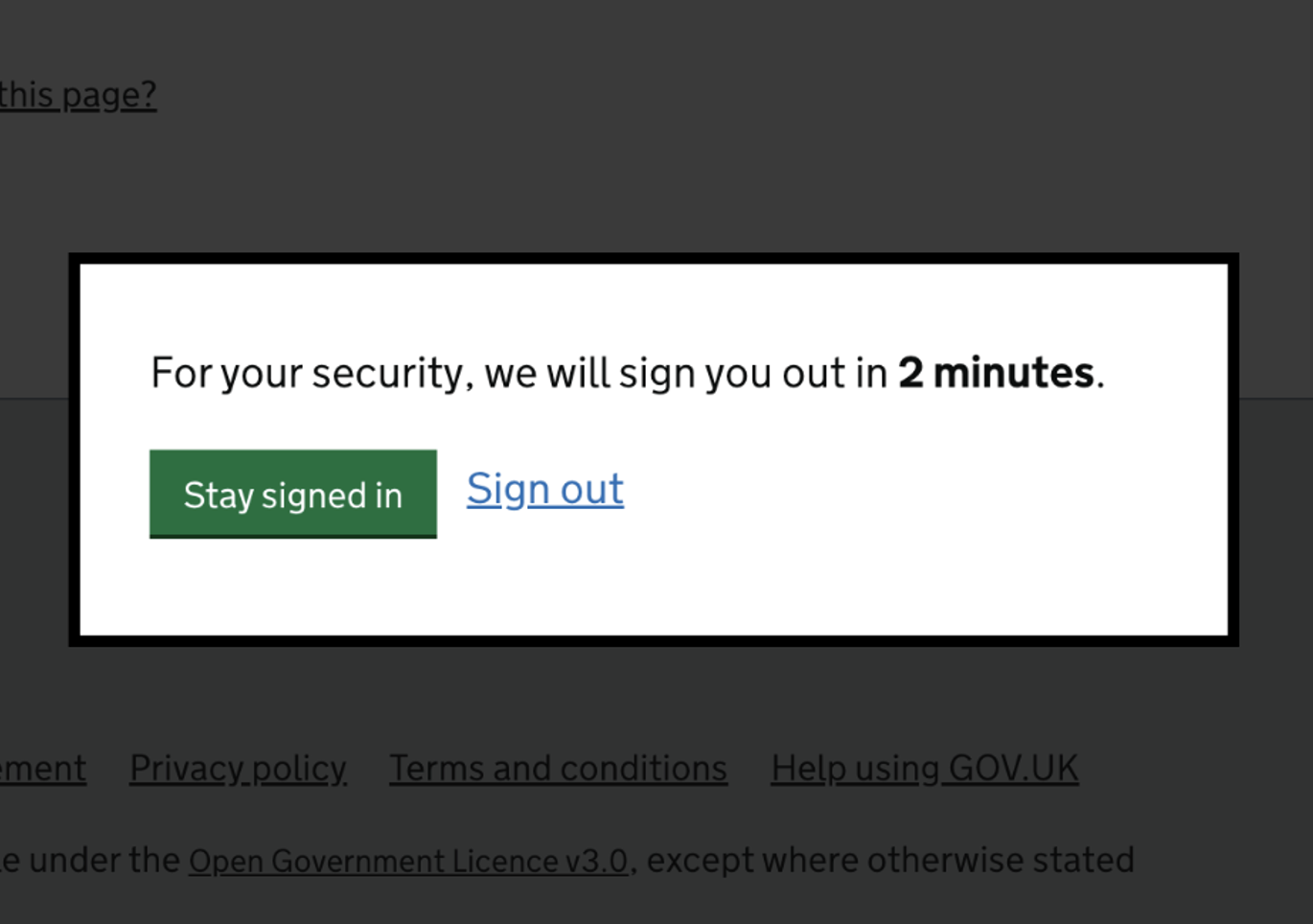
Time restrictions
Whether the form allows the user to save and come back or not we also want to avoid setting artifical time limits on the time they take. Again not all users work to the same pace and asking users to complete an application or move to the next section within 15 minutes may be ok for some but difficult to achieve for others.
The way we can manage this is to either not set any limits in the first place or offer a way for the user to extend their session. The most common way is to provide some type of alert or dialog which appears shortly before the session is about to expire offering the user the chance to extend their session.
Cognitive load
Whilst it may be possible to cram all the fields your task needs onto one page it can be better for the user to spread them over several pages.
Having a lot of fields on a single page may feel more efficient, however it has a few downsides.
- having a lot of questions on one page can be overwhelming
- less chance to save progress
- more time pressure
- more difficult to locate errors
- more chance for data loss
- branching questions become more technically complex and more difficult to understand
We can avoid these issues by placing small groups of related questions on their own pages. This allows the user to just think about that topic, keeping cognitive load as small as possible.
This is a pattern called “one thing per page”. The “one thing” does not mean one field, but one concept per page. For example “Your contact details” is one thing but may include fields for your name, email, phone and address.
This may not always be the best solution - for example users who reguarly fill out the same form may prefer to avoid the additional navigation, or users may prefer to see the entire form in one go to better manage expectations and required information. However this pattern is often a good starting point and fields can be grouped onto the same page in response to feedback during testing.
Inclusion
We should also consider if we might be excluding users by the questions we ask. This also crosses into inclusivity and includes examples such as:
- asking about gender or sex
- asking about equality information
- cultural biases such as asking for a first and last name rather than a freeform field
- only asking for a phone number when users may prefer or need to be contacted in other ways
Remember that if you need to gather data around a user's gender or pronouns you should also have a route for them to be able to edit them in the future.
Communication
Forms are all about communication. Content within a form is really important to get right. We need to avoid any confusion about what the user should enter and in what format. When things go wrong we also need to make sure they know why and how they can fix it.
All the following need to be carefully considered by content designers:
- content which directs the user to the form
- labels and legends
- hint copy
- error messages
- confirmation and “what happens next” content
But before we get into these, we also need to think about how our form is communicating with the user visually.
Styling
When users are entering data into a form their main concerns are going to be about getting the data entered and knowing they have filled in all the required fields. Whilst a set of fields which fit nicely with the site design are pleasant, this should not detract from the functionality of the form or get in the way of the user completing their task.
Also think about font-sizing. Users are able to adjust their font sizes so ensure that your styles are able to cope with this.
If you are going to be doing anything but very simple form styling you need to look to heavily test these components. This includes introducing components from a component library (such as calendar pickers). Even simple CSS can render a form inoperable to a keyboard or screen-reader user. This is even more of a risk when javascript is also introduced. This can mean they will not be able to complete their task - which may be the primary functionality of the site.
More about styling impacts in forms
Labels
Labels are a visual instruction for a field, but it is not enough to place text above an input. There are several things to consider when writing and coding a label.
Larger touch target
When correctly associated with the field labels provide a larger hit target as clicking the label will place focus within the field. This is especially important for checkboxes and radio buttons due to the smaller size of the input itself.
Positioning
Users need to visually associate the label with the field it relates to. This means the label needs to be adjacent to the field. Having a bunch of content between the label and the field makes it more difficult to make this cognitive leap but especially so for screen-magnification users and mobile users.
Take the below for example:
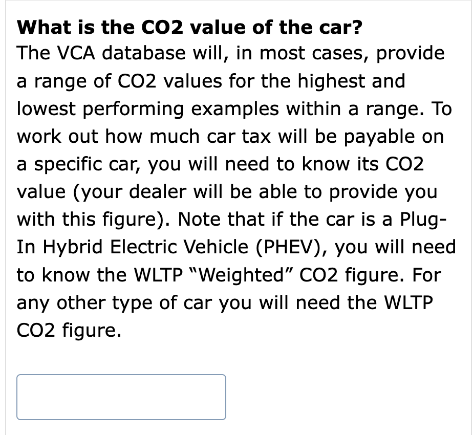
This is not great. If we take this line-by-line we are asking a question, then providing the user with a hefty set of copy around how they should answer and then asking them to tell us the answer (the input). By the time the user has read the guidance copy it is likely they will need to re-read the question. This becomes even more of an issue for screen-magnification users (and mobile users) as they cannot just glance up at the question, instead having to move back up the page to find it.
A better option would be to put that label right next to the input and precede the block of content with a heading:
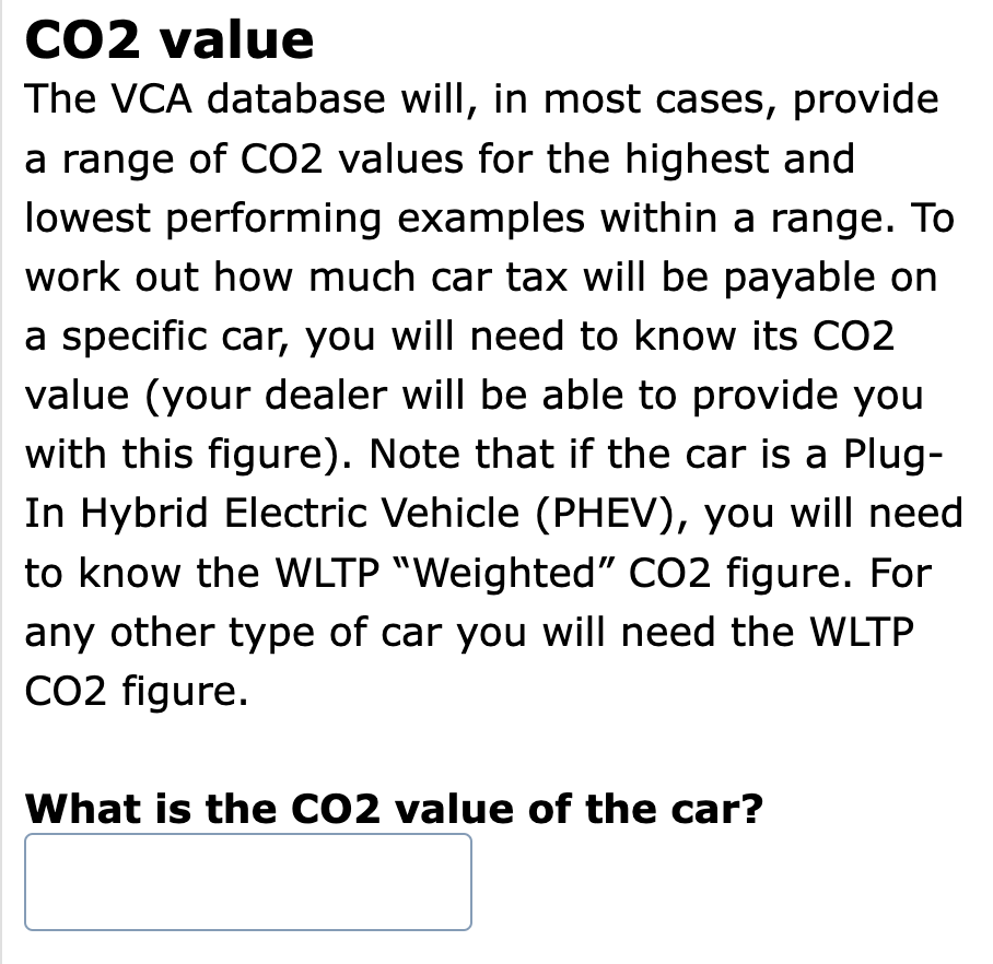
It would be even better if the block of text could be reworked to make it easier to understand or even broken up a little.
Accessible name
Labels most importantly provide the accessible name for the field. This programmatic link means that when a screen-reader user lands on a field the label is read out.
It also allows a speech-recognition user to focus the field by using the label. Labels should be visible text next to the field and easily identifiable to the user as the label to help make the cognitive link but also assist speech-recognition users in understanding what they need to say to select the field.
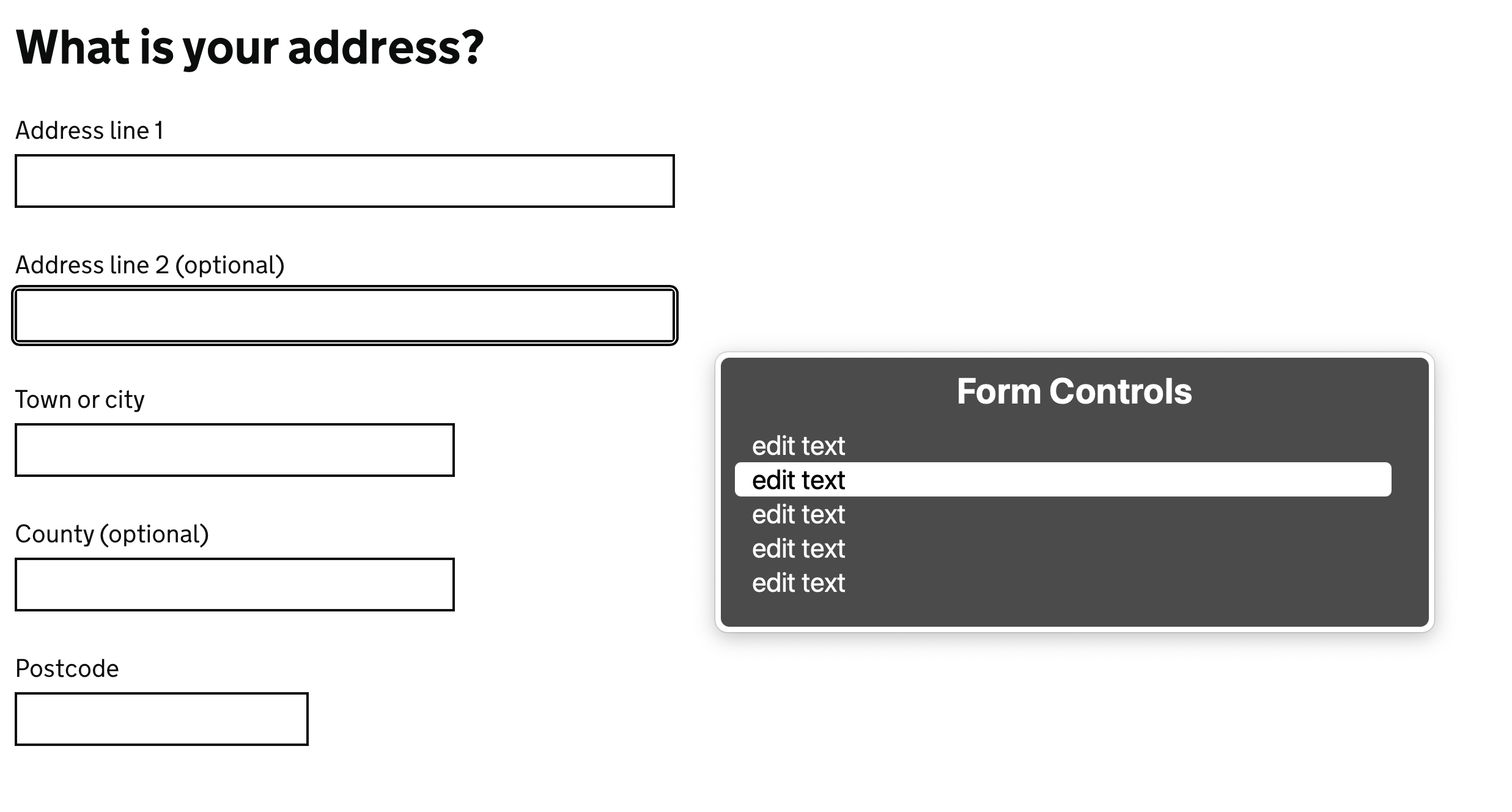
Let's take a quick look at a poorly constructed field:
<div>
    What is your name?
</div>
<input type="text" ... />
If a screen-reader user jumped directly to the field above, they would hear:
“Edit text”
They woud not know what the field was expecting and would have to explore the page to find out and assume text above the field was the label. Having the user make cognitive leaps like this is poor accessibility.
Similarly a speech-recognition user would not be able to easily place their cursor in the field. A speech-recognition user would typically say the label text to focus the input (“Click What is your name”) - here doing that would not do anything because the input does not have the accessible name.
Even if we had used a label instead of the div this would make no difference as without the association with the field the label essentially becomes just plain text.
So how do we make this association?
The label is programmatically associated with the field by using the for attribute to point to an id attribute on the field. This relationship allows the accessible name of the field to be supplied by the label contents.
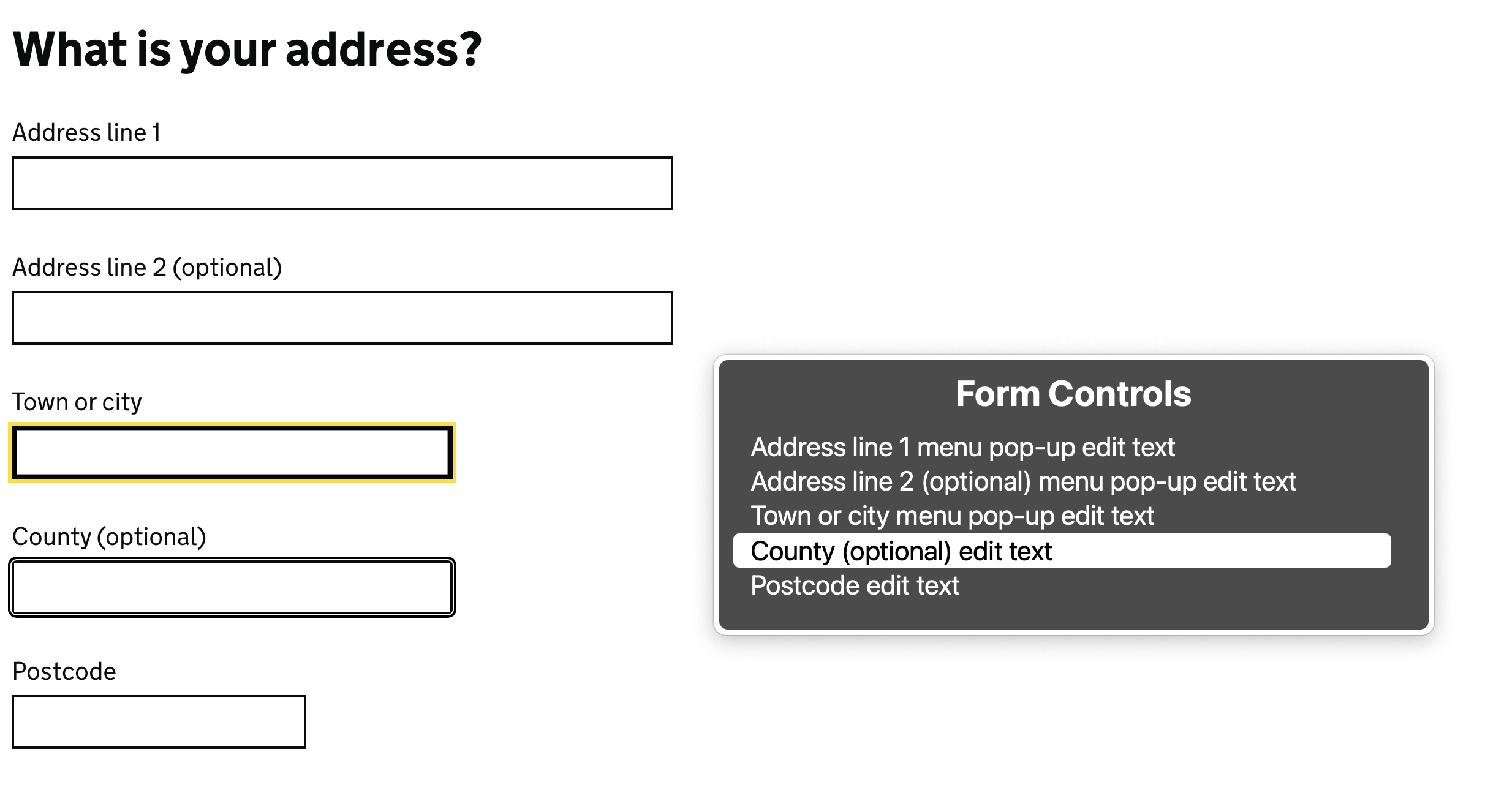
<label for="name">
    What is your name?
</label>
<input type="text" id="name" ... />
Now if a screen-reader user jumped directly to the field above, they would hear:
“What is your name name, edit text”
Let's have a look at that on a larger form.
Do not be tempted to just wrap the label around the input to rely on implicit association like this:
<label>
    What is your name?
    <input type="text" id="name" ... />
</label>
Whilst this is valid HTML it can cause issues for some assistive technology in accessing the field.
If you need to wrap the field for some reason, then you will also need to add in the for attribute to avoid these issues:
<label for="name">
    What is your name?
    <input type="text" id="name" ... />
</label>
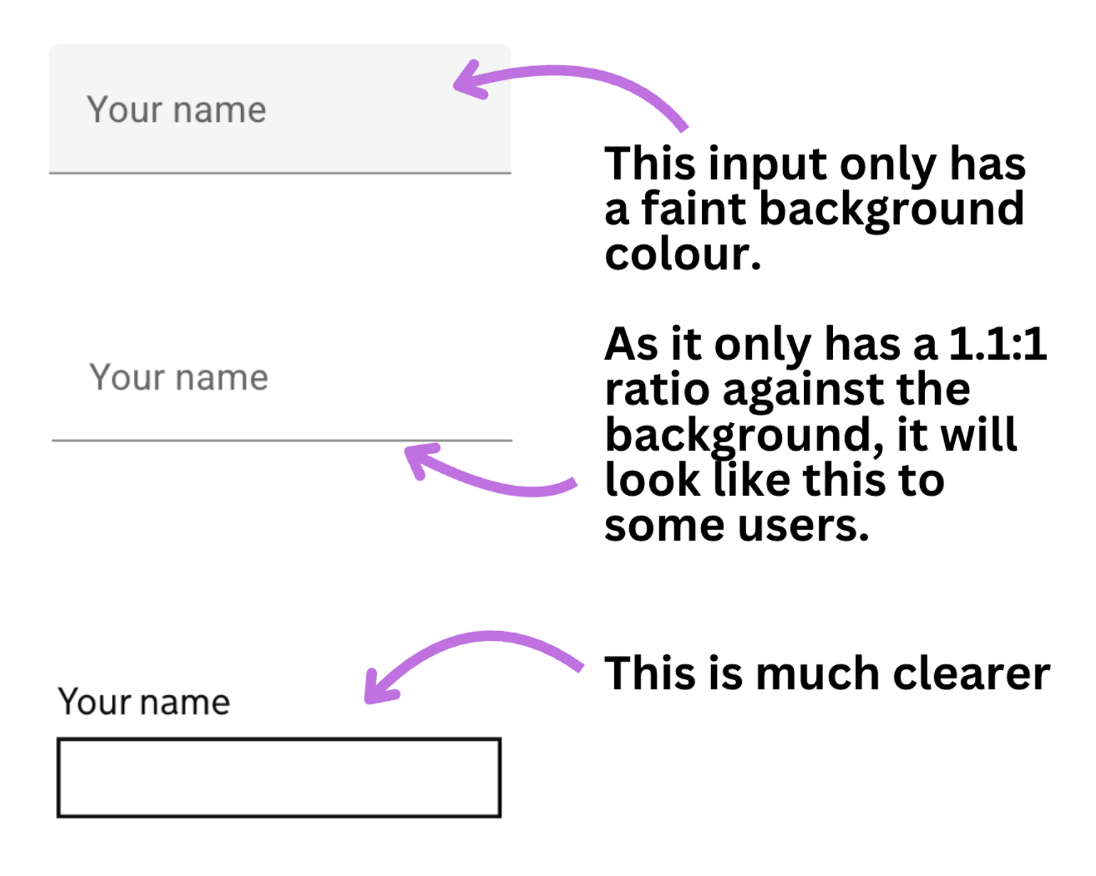
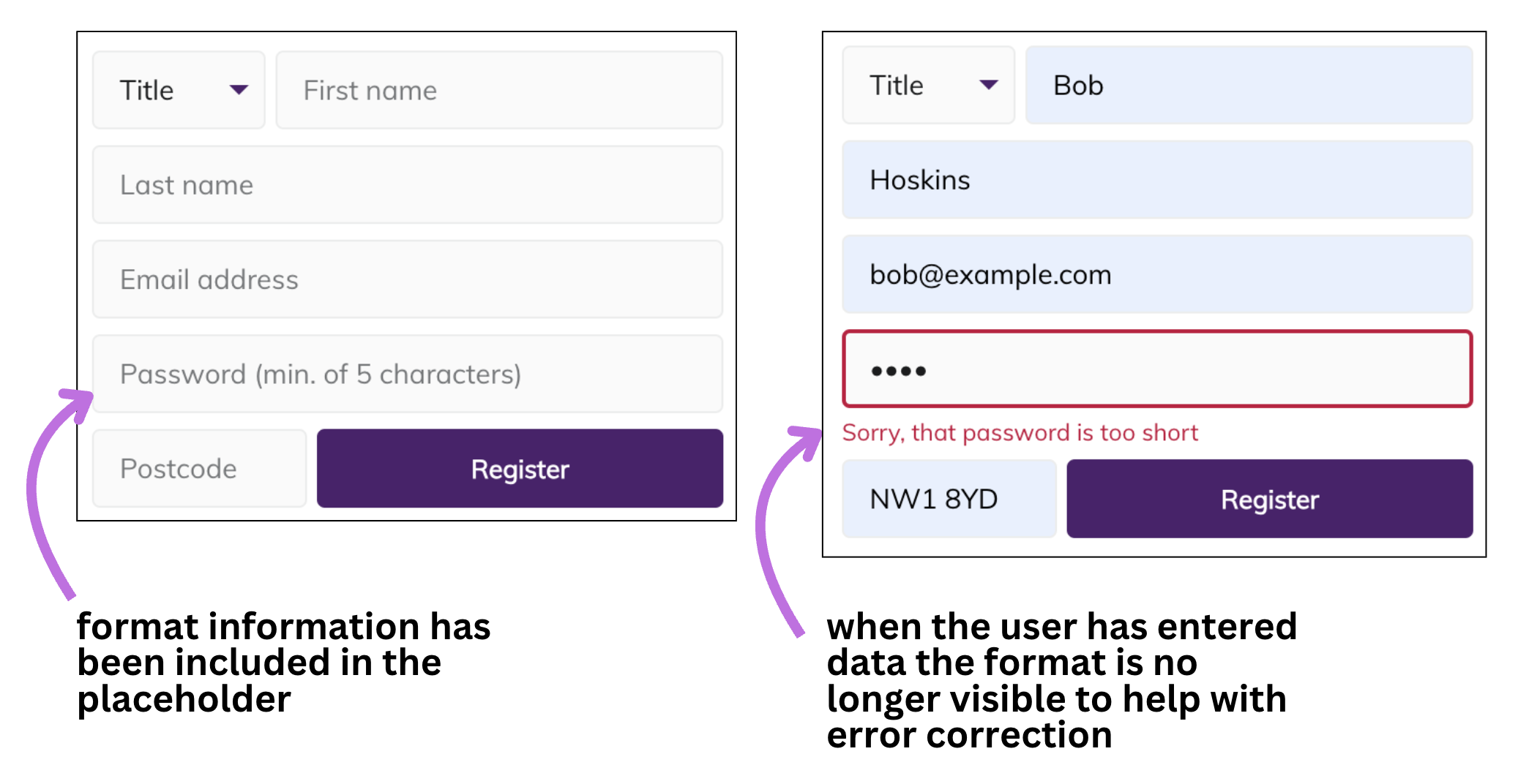
Placeholders
Placeholders are faint copy inside an input and are set using the placeholder attribute. The intent was for them to provide format information. We will see how even this is problematic but their use has been stretched beyond this to include providing labelling.
Placeholders as labels
If no other accessible name is provided they can offer an “accessible name of last resort”, but are far from an ideal way of providing one.
It can be tempting, especially when struggling for space or when wanting to “de-clutter” an interface to use a placeholder instead of a label. However using placeholders instead of a label has accessibility knock-on effects.
Increasing font size can lead to placeholder copy being cut off. This can also be an issue where the page is translated into different languages and the content becomes longer than the original.
Once the user starts typing, the placeholder (which remember is taking the functionality of the label), disappears. This can be especially an issue when the browser autofills fields incorrectly.
When you remove a visual label you are also removing the ability of the user to verify that they have added their data in the right place. You are essentially preventing the user from checking their answers before they submit the form.
Any format information has to be included in the placeholder, so we are unlikely to be able to provide a meaningful hint. Remember we need to be careful of increased font sizes and translations.
Placeholder contrast is normally low in order to prevent it being registered as actual data entry. However this also means that it often falls below the required contrast ratio so can be difficult to read.
“We'll just increase the contrast so people can read the placeholder then” you might say. When contrast is increased the placeholder copy can sometimes make it look like the input has already been filled in which can lead to more confusion.
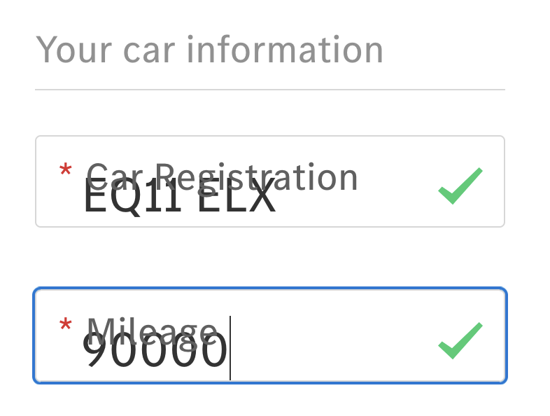
Some of the examples above use what is known as the “floating label pattern”. This is where the label sits over the input (so it looks like a placeholder) and then is animated to sit above the input once the user places focus in the field. This is better than just using the placeholder as a label, but issues remain:
- the label has to take on many characteristics of the placeholder (for example low contrast) to avoid looking like the input has been pre-filled
- the label text ends up being overly small to avoid an odd layout shift when it is placed above the field as the inputs are typically closer together
If the labels are going to float, why not just have them in that position in the first place?
Placeholders for format information
Even using placeholders for format information (what we will call hint copy) is problematic. Many of the reasons outlined above also apply, such as contrast issues.
Just as with labels, by removing the format information as the user starts typing you are preventing the user from checking their answer is correct before submitting the form. It also means you will need to be more verbose with any error messaging to make up for that loss of reference.
Repetition
What often happens is placeholder information is added without considering the other options. With some thoughtful reworking we can remove the need for placeholders entirely.
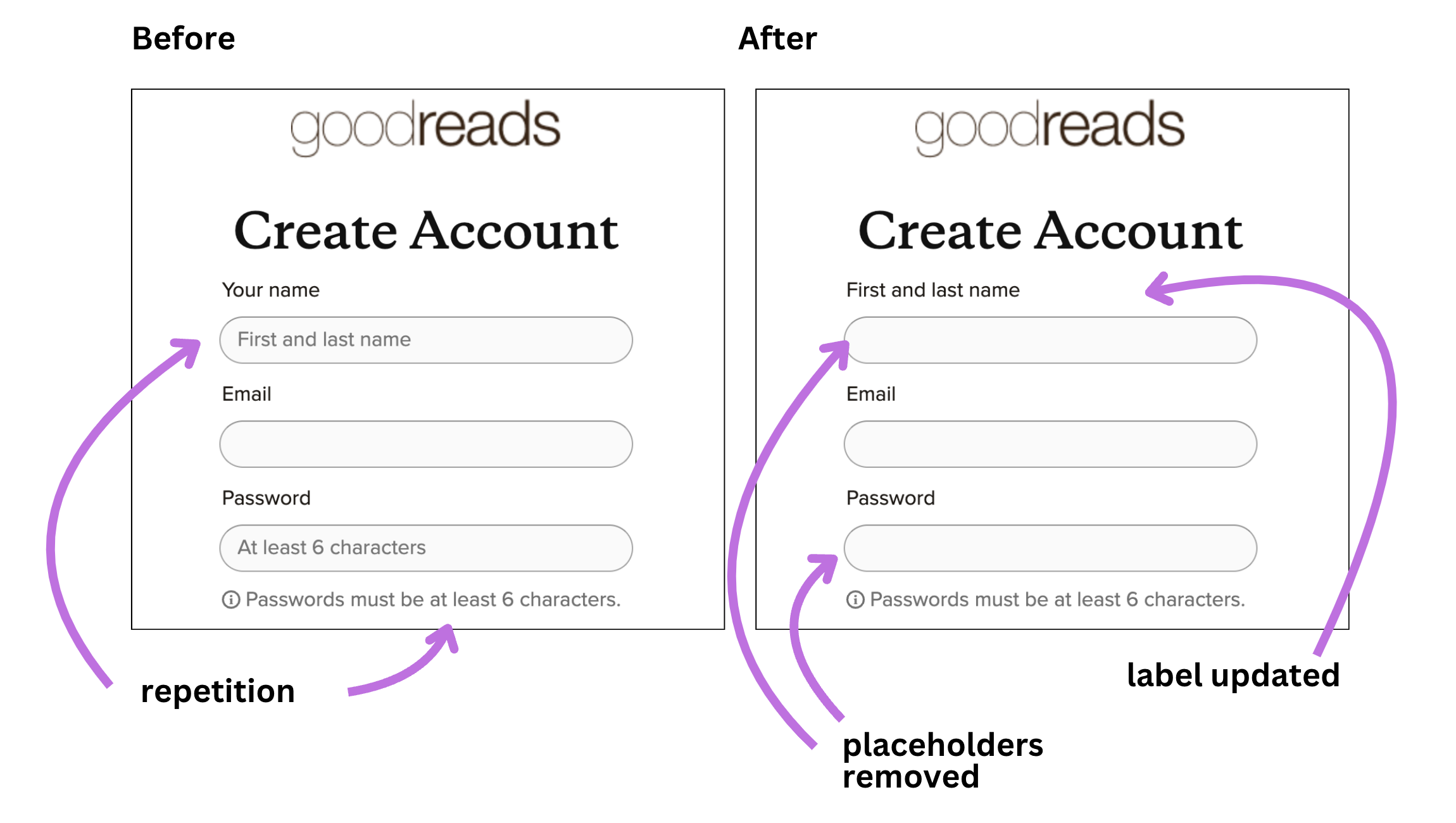
Placeholder wrap-up
Any situation where you end up removing visual information just as the user starts interacting sounds like a terrible idea. But this is exactly what we are doing with placeholders, however they are used. And if the removal of that information does not impact the user then you need to consider if it was really earning its spot on the page in the first place.
This is a great write-up of some of the issues with placeholders.
In short, avoid placeholders entirely. Instead use well-sized labels and leave format information or examples to separate hint copy.
Hints
We don't want to overload a label with too much information. However we still want users to understand if there are particular format requirements or help them understand waht they are being asked to enter a little better. The aim of the hint is to reduce cognitive load and prevent errors.
Good examples of a hint might be:
“For example GB123456”
when asking for some sort of reference number, or
“You do not need to include any middle names”
when asking for someone's name.
Because we do not want to include the hint in the label tag (labels should be short), we need to programmatically tie it to the input somehow so it will be noticed by screen-readers. The way we do this is by using ARIA.
Here is an example of this in practice:
<label for="yourname">
    What is your name?
</label>
<div id="name--hint">
    You do not need to include any middle names.
</div>
<input
    type="text"
    id="yourname"
    name="name"
    aria-describedby="name--hint"
    autocomplete="name" />
Here we have given the hint an id attribute which we then use in an aria-describedby attribute on the input itself.
The hint is now assigned as the “accessible description” for the input. Accessible descriptions are read out by screen-readers after the accessible name and a slight pause:
“What is your name?, edit text [pause] You do not need to include any middle names”
One thing to be aware of is that content which is announced using aria-describedby is stripped of all semantics. So it is best to keep this content as plain text.
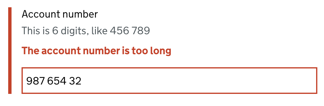
For example, avoid adding a link to a hint such as below:
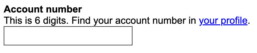
When a screen-reader lands on the input the hint will be read out as:
“This is 6 digits. Find your account number in your profile”
We can see immediately that the link is not announced, so the user is likely to miss that there is a handy link there.
Similarly some screen-readers (MacOS VoiceOver) will stop announcing aria-describedby copy when it encounters markup such as lists, so it is best to keep hint copy simple.
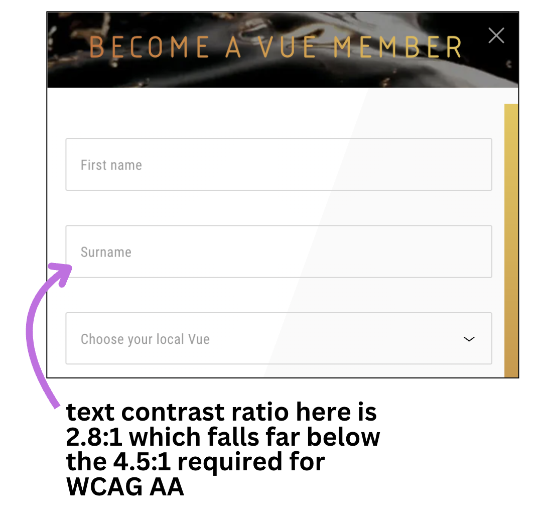
One final thing to be wary of with hints is colour contrast. It is often desirable to make the hints visually distinct from the adjacent labels. It can be tempting to reduced the contrast a little to achieve this. But be aware that all copy needs to be of sufficient contrast for all users to see it (at least 4.5:1 but in practice above this).
Errors
If the data the user submits does generate an error we need to tell the user three things:
- that there was an issue with their submission
- which field had the problem
- how they can fix the issue
Tell the user there was an issue
What a user is going to expect when they hit submit on a form is that they will get some sort of “success” message. So when they don't and instead find they are still where they were, we need to tell them why as soon as possible to prevent confusion.
This means we also need to think about managing the user's focus. If we don't manage focus, the user is going to be dropped back at the top of the page (assuming a page refresh happened) or stay on the submit button (with a javascript handled form). This can mean the user does not realise there was an error as the form and error message may be off-screen. Keyboard and screen-reader users would also need to navigate back down to the form.
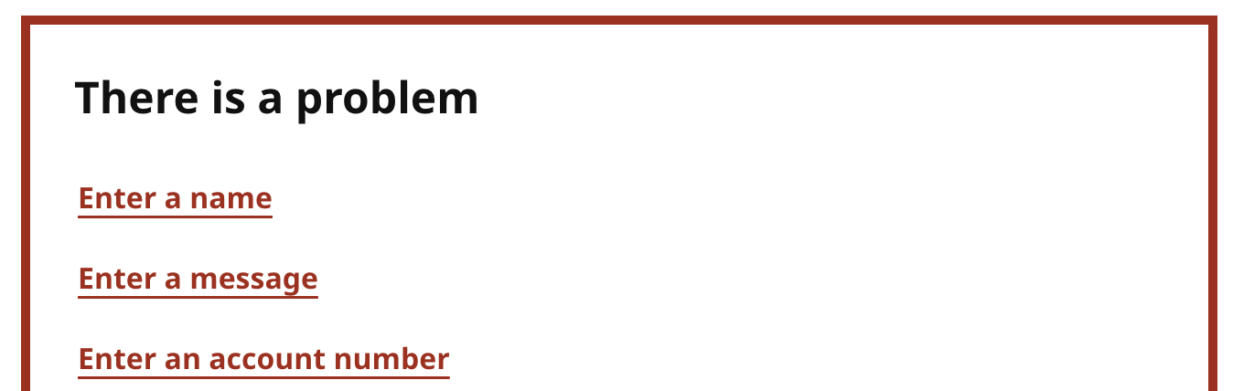
If we are dealing with a multi-field form it can be best to present an error summary at the top of the page where it will be very visible when the page loads and we can also place focus on this. But if it is just a single field then placing focus on the field may be sufficient.
An error summary is a section above the form which lists all of the errors. This can be helpful as it makes it very obvious that something has gone wrong and we can even tell the user that in the error summary heading. The errors listed in the summary should be the same content and in the same order as those in the form it relates to. Ideally the errors in the summary should link to the field they relate to, enabling the user to quickly jump to the field to fix it.
It can also be helpful to add the word “Error” in front of the page title (in the tab bar) as this will mean a screen-reader user will hear that when accessing the page. This can be helpful if either the user switched tabs by mistake or moving focus failed.
Which field had the issue
We also want to make it clear which field or fields had the issue. We do this by displaying an error message next to the field (even if we are showing an error summary) and also adding some sort of visual treatment to make it easy to see the problem fields. The visual treatment should ideally be not just a colour change.
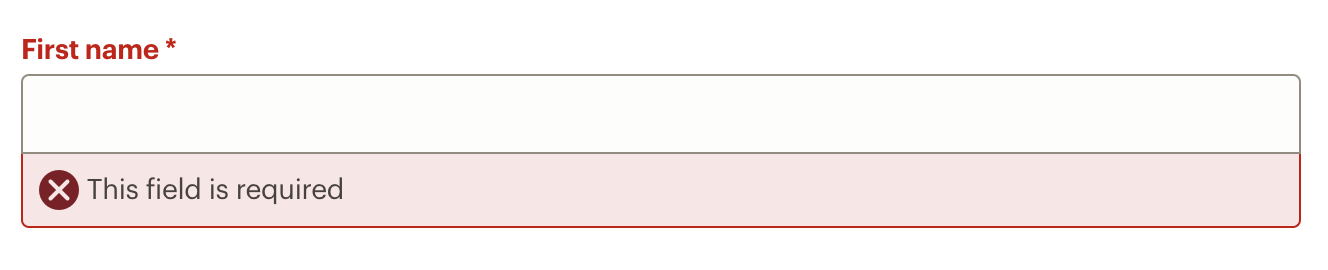
It is also important that the error message remains visible until the user submits the form again. This allows the user to refer to the error for help on fixing the issue.
The error message should be associated programmatically with the field just like we did with the hint, using aria-describedby. If we are also showing a hint for the field then the ids of the hint and error should be added to the aria-describedby in the order they appear on the screen so they are announced in the same order.
How they can fix the issue
Whilst just adding a message like “Invalid” next to a field may tell the user there is an error, it doesn't tell them how to fix it. Our error message should give the user specific information on how they can fix the issue they have.
We also want to make sure we are replaying the data they entered in the field when we show them the error. This means the user can see what in that field caused the error they are now seeing and helps them edit the answer to fix it.
If we don't do this it makes it more difficult to understand the error (as they may have just mis-typed something and be unaware they did) and it allows them to edit it to fix it.
Grouping inputs
For checkboxes and radio buttons which are in a set of options such as below, it is important to provide screen-readers with some way of understanding that they are part of a group beyond the shared name attribute.
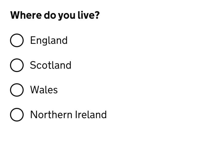
We can do this by using a fieldset and legend. As checkboxes and radio buttons have labels which indicate the value of each option we typically want to have some sort of question or name for the group.
The fieldset provides this grouping mechanism (if you are curious this actually has an ARIA role of group). The legend needs to be the first element inside the fieldset and this provides the accessible name for the group. Without the accessible name the group will not be announced.
<fieldset>
    <legend>Where do you live?</legend>

    <input type="radio" value="eng" id="eng" name="country" />
    <label for="eng">England</label>

    <input type="radio" value="scot" id="scot" name="country" />
    <label for="scot">Scotland</label>

    <input type="radio" value="wales" id="wales" name="country" />
    <label for="wales">Wales</label>

    <input type="radio" value="nire" id="nire" name="country" />
    <label for="nire">Northern Ireland</label>
</fieldset>
The fieldset also means we have a nice grouping which allows us to assign an error message or hint to the contained fields as a set which is necessary as we will be validating these fields as a set.
We can assign a hint and / or error by using aria-describedby on the fieldset:
<fieldset aria-describedby="country--hint country--error">
    <legend>Where do you live?</legend>
    <div id="country--hint">This is your main residence.</div>
    <div id="country--error">Error: select where you live.</div>
    ...
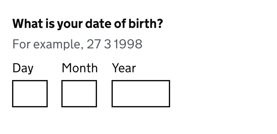
Beyond checkboxes and radio buttons, fieldsets can also be useful if you are asking similar questions on the same page. Having the legend allows the fields to be named the same, but the legend and fieldset provide the differentiation - for example asking for shipping and billing addresses.
They can also be used to group other inputs which need to be seen by the user as related - for example a date group consisting of three text inputs for day, month and year.
What we don't want to do is apply fieldsets where we don't need them. This is because screen-readers will announce the fieldset as a “group” with the legend as the accessible name. We only want to be providing information like this where it will be useful, this keeps noise to a minimum.
Assistance
Validation
HTML5 Validation
We need to talk about HTML5 validation at this point. When you use certain attributes such as required, maxlength and pattern, or certain input type attributes like email, this triggers HTML5 validation (also known as native browser validation or constraint validation). This is not very good from a usability or accessibility point-of-view - for example the messsages do not persist, have issues with zoom and the user only gets one error message at a time.
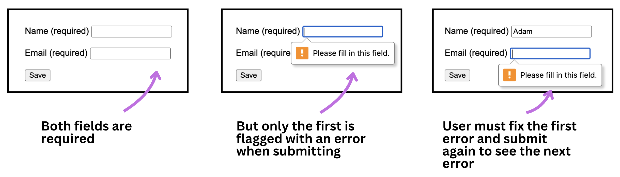
Whilst it can be improved, it is a lot of work and just adds complexity. The recommendation is to disable HTML5 validation and handle error messages ourselves. Adding a novalidate attribute to our form tag will prevent this validation from ever appearing.
<form action="/" method="post" novalidate>
Dynamic error handling
Dynamic error handling, also referred to as client-side validation, is where fields are checked to see if the data is valid using javascript. This is best done when the user submits the form, rather than firing off errors whenever a user enters invalid data (what we will call inline validation).
The issue with inline validation is - when do you tell the user?
Often you will see websites trigger an error message as soon as you place your cursor in the field and it only clears when a valid entry is added. This is clearly problematic and not desirable.
How about validating after each character or word? Well consider how this might sound to a screen-reader user who is trying to check that they pressed the correct key. Each validation check would trigger an announcement which could prevent them from hearing information they need to fill in the field. Remember we
So how about validating when the user exits the field? The problem here is that the user has most likely moved to another field and will be on that field when the validation announcement is played. At best it is going to distract them from their current task of filling in the field, at worst depending on the error message they could think the error relates to the field they are on right now.
So validation is best left to when the user expects it - on form submission.
Be forgiving
We should also think about the validation we are carrying out. Our aim is to prevent the user from seeing any error messages. The best way we can do this is by using helpful labels and hints with examples of the data expected so the user is more confident about their submission. But where there is some format required it might be that by being just a little bit forgiving with our validation we can avoid the error in the first place.
Let's look at a couple of examples.
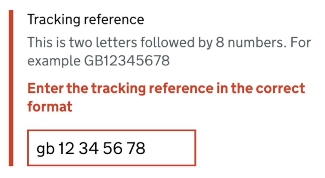
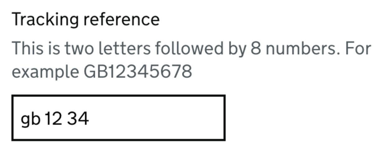
Here we have a tracking ID field which is asking for a 2-letter prefix followed by 8 digits. We have a hint with the format in to help the user. However this does not mean we have to be really strict with what we will validate. We can see the user has input lowercase letters (well we didn't say about it being case-sensitive) and the numbers have spaces every couple of digits.
There are a few reasons why a user may enter the reference in this way, for example:
- simply not understanding the format is strict with casing and spaces
- when using speech-recognition or by using the voice-entry option on a mobile virtual keyboard. As the user reads out the reference, each time they take a breath the software will add a space, especially if the user groups numbers. For example the user may enter this by saying “gee bee twelve thirty-four fifty-six seventy-eight”.
- users with low numeracy or dyscalculia may prefer to enter numbers with spaces to aid reading
- users with poor motor skills may have difficulty changing case
- screen-reader users will hear the hint but may not pick up on the casing
- by copying and pasting from elsewhere - this can also introduce leading or trailing spaces
Instead of failing this on validation we can be a bit smarter - and more helpful to the user. We can simply uppercase and strip out spaces from the user's entry and transform this into our desired format. We can see what they mean and are not changing any of the actual meaning of the data. But we will prevent the user from seeing an error.
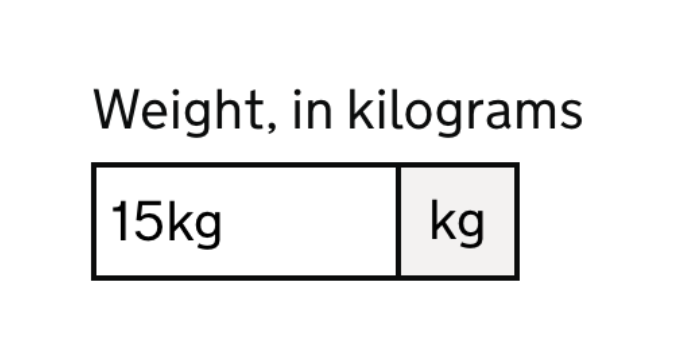
In the next example (below) we have a field with a unit of measurement as part of it. The unit is displayed visually but it is hidden from assistive technology, instead the unit is mentioned in the label. However as screen-reader users cannot see the unit placed after the input, suggesting that the user does not need to add it, we should allow the unit as part of the entry and strip it out. Care should be taken to allow different versions of the unit which users may enter, such as different casing.
The only place you may not be able to be as forgiving is if the data is case-sensitive or where spaces have meaning. But where possible we should be avoiding this being a requirement in content like reference numbers. By thinking about accessibility from the start we can look to design out stumbling blocks like this before the user is affected. This both helps speed up form completion and means less errors are seen which then reduces the overall cognitive load of the form.
Optional or required
It can be helpful to indicate in the label if the field is optional or not, the actual implementation will depend on your use-case. One thing to bear in mind is that the required attribute is to trigger HTML5 validation and prevent submission of empty fields. As we want to avoid HTML5 validation this is something we also want to avoid.
There is an aria-required attribute which purely signals to assistive technology that the field is required, but does not do anything beyond that - so does not trigger validation but also does not tell any other user that the field is required. Also bear in mind that if all your fields are required, having this attribute announced on every field can become intrusive for screen-reader users.
A better option is sometimes to just indicate the optional (or required) field status within the label. This way everyone gets the information.
Avoid select inputs
Whilst select inputs can offer an easy way to display a lot of potential answers, it has been shown that using them presents challenges to some users. This can be problems in trying to recognise which answer should be chosen (especially if the list is long), or difficulty in scrolling or picking from the list.
A better solution might be using a set of radio options, using a type-ahead or even reworking the design to avoid the need for the select input.
Avoid disabled buttons or inputs
A not-uncommon pattern is to disable a submit button until all fields in a form are filled in or valid. Disabling controls (inputs and buttons) is an issue for users for several reasons:
- to distinguish from non-disabled controls they often have reduced contrast making them difficult to read
- users may not understand why a control is disabled and become frustrated
- disabled controls are not included in the native tab order for keyboards
Disabled buttons
The last point brings us onto another variation of this pattern which is hiding a button until certain prerequisites are fulfilled. Whether hiding or disabling the submit button, the user may not understand how they can proceed - they may not realise they have missed one of the requirements.
Instead keep it simple - present the button and allow the user to submit the page. Then explain why they cannot continue. If it is an issue with a field on the current page then display an error as normal. If it is more complex such as a section has not been completed then take the user to an explainer page where the issue can be detailed and the user directed where to go to fix it.
Here is an example of a button being disabled until inputs have been filled:
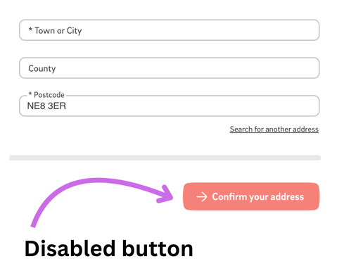
The issue here is the user may be trying to click the button but nothing happens - and no error message is shown. It is not clear that the button is in fact disabled. This means the page is asking the user to problem-solve why they cannot submit the form. The user may work it out or they may abandon the task.
A better solution would be to allow the user to submit the form and then provide error messaging for the missing field information. This requires more work and thought from the team, but will result in a better outcome for the user and likely less abandoned forms.
Disabled inputs
Similarly disabled inputs can be an issue. The contrast has to change to indicate the difference to normal inputs, but this is either so slight as to be hardly percievable (causing users to click on the input thinking it is an active input) or so different as to make the text in the input unreadable. They are also not included in the natural tab order.
Avoid read-only inputs
As with disabled controls, read-only inputs tend to cause confusion. Whereas a disabled control is removed from the tab order, a read-only one remains in place but cannot be edited. This duality can be confusing, especially as the read-only state is not visually communicated.
This is often done to save development time - it is easier to just switch out the readonly attribute than do the work needed to use static text instead and the potential styling and routing for edit option requirements. But by doing this work we can make a more understandable interface.
Instead make it clear what the user is looking at and how to proceed. If the data is not in an editable state then display it as text and have an “edit” button alongside if needed. This way the user can see what they can edit.
Showing the correct keyboard
Most of the time when entering data in a field on a touch-screen device you will be using the standard virtual keyboard which shows the QWERTY key layout.
But sometimes we might want to alter which keyboard is shown. For example if the user is entering a phone number then having to switch to the number keyboard will take time and effort and even then it may not be easy to use.
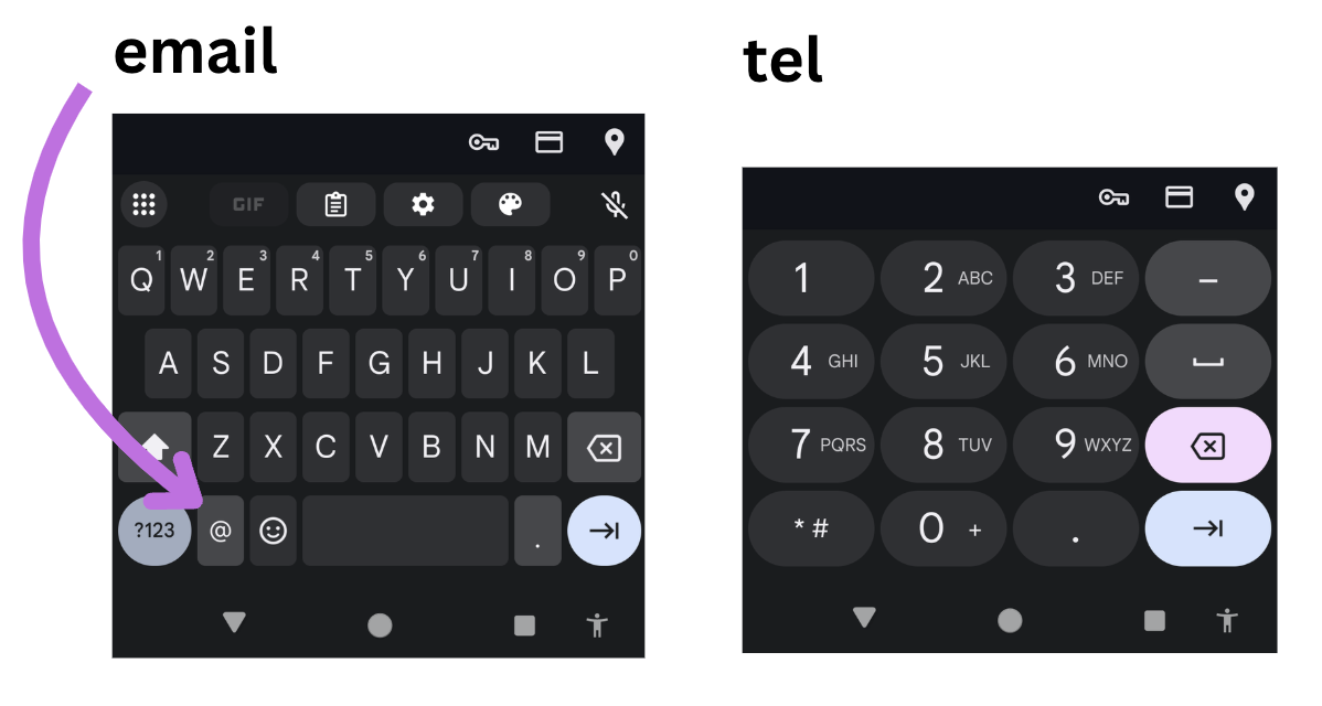
For this reason we are able to give the user's device hints as to which keyboard should be shown for a given input. For example for a field asking for an email address we can present a specific virtual keyboard which includes email-specific keys such as @. This saves the user having to switch keyboards part-way through their entry to find that symbol.
We can do this by using either specific type values (which have an implicit inputmode) or by using the inputmode attribute directly. Some of the more useful inputmode values:
inputmode="tel"(ortype="tel") will present a phone keypad making it much easier to add a phone numberinputmode="email"(ortype="email") will add specific email address characters like @ and .inputmode="numeric"will display numbers but should only be used for whole numbers as the keyboard may not include a decimal point
Things to avoid with inputmode and type attributes
The actual keyboards presented will depend on the operating system so it best to conduct testing if exploring other options.
There is an issue with some system's handling of inputmode="decimal". Whilst this should display a number keyboard (as numeric does) but with the addition of a decimal and/or comma, some systems omit to include the decimal. As such it is best to avoid this value or do comprehensive testing.
Be aware that the type="numeric" should be avoided. This has also had a troublesome past with some browsers allowing the user to enter non-numeric values but then stripping them out of the data actually sent to the server. It even caused issues with numbers entered with decimal points as they aren't whole numbers. Instead stick to the inputmode="numeric" attribute to provide assistance without the validation issues.
Helping browsers autofill inputs
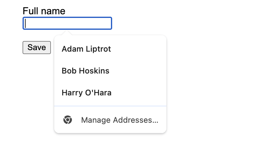
It can be annoying to have to keep typing your name, contact information and payment information into forms all the time. Browsers can now store this data for you and when they see a form which is asking for it prompt you to autofill it from this stored data.
This can be very useful for people who have cognitive conditions which affect their memory for example or those who find typing difficult or tiring. Whilst browsers can try to work out which fields to suggest autofilling they can sometimes get it wrong. This can end up with the browser not prompting the user, leaving some fields blank or in some cases adding the data to the wrong field. As such it is always best to help the browser out by telling it what data (if it has it) it should add to which field.
This is done by using an autocomplete attribute with a set value. For example here is how we would mark up a field which is asking for someone's full name:
<label for="fullname">Full name</label>
<input type="text" id="fullname" name="fullname" autocomplete="name" />
This has some obvious benefits:
- reduced typing for the user
- allows the user to use recognition rather than recall
- avoids introduction of spelling mistakes
- speeds up form filling, especially for addresses
Note we should normally only add autocomplete attributes to fields where we are asking for data which we can anticipate they have the data for. This is normally their own personal data. So if the above field was asking for someone else's name we would not add the attribute.
For some data we can add more than one value to be specific, such as here where we are asking for the person's work phone number (as distinct from their home phone):
<label for="phone">What is your work phone number?</label>
<input type="tel" id="phone" name="phone" autocomplete="work tel" />
Focus indicators
Just as with other controls, form inputs and buttons should have very visible focus indicators. For text inputs, strictly speaking the cursor flashing is counted as enough of a focus indicator to pass WCAG compliance, but some users may modify their cursor not to flash and besides we want to go way beyond just compliance.
Ensure that at least some of your error styles are not obscured when the field is focussed.
Whilst browser default styling is enough to pass compliance for radio button and checkbox indicators, in reality they are very poor. So we would want to also provide good focus indicators to the non-text inputs too.
Providing custom focus indicators for form controls can really help users find their place in the heavily interactive landscape of a form. Be careful not to cause additional accessibility issues when adding styling.
Do not disable copy & paste
Sometimes there is a requirement to disable copy & paste in a form. Requirements like this should be scrutinised to see if a different approach could be used instead. Removing the user's ability to copy & paste is going to disadvantage users who may rely on this - for example speech-recognition users often work within a sandbox area to generate responses which they copy & paste into a field.
Look for alternatives. For example, you are asking for an email address twice to prevent errors and are disabling copy & paste to force the user to type it in twice. Instead add an autocomplete attribute to an email field potentially avoids the user typing at all, and then you could replay the entered email before submission, or send a confirmation email.
Avoid using maxlength
The maxlength attribute is often used when asking for data which we expect to be a certain length and no more. For example reference numbers or dates. The issue with this is that users are not told when the limit is reached, often browsers will just stop responding to data entry. Even if we tell the user in a hint how many characters the answer should be it can still cause issues.
We have already discussed not disabling copy & pasting. Users may need to paste in a larger answer before editing it down. Similarly for longer answers (such as in a textarea) it is best to allow the user to go beyond the allowed limit within the field to finish a train of thought and then they can reduce their answer by editing it down.
We have also seen how speech-recognition can add spaces to data entry and how we should be forgiving of this in our validation. If we physically restrict the data length we can end up with some very unsatisfactrory outcomes.
The best approach is to let the user know of the required format but allow them to exceed it in their submission and if necessary display an error message to allow them to edit their answer down to the correct length.
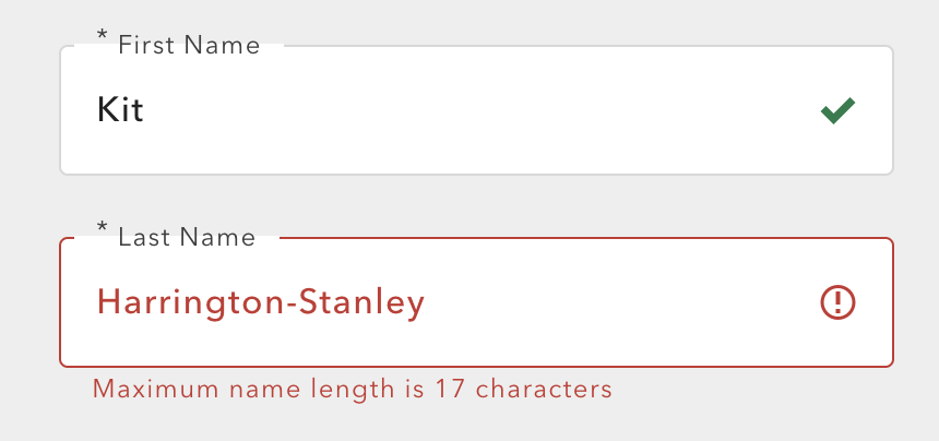
Something to bear in mind with this example is that the user was not notified of the restriction ahead of entering their information. It is always a good idea to make the user aware of format requirements so they can adjust their answer accordingly and avoid the error in the first place. In this case the limit is really too restrictive for the required data and we'd want to set a limit which the user would be very unlikely to hit (such as 50 characters) - if we did this we would not need to make the user aware as no-one should hit the limit.
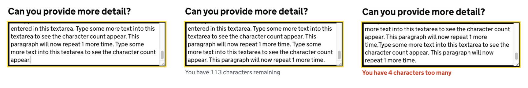
For larger blocks of text where the user is being asked to submit several sentences of copy, we can look at using dynamic messaging. This can indicate how many characters they have left and even more usefully how many they are over the limit by. This can make use of an aria-live region to ensure screen-reader users are updated too.
Size fields to expected data
For visual users it can be a help to size text fields to give an indication of the amount of data required. For example the field for a post code should be shorter than that for an email address.
Having a field which is too large or too small can make the user wonder if they are entering the correct data. A field which is too small can also make it difficult to read the content and even more difficult to edit it confidently. Always ensure the field is large enough to accomodate the longest answer you might expect.
Review before submission
It is good practice to allow users to review the data they have entered before they finally submit it, particualry if there are more than a few questions. This should also provide an opportunity for them to change any of their answers. This is especially important when the thing the user is submitting is to do with official documents - such as a government application, legal or financial processes.
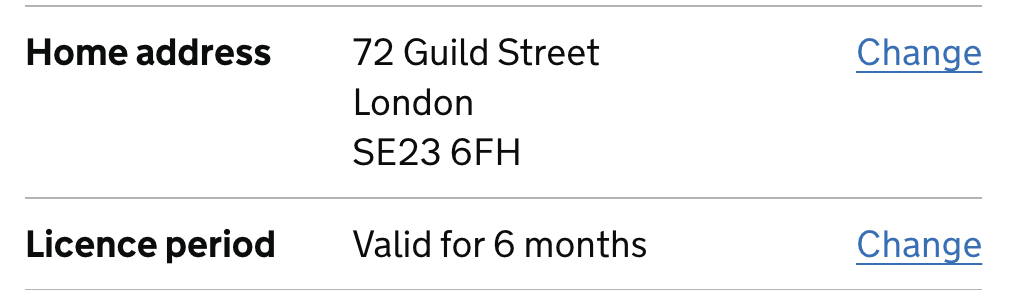
When a user goes to edit one of their responses we should where possible take them to the same page where they entered the data, with their data pre-populated. This should provide the same labels, hints and guidance material they had first time around as well as letting them re-read their answer and edit it if needed. By replaying their answer we allow them to simply correct a spelling issue without having to re-enter the whole thing.
Once the user has finished editing their answer we should return them directly back to the review screen - not require them to resubmit each subsequent page after the one they just edited. There may be some additional work involved if the form included branching questions to clean up redundant answers or present additional questions where necessary, but the user should be returned to the review screen as soon as possible.
Wrap-up
Forms are a complex thing and offer many places where we can inadvertently place barriers in the way of users accomplishing the task they are set on.
By considering how we can reduce the friction users have with forms we can make this potentially stressful part of digital interaction less daunting.