Contents
- Contents
- Introduction
- Custom styles
- Page zoom
- Screen-magnifiers
- Font-size increase
- Hardware assistance
- Switch controllers
- Eye-tracking
- Text-to-speech
- Screen-readers
- Speech-recognition
- Windows High Contrast
- User preferences
- Wrap up
Introduction
It can be very easy to fall into the trap of only considering the type of browsing and input methods which we ourselves use every day. For many in digital teams this is heavily mouse-oriented, but not thinking about how others may interact with our products can lead to unintentionally excluding users.
Whilst we will be exploring screen-readers and speech-recognition, there are a lot of different adaptations users might use and which we need to consider when building accessible interfaces.
The economics of assistive technology
Before we look at specific assistive technology we should take a moment to look at how disabilities can affect the performance of some technology.
Users with disabilities are more likely to have a lower disposable income than those without. This can have a knock-on effect in the age of hardware or software being used due to the costs involved in keeping them up-to-date. On top of this is the concern that any software update - either to the operating system, the standard software or the assistive software - will render the computer unworkable or mean time having to trouble-shoot or relearn interfaces.
For this reason it may be that the user of some of the following may not be using the latest version of the technology stack. This along with the additional processing overheads of running assistive technology can mean poor performance metrics for websites can have a greater impact on these end-users.
Do not assume conditions based on tools
When looking at supporting particular assistive technology it can be helpful to concentrate on the tool first. These tools are used by a myriad of users for many different conditions so do not assume that a particular tool is only used by one group or that one group only uses one tool. Users are just as likely to jump between tools based on their current needs.
For example a user with low vision may use a screen-magnifier but switch to a screen-reader when they become tired. Users may also have multiple conditions and use a selection of tools in concert.
Design for no tools
Something else to bear in mind is that not all users who would benefit from assistive technology may be using it. They may not be aware of the existence of the different options, or they may not be confident enough to install and use it, or they may just not consider themselves as needing it. We should build our interfaces to as much as possible be accessible without users having to rely on tools to make it so.
Custom styles
When we design a page we are making a lot of assumptions about our user, but it is also not possible to produce a design which accomodates all users to the extent that might be optimal for them.
Whilst this should not stop us designing as accessible a page as possible from the start, we need to be aware that some users may need to go beyond what we provide and we should not prevent them from adapting our design themselves.
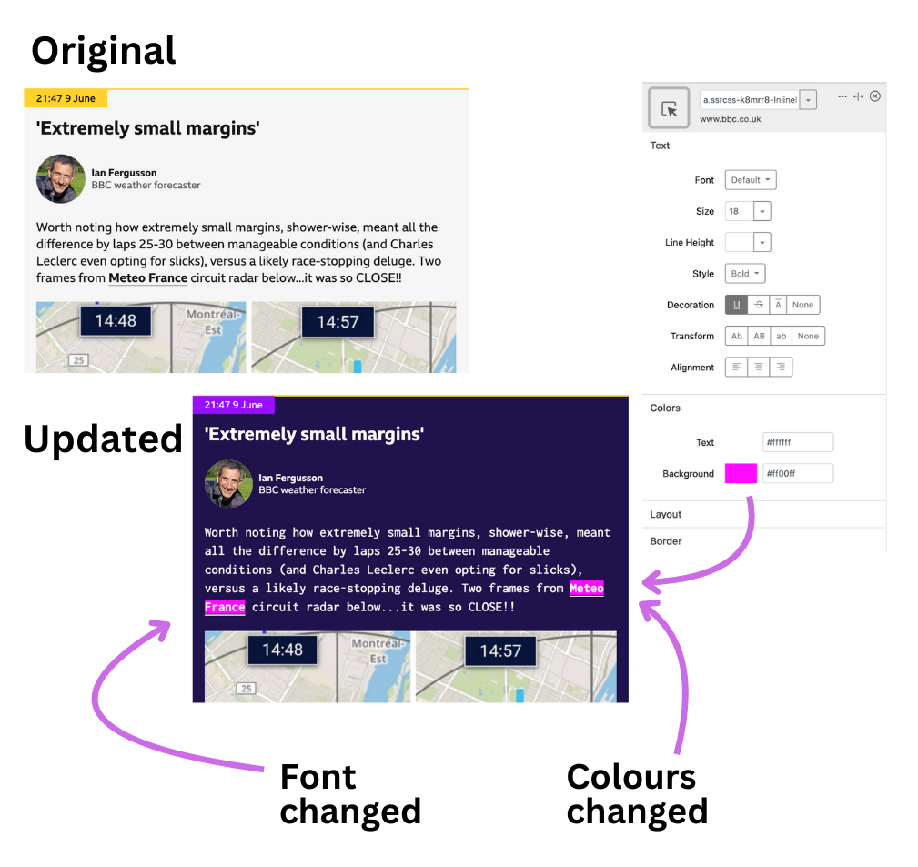
The most common way a user may adapt our page styles is through use of a custom style plugin for their browser. This will allow them to change various elements of the page.
Something to be aware of here is that the more specific our styles are (for example styles set on the element itself, rather than using the css cascade), the more styles the user then has to override with their own and the harder it will be for them to adapt your site.
Page zoom
This is something which all desktop browsers have available to them. These allow the entire page to be zoomed up to around 500% in increments.
Something to note here is that this will typically trigger a mobile viewport style, so even if you are not expecting mobile users you still need to develop and robustly test a mobile-friendly style. These users will be using keyboard on that view rather than their fingers as they would on an actual mobile, so we need to test that mobile view with keyboards too.
As some users may require a higher level of zoom than this allows, they may prefer an alternate method or combine this with another.
Screen-magnifiers
This is a piece of software which might be either built into the operating system or installed and which acts as a magnifying glass on the screen. These can take various forms:
- full-screen - the entire screen is zoomed
- split-screen - half the screen is retained at standard zoom and half shows the zoomed view. This can help users with orientation on a page.
- picture-in-picture - essentially a digital magnifying glass shows a small section zoomed
They can be set to different levels of magnification suited to the user and the user can adjust the magnification to suit different situations.
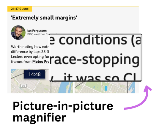
The main thing to be aware of with this type of magnification is that the user has a much reduced view of the wider page - it could be as small as a few words across. This can then impact on the understanding of how elements visually relate to each other but also on cause-and-effect interactions.
For example when a user clicks on a button and something happens at the top of the page, someone using a screen-magnifier might not see this - to avoid this we should look to closely locate triggers and the things they trigger so the effect is easier to understand.
Font-size increase
Browsers also have the option to just increase the size of the text. This tends to be hidden in the browser settings menus (except for Safari on iOS) but generally allows text to be increased up to 200%.
This is useful because it preserves the layout of the page (it doesn't switch to a different viewport layout like page zoom does) and be a better user experience because of this. However because it is not something which is tested during development we tend to see broken layouts when this is employed.
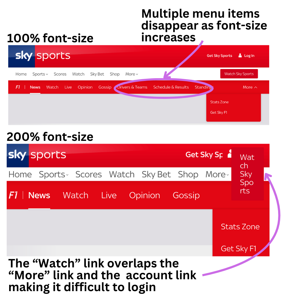
Container heights set in absolute (rather than font-size-relative) units mean they don't scale along with the font. This means text either gets cut-off or overlays other content.
Hardware assistance
Outside of software assistance, some users may also use hardware to assist them. An example of this is a keyboard overlay to help a user with mobility issues to only trigger the key they want and not inadvertantly trigger neighbouring keys.
These type of adaptations may not directly impact how the user interacts, but is worth keeping in mind as it can illustrate the difficulty some users may have in just typing. This is why we should try and help users reduce the amount of typing they need to do, either in the design of the page or in being forgiving of data submitted in form fields.
As some users may also require their mobile to be held in a cradle it might be that they are unable to change orientation. So we should also make sure we are not forcing any particular orientation to view our sites.
Switch controllers
This is a group of hardware and software tools which allow users who have limited mobility to interact with a screen using just a single click at a time with no mouse. They consist of one or two physical switches mapped to specialist software. Mac OS has switch support built in.
The switch software moves through the options available and the user activates the switch when the desired one is highlighted.
For data input the user will use a virtual keyboard, first selecting the line of keys the desired character sits in, then the second switch trigger will select the key on that row.
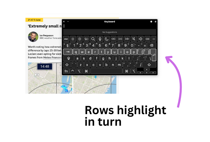
For on-screen navigation the user will trigger first a vertical line moving across the screen, stopping it when it is over the target. Then a horizontal line moves across the screen and again the user will action the switch to create a cross-hairs where the two intersect.
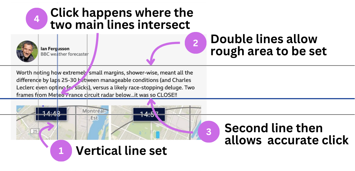
As you can see, using a switch will greatly slow down a user compared to a mouse user, and entering text can be time-consuming. We should also look to ensure there is adequate space between controls to avoid mis-clicks.
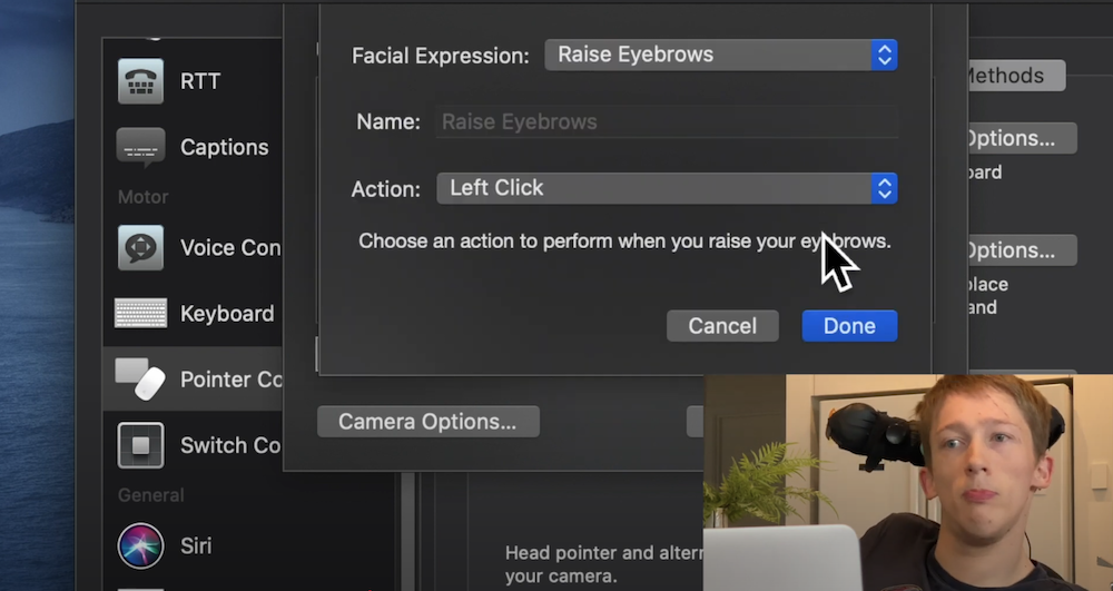
Head pointer
This was addd to Mac OS and makes it easier for those who might otherwise use a Switch device. It allows head movement to be mapped using a webcam and to control a mouse pointer's movements. Using alternative pointer options also allows commands such as clicks, key-presses and shortcuts to be added using facial expressions.
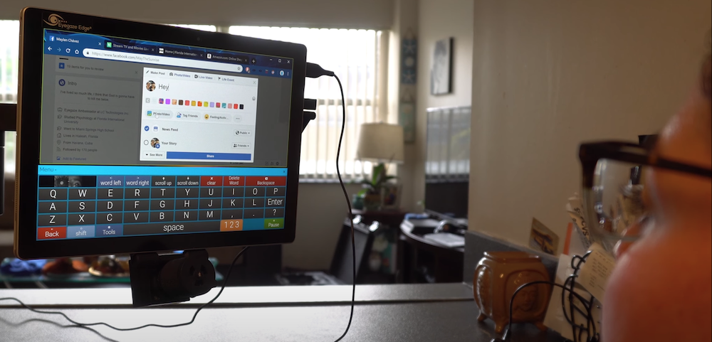
Eye-tracking
Eye-tracking software translates the user's gaze (tracked using a camera and LED targeted at the user's eye) to mouse clicks or gestures. Like switch devices it allows users who find it tiring, difficult or impossible to use a mouse to interact with sites.
As with switch users, although eye-tracking software may also include zoom options to increase accuracy, we should look to provide margin for error in making sure our controls are both large enough and well spaced. Eye-tracking also uses on-screen keyboards to allow users to enter data.
Eye-tracking also has similarities with other assistive technology such as screen-readers and speech-recognition in that they are code-aware - such as being able to identify links on a page. For this reason it is important to use the correct elements when marking up the page.
One other consideration is that the user is having to use their eye movement for all mouse movement and keyboard entry, so their time looking at the screen is increased, so fatigue can become an issue. Help these users by avoiding overly bright content and distracting animations which pull their gaze away from their task.
Text-to-speech
This is software which reads out the content on the page. There are lots of different versions as well as some which are part of the operating system or browsers.
These are helpful for some low vision users, but can also help with cognitive conditions, such as dyslexia and other reading difficulties, and those who find reading tiring.
Most will provide reading aides as well - for example MS Edge browser's Read Aloud will highlight the line and each word as it is read out.
Unlike screen-readers, they do not expose accessibility information or hidden copy, purely reading the visible content. They do not announce if the copy is a link for example and will not read out image alt text.
Well structured content where sentence length is not allowed to become too long can help users take in spoken information easier. A similarity with full screen-reader software is that ensuring the language of the page is set correctly will allow the software to load the correct voice engine to provide accurate pronunciation.
Screen-readers
Screen-readers are software which produces an audible, or braille, version of what is on-screen. They are available on all operating systems, including mobile, both as part of the OS and as installable software.
Screen-reader is a little of a misnomer as they do so much more than just read the screen and so are more complex to use and have a lot more options than a text-to-speech reader. Along with the content, a screen-reader will announce a set of meta data for that content which helps the user to figure out the page structure and how the interface works.
It is also assumed that all screen-reader users are blind but partially-sighted and those with some cognitive conditions find them helpful too.
The information which gets passed in addition to the content includes data about the type of content (input, heading, link and so on) along with any status information (such as a radio input being selected or not).
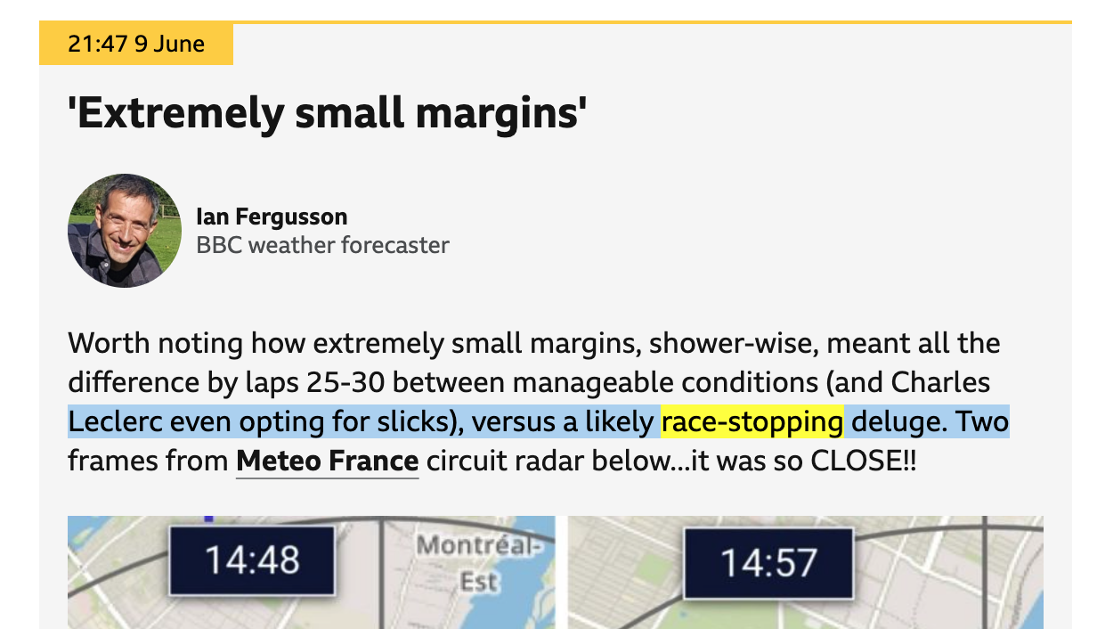
For example with a simple heading such as this:
<h2>Extremely small margins</h2>
a screen-reader may hear:
"Extremely small margins, heading, level two"
So the user can tell this content is a heading but also that it is a level two heading, information a visual user may get from the visual styling.
Find out more about accessible names and how screen-readers work.
Screen-readers also allow users to move around the page in a non-linear manner to prevent them from having to read each page from top to bottom. For example a user could move from heading to heading in order to understand the page structure and find the section they want.
This data is built from the code we write. This means we can have significant impact on what gets passed to the screen-reader and what gets ignored, as well as being able to manipulate the information sent. This is why screen-readers are often highlighted as having particular issues when it comes to accessibility as we can actually make things worse for the end-user if we aren't certain about the effects the code we write has.
Speech-recognition
This allows the user to navigate and enter data using just their voice. This software is built into both Windows and Mac, but there are also commercial options.
The user typically interacts by stating the name of the thing they want to click. Because of this they rely heavily on the visual text associated with the control (for example the link text) or well-established conventions (such as “close” for a cross icon on a popup).
Sometimes using the visible text, or trying to guess when there is no text, does not work. Some speech-recognition software allows the user to request the names of elements be displayed.
Different speech-recognition software has different tolerances for how much of the accessible name is needed to trigger a response. If they are unable to trigger the control in this way they can ask the software to number elements and then choose one of those numbers.
As a last resort and as a way the user can also perform more complex interactions, such as drag and drop, the user can overlay a grid (called a ”mouse grid”). Each square is numbered and choosing a square reveals another grid inside similarly numbered. By repeated choices the user can direct a click or other action.
When it comes to entering data (such as in a form), doing this by dictation can be difficult if the software doesn't pick up the word correctly. Where possible we want to again avoid having the user type unnecessarily, so offering options which don't involve typing (such as picking from a list) can be helpful.
Windows High Contrast
Windows has a High Contrast set of themes which the user can choose from and even edit to an extent. Note this is different from high contrast user preference settings.
These are primarily used by people with low vision (around 30% of low vision users use high contrast modes), where the increased constrast helps them pick out elements on screen. They are also used by people who find the standard display too bright as it allows them to enforce a theme which suits them better.
When the user chooses to use one of these themes it is to enable them to read the page so the visual design must take second place to practical readability.
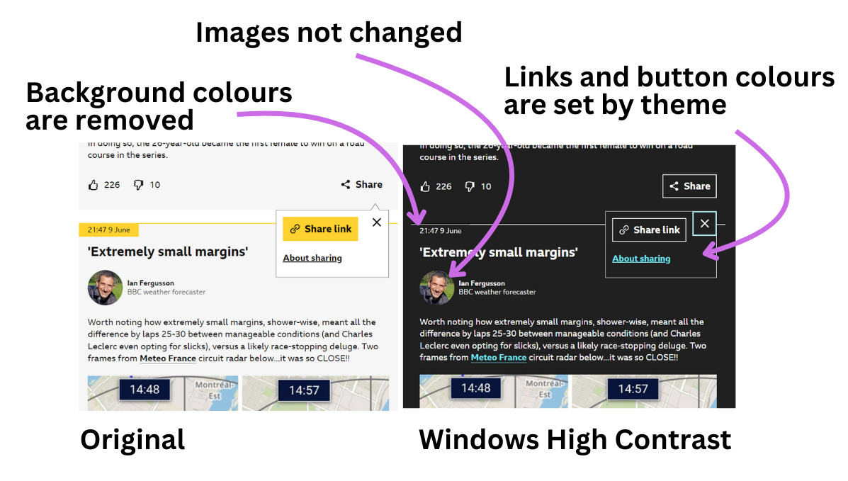
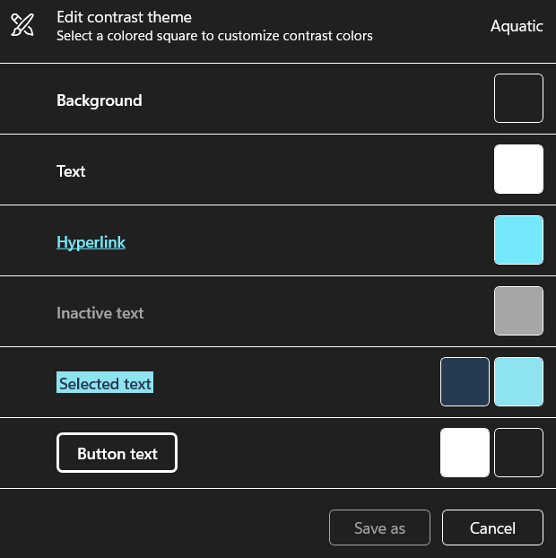
Windows High Contrast mode has several preset options but also allows the user to edit the default colours. This allows the user to adjust the colours to best suit their own requirements.
As we have seen already, using semantic HTML is important to accessibility and it is here too. By using standard HTML elements for buttons and links we can ensure a consistent experience for Windows High Contrast users. For example Windows High Contrast does not recognise aria attributes when assigning styles.
Whilst css can be used to tweak our designs in Windows High Contrast mode this should be done very sparingly and in a very specific way. This is because we can't be sure what colours the user might use so we need to be careful not to end up with something unreadable by forcing specific colours.
User preferences
When we talk about user prefernces we are looking at the various options the user can set via their operating system's settings panel. Whilst these might not do anything with a website on their own, they give us the ability to respect these preferences when we are coding our interfaces.
Colours
As we have seen already users may want to adjust the colours on-screen for a variety of reasons, from reducing fatigue to making it easier to percieve elements or make reading easier. There are a few options which allow this.
Dark and light mode
We can check for the active operating system dark or light theme and align our site's dark or light mode with it using the prefers-color-scheme media query. However we should always provide an on-site switch to let the user change the theme independently of the OS.
High contrast
High contrast is where the operating system performs a system-wide colour switch. Although both Windows and Mac also provide options to heighten the standard contrast used across the OS this doesn't affect web pages automatically. We can implement changes however using the prefers-contrast css media query.
Inverted colours
Whilst Macs provide the option to invert colours it is not customisable by the user, but we can help designs work with it via css inverted-colors media queries. Just as with Windows High Contrast care should be taken not to override the reason the user enabled it in the first place.
Motion
Some users may have conditions which are triggered by animation - especially large animations or repeating ones. Anything from carousels to parallax scrolling to advertising can cause unwanted distraction or even a physical reaction, such as intense headaches or nausea.
The user can request reduced motion at the operating system level and we can hook into this with the prefers-reduced-motion css media query to disable or tone down animations and movement.
This can be demonstrated using a carousel (on BBC's iPlayer site) which has been coded to respect this user preference.
Something as seemingly small as this can make the difference between a user being able to access content or not.
Wrap up
When we consider these different methods of interaction when designing and building our interfaces we are more likely to deliver an accessible product at the end.