Contents
- Introduction
- Why test for keyboards?
- Can we automate keyboard testing?
- Set-up for testing on Macs
- What are we testing?
- A quick look at navigating by keyboard
- Tools
- Skip links
- Can I see where my focus is?
- Functionality
- Logical tab order
- Preventing doubling up
- Managing focus when content updates
- Did we WCAG?
- Wrap-up
Introduction
There are many types of users for whom the keyboard is the only way they can access their computer. It also forms the basis for how other users, such as screen-reader and speech-recognition users interact.
Keyboard accessibility is both fundamental to wider accessibility and one of the easiest things to test when it comes to accessibility. Because most developers will primarily use a mouse when interacting with the end product they are coding it can be all too easy to make some simple errors which have a major impact on our end users.
By being aware of how excluding keyboard users can happen we can improve our code and testing practices.
Whilst this is a simple check to do, it actually covers several WCAG criteria because is such a core accessibility concern.
Why test for keyboards?
7% of working-age adults have a severe dexterity difficulty or impairment (Microsoft / Forrester report). In the UK of those who reported an impairment around 25% had a condition which impacted their dexterity. This can result in users prefering keyboard interaction over mouse or touch as it may be less prone to error, more easy physically or less painful.
Some users will be physically unable to use a mouse and so will need to use a keyboard to navigate your product.
Alongside dexterity or mobility impairments, the majority of screen-reader users will also use a keyboard. So by testing for keyboard accessibility we are already making headway into more complex accessibility testing requirements.
Can we automate keyboard testing?
Out-of-the-box automated testing (such as Wave or axe) will only tell you if something is:
- focusable and should not be
- focusable and is missing an accessible name
Some automated tools also provide options to visualise focus order (more on that shortly).
But we need to test much more than that.
Automated tests are effectively linters. They catch the simpler issues (although they can be super-useful).
You would not ship code with the only testing being a linter. In fact with most of the examples we'll be looking at, automated browser plugins did not pick up the issues we will be fixing.
But all is not lost! We can add some checks to our custom scripted tests to help enforce better accessibility at build time. Read more about improving tests for accessibility.
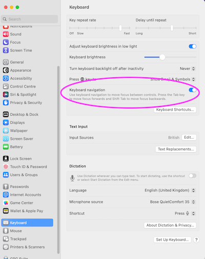
Set-up for testing on Macs
If you are a Mac user, tabbing to navigate links and form controls in a webpage may be turned off by default. This affects Firefox and Safari. You should check your settings if you are on Mac and using either of these browsers.
How to enable tab navigation on Mac
Firefox
To fix Firefox you need to go make a change in the Mac system settings.
Before OS 13 it is in System Preferences > Keyboard > Shortcuts and check “Use keyboard navigation to move focus between controls”.
For OS 13 on it is in System Preferences > Keyboard and toggle on “Keyboard navigation”.
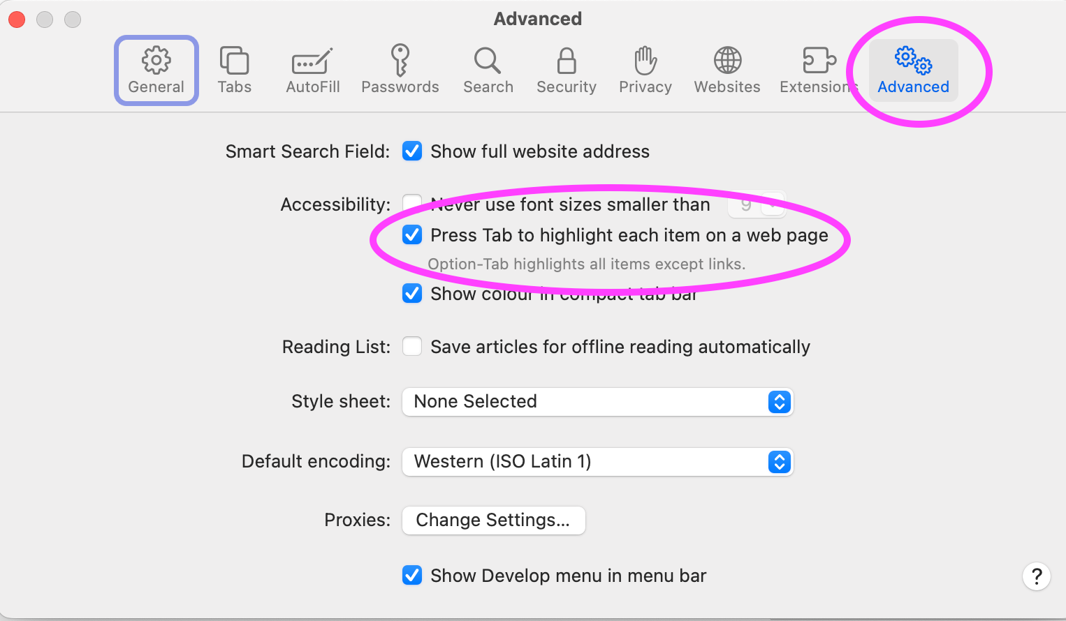
Safari
For Safari you need to make a change to Safari's own settings. In Safari > Settings > Advanced, check the option “press Tab to highlight each item on a web page”.
What are we testing?
There are a number of things we are going to be looking for during our testing:
- skip links - adding these allow keyboard users to jump past the repeated blocks which are present on every page, such as navigation
- visible focus - while we are navigating can we tell exactly where our focus is at any moment - that is to say if we hit the enter key do we know what would happen?
- access and operation - can we get to and then trigger the various controls on the page? Are there things we can reach which we should not be able to?
- focus management - when something is added or removed as a result of user action, are we handling the focus in an appropriate manner so they can continue without interruption?
- focus order - is the order in which focus happens logical based on the position of the elements or are we jumping all over the screen?
Check different states
Also remember we need to test any different view states. These can be:
- menus which appear when a button is clicked
- dialogs or notifications
- different types of content loaded into the same component
Check mobile viewports
We also need to check the mobile viewport of any page. Sometimes developers assume that a mobile user will be using a pointer (such as a finger or stylus), but external keyboards are a popular addition to mobiles or tablets.
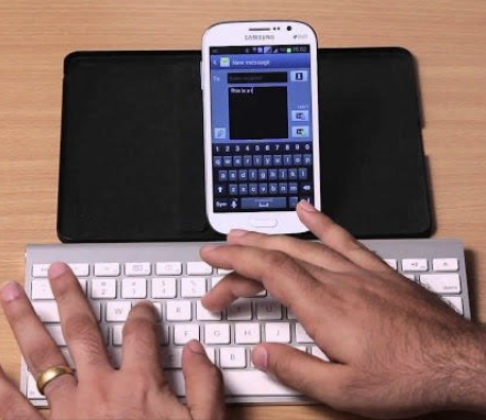
A desktop browser can also trigger the mobile viewport when zoomed. It is important to also check that any interactions, especially menu and navigation related, are still operable with a keyboard.
Whilst looking at mobile viewports, also check how the page operates in landscape mode. This is often when you may find that a sticky header will overlay content preventing a user from seeing where their focus is.
Testing on mobile devices
Whether testing a native app or a website with a keyboard on iOS you will need to turn on “full keyboard access” under Accessibility in Settings. This will allow you to tab through as you might on a laptop.
On iOS you also have the option of using “keyboard gestures” by using the Tab + G command. This then allows you to make swipe gestures. However bear in mind that not all users will be aware of this and Android phone users (nor laptop users) do not have this option. It is always best to provide keyboard users with buttons to accomplish what other users may do with gestures.
A quick look at navigating by keyboard
When we are using our keyboard, we only want to navigate to things which are interactive. The main way of doing this is by using the tab key. This will place a focus indicator on the element to show us where our focus is and this indicator will move as you navigate between interactive elements. You can use enter or space to activate buttons and enter to activate links once your focus is on them.
A mistake that some people make when it comes to testing for keyboard use is that they assume that the tab key is all that is used. Some components might require arrow keys to be used to move around elements within them.
Radio button groups for example show focus on tab (either on the first or last depending on your direction of navigation) and then you can use space to select that radio or use arrow keys to move up and down the list. This behaviour means that long lists of options can be easily skipped over once we have made our choice.
Some library components such as a tab component may have what is called a roving focus (or roving tabindex) which operates in a similar way to radio buttons - you focus onto the first tab element and then use arrow keys to move from tab element to tab element.
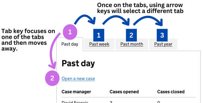
This allows the user to avoid having to navigate through all the tabs of the component to get past it. However this also relies on the user being aware of this pattern so this should be used sparingly, else the user may be confused as to why they cannot tab to an element.
Remember that a user will not need to focus on content to scroll the page - this can be done with other keys (space bar, arrow keys or page up/down keys).
Tools
Testing for keyboards can raise some difficulties for us just as it might for a user.
Enhancing focus indicators
Sometimes the page we are checking may have poor focus indicators which make it difficult to work out where our focus is.
One way around this is to enhance the focus indicators with some css. Usually something like this should be enough:
*:focus {
    outline: 2px solid hotpink!important;
}
This will add a pink outline to each focusable element as you move to it.
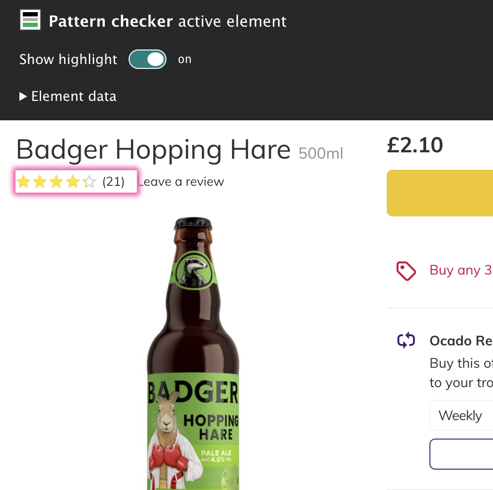
I added this functionality into the Pattern Checker browser plugin to make it easy to check:
Viewing the focus order
Sometimes it can be valuable to be able to see each focusable item on the page or to plot where focus is moving. This is especially true when trying to report an issue. Fortunately there are some browser tools which can help us here.
I'm going to look at 3 tools which show the order in which focus is applied to elements on the page.
All these tools plot focus by adding a numbered tag next to the element to represent the order in which they will be accessed by the user. Some also draw lines to assist you in seeing where the next numbered tag is located.
However what they see as a focusable element is slightly different.
Firefox's built in "Show tabbing order" in the accessibility panel shows tab stops. These are just the items which are reached by the tab key.
IBM's Accessibility Assessment plugin shows all focusable items. This includes tab stops, but also items which can take focus in other ways.
Microsoft's Accessibility Insights works slightly differently. It doesn't show all the focusable items in one go. Instead it plots the items as you move through the page. Depending on how you navigate will determine how it plots.
The video below shows each of these in action.
Video description
A page is shown in Firefox with two radio buttons in a group, below which are a link and a button.
The context menu is brought up and “Inspect Accessibility Properties“ selected. Developer tools opens with the accessibility panel shown.
At the top of the panel is a checkbox for “Show tabbing order“ which is then checked and numbered icons appear next to items on the page.
The icons are numbered next to the following items in this order:
- The first radio button
- The link
- The button
Firefox is dismissed to show the same page in Chrome.
Developer tools is opened and the IBM Accessibility Assessment panel is selected.
There is a “Scan“ button in the panel which is clicked, generating a report. This allows the “Keyboard checker mode” to then be clicked.
Numbered icons with connecting lines appear next to items on the page.
The icons are numbered next to the following items in this order:
- The first radio button
- The second radio button
- The link
- The button
The developer tools is closed and the MS Accessibility Insights extension icon is clicked in the toolbar.
From the extension popup the “Tab stops” option is selected and the popup closes.
Focus indicators show the elements on the page as the user moves between them. As the focus moves, numbered icons appear next to items on the page with lines connecting each icon to the next.
The icons are numbered next to the following items in this order:
- The first radio button
- The link
- The button
The page is reloaded and the MS Accessibility Insights extension rerun and the “Tab stops” option selected again.
This time the focus does not move from the first radio to the link, instead moving from the first radio to the second.
As the focus moves, numbered icons appear next to items on the page with lines connecting each icon to the next.
The icons are numbered next to the following items in this order:
- The first radio button
- The second radio button
- The link
- The button
It is strongly advisable that these tools are only used to support manual testing and not as a replacement. Also remember that these tools, just like other automated browser plugins only work on the current state of the page.
Skip links
These are primarily for keyboard users so are a good place to start.
The benefit of a skip link
A lot of sites will employ these but you may not have seen them as they are generally hidden until they recieve focus to avoid making the top of the page cluttered.
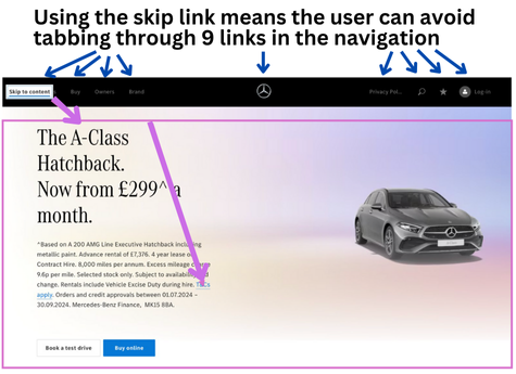
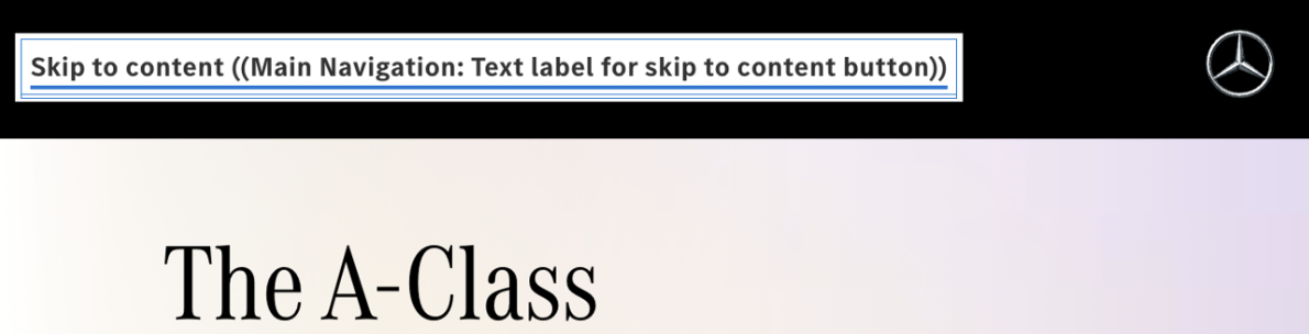
A skip link should be the first focusable element on a page, even before the navigation or logo. This is because their function is to allow a keyboard user to jump over the repeated header elements (which tend to be link-heavy with navigation) and allow them to more easily get to the unique content on each page.
If we didn't provide a skip link like this on each page a keyboard user would have to tab perhaps a dozen or more times when they land on each page in order to access the main content links. Remember that keyboard users may have difficulty in activating a key, so asking them to repeatedly do so when we can remove this need is not acceptable.
How skip links should work
The skip link is an in-page link and will typically take the user to the main element (usually done by temporaily assigning a tabindex="-1" to allow it to be programmatically focused). The next use of the tab key will take the user to the first focusable item within or after the main element. Some sites may take the user directly to the first focusable item which is acceptable also.
main element. The next use of the tab key will take the user to the first link inside.Potential mishaps
Despite being a simple interaction there is scope for issues with skip links, partly because their default state is to be hidden visually so they can be forgotten about when testing.
Skip link text
Because skip links are hidden it is easy for issues with their content to be missed. Check the content makes sense and if offering translations of a page that the skip link translates correctly.
Skip link appearance
We should check that the skip link is actually shown when it gets focus and sits above other content.
Skip link functionality
Our final check is to make sure that when clicked, the link actually takes the user down the page and focus is moved there.
It might be that the target of the link is missing or has been mis-spelled.
Video description
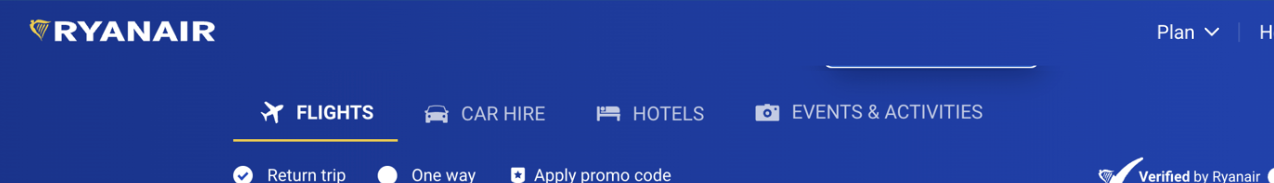
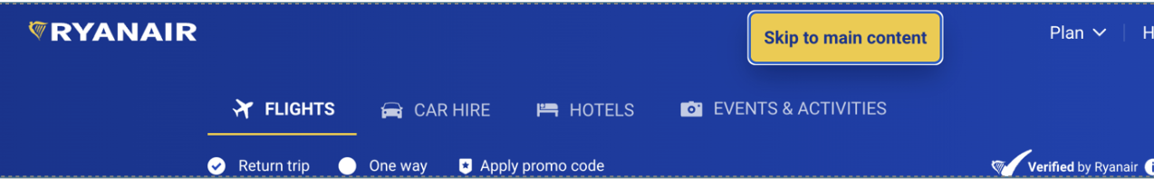
The 2024 Olympics homepage. A "skip to main content" link appears top left.
The link is clicked and the page scrolls.
Another skip link appears replacing the first. This one is labelled "Skip to language selection".
The same happens - the page scrolls but focus does not move from the link.
Three more skip links appear one after the other as focus moves to each in turn, each with the same effect.
The focus now moves to the primary navigation links.
Can I see where my focus is?
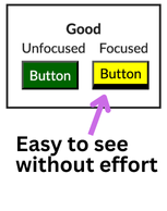
Keyboard use relies heavily on being able to see where the focus currently is. If this is taken away by css or obscured (or just not added) it can make it very difficult to work out where you are on the page. Making focus states really obvious helps especially when focus can jump across large sections of the page.
As a quick test, go to the page in question and close your eyes. Hit the tab key several times. Can you see immediately where the focus is? If not then the focus indicators need some work.
Providing good focus indicators
Not having a focus indicator is like not having a mouse pointer for a mouse-user. It makes it a lottery as to what you will trigger when you click. Good focus indicators make interfaces immesurably more pleasant and less tiring to use.
A good focus indicator makes it immediately clear that the item has focus. Remember that some keyboard users may also have poor eyesight.
Here is a video of a user navigating a site which has poor focus indicators - the user is pressing the tab key throughout the video. The focus is very difficult to see as it only appears on a few links and not at all on the primary navigation. (Note there are other issues apparant in the video which we will come to shortly.)
The Thomas Cook site has poor focus indicators. Navigating with keyboard many links have no indicators at all and a few have just thin dotted outlines.
Now let's look at that again, but this time we add some good focus indicators (done using the Pattern Checker plugin). The focus is now immediately visible as the user tabs through the links.
This video shows the same but with forced focus highlights.
If you can't see where the focus went on a page then you need to check if this is just down to a poor focus state or because the focus has gone to content which has been hidden from view. Disappearing focus indicators is something you will often find when content has been hidden off-screen until triggered (like a menu) - we will look at this in a moment.
Potential mishaps
Visual appearance
The most obvious issue with focus indicators is their lack of visibility. As we have already mentioned a good focus indicator is very clearly different from the non-focused state.
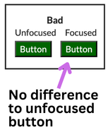
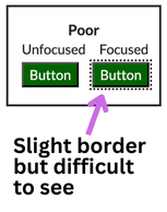
Focus indicator clarity can be provided in several ways - via the addition of a border or a background color change for example. However it is applied there should be a good colour contrast between the two states so users with vision impairments can easily percieve the difference.
Finally check your design in Windows High Contrast (WHC) to ensure that focus is still visible where expected. Note that WHC exposes native HTML buttons and links differently to ARIA-based ones, including focus states. So it is generally wise to use native HTML where possible.
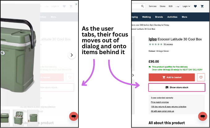
Focus obscured
Focus indicators should not be hidden from the user by other content sitting over it. If other content is obscuring the focus indicator then the user will not be able to see either see that content or where their focus is. There are a few instances where this can happen.
Focus obscured by non-modal overlays
A non-modal overlay is one where the rest of the page can still be accessed without having to dismiss the overlay first.
A common use of these is in site menus. However drop-down or fly-out menus can become a hinderance to users when they allow the user to tab through them and onto content which sits behind them without the menu being removed.
Where a menu allows the user to interact with the rest of the page when it is open, the menu should either:
- be closable via the Esc key when focus is outside the menu so the user can dismiss it without having to backtrack to the close trigger
- be auto-closing once focus exits the overlay - for example by moving to an adjacent link outside the menu
The Tesco main navigation has drop-down menus which cannot be dismissed with the Esc key and persist when focus moves off them, resulting in the user's focus being hidden from view. Due to the poor focus indicators on the site I had to force focus indicators to show this issue in practice.
Without these considerations a user will be forced to try to go back to what triggered the menu in an attempt to dismiss it.
Focus obscured by modal overlays
Modal overlays are different from non-modal ones in that they need to be closed before the user can interact with the page which launched it. This might be through choosing from a set of options or by using a close button.
These type of overlays communicate this by either taking over the entire viewport (in a lightbox type pattern) or by adding a semi-transparent backdrop between the modal and the page, effectively focusing the user attention on the modal.
Just as with non-modal overlays the issue with modal overlays can be poor coding which allows the user to access content sitting behind them and then be unable to see where their focus is.
With a modal dialog the expected behaviour is that focus is restricted to the dialog in the same way as a mouse user cannot access the content behind it. For a keyboard user this would prevent a user from tabbing out of the modal and onto the rest of the page.
The dialog element will do a lot of this for you. It will:
- make the page behind the overlay inert (so the user cannot interact with it)
- add the Esc key functionality
- add a backdrop
- place focus on the first focusable item in the dialog
All with minimal effort for the developer.
Focus disappearing
As well as focus disappearing due to other elements appearing in front of them, a common occurence is for focus to drop out of view entirely. This is most often the result of focusable elements which have been visually hidden still being reachable by keyboard.
A keyboard user will only ever want to access controls which they can see. A simple rule-of-thumb is if the user cannot see it when it has focus, then it should not have received focus.
Let's look at an example. This is part of a main navigation for a site. There is a drop-down for a language selector.
However for keyboard users, instead of being able to tab from the current selection to the next link in the navigation, their focus indicator disappears for half-a-dozen hits of the tab key before re-emerging on the register link.
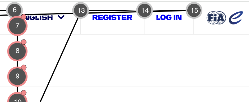
This is because the method of hiding the collapsed menu options was incorrectly applied making the options available all the time.
This type of issue is especially harmful because putting content into collapsable components (or hiding off-screen behind a hamburger menu) is often used to hide large sets of options. The worst example I found of this was a filter component which was visually hidden but available to keyboard and screen-reader users and contained over 80 tab stops!
When hiding content from view, whether that is for a mobile-style menu, a set of filters or a drop-down like this, always check that the content inside cannot be tabbed to by keyboard users (or seen by screen-readers).
Scott O'Hara and CSS Tricks both have articles on how to hide content in an accessible way.
Focus wrap-up
If the user cannot see where they are on the page then it becomes very difficult to interact with the content and mistakes will be very likely, leading to further issues.
- check focused items can be easily differentiated from unfocused ones
- check the focused item is not obscured by other content, especially components like menus and dialogs
Functionality
There are two main questions we need to ask when looking at keyboard functionality.
- can the user reach the control with the keyboard?
- can the control be activated with the keyboard?
Check to see the user can reach any element on the page which they should be able to interact with. Pay particular attention to more complex components and navigation sections. Any component which utlises javascript is especially prone to omitting keyboard functionality.
Using the correct element
The easiest way to ensure a keyboard user can move focus to a control is to use the correct element. This most often means using input, button and a elements.
Whilst in theory a span or div can be made to act like one of the above, it requires a lot of consideration and additional technical complexity. This is often missed and only mouse users are accounted for, or only partially implemented and a poor experience is the result.
Example
The navigation on the Thomas Cook website does not allow keyboard users to access the “My Account” item, as shown by the IBM Equal Access tool below - there is not a focus-order marker for it.
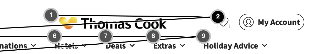
Let's take a look at the code for the “My Account” option.
/*My Account*/
<tc-my-account-navigation-open class="⭐️umd9c1-1">
    <div class="tc-menu-toggle-icon"></div>
    <div class="tc-menu-toggle-name">My Account</div>
</tc-my-account-navigation-open>
Now let's compare it to the ”Wishlist” one which sits alongside. This one does take focus.
/*Wishlist*/
<tc-my-account-wishlist-icon class="⭐️umd9c1-1">
    <a href="/my-account/wishlist" class="wishlist-heart">
        <img src="heart-love-outline.svg" alt="Wishlist">
    </a>
</tc-my-account-wishlist-icon>
We can see the “My Account” one is made up only of generic elements (divs), whilst the wishlist is a link (a):
Generic elements (such as span and div) do not take focus, meaning our keyboard user cannot access them. Moreover, whilst a screen-reader user will be able to read the content, they will not know that it is clickable. This is because the elements which have that generic role will be announced purely as text.
The fix
We can fix these issues with a two step approach.
The first is to use the correct element for the job at hand. For this example I will use an a which will allow for a fallback in case javascript is not available and take the user to the account page. We can then progressively enhance this link to open the account menu when javascript is available.
Important to note that an a element without an href is not a link and cannot be focused. So if this was not going to be progressively enhanced I'd opt for a button instead.
I have also added two ARIA attributes on the link to tell screen-reader users that this link will trigger a same-page menu. As we wouldn't want these on a link which will cause a page load we should only add these as part of the javascript-applied progressive enhancement which also adds the event handlers.
This is the code as it would be rendered:
<tc-my-account-navigation-open class="⭐️umd9c1-1">
    <a href="/my-account/" aria-haspopup="true" aria-expanded="false">
        <div class="tc-menu-toggle-icon"></div>
        <div class="tc-menu-toggle-name">My Account</div>
    </a>
</tc-my-account-navigation-open>
With our change in place the navigation now allows keyboard users to access it:
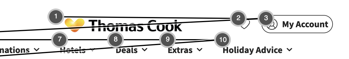
Our next step would be to ensure that the keyboard user can then trigger the item to open the menu:
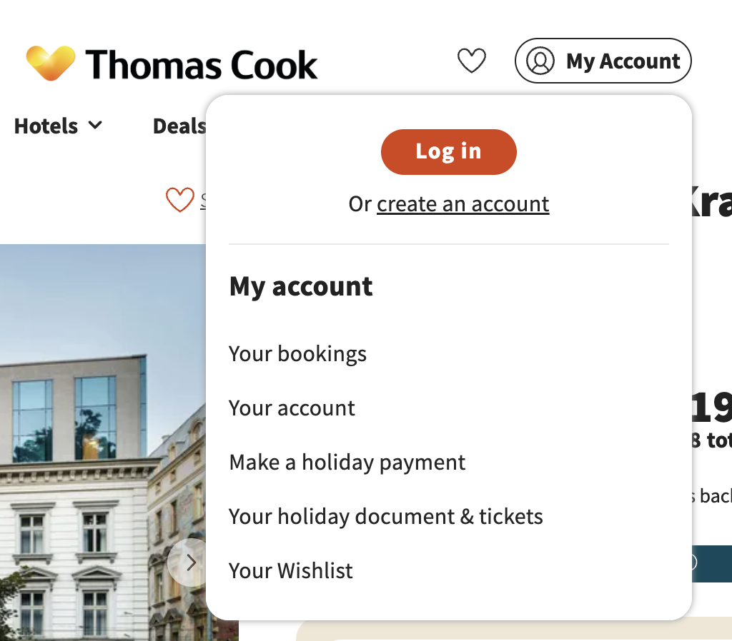
and make sure that our new aria-expanded attribute is updated to true when the menu is open.
This issue is more widespread than you might think. Here is another example, this time the Premier Inn main navigation is entirely unavailable to keyboard users.
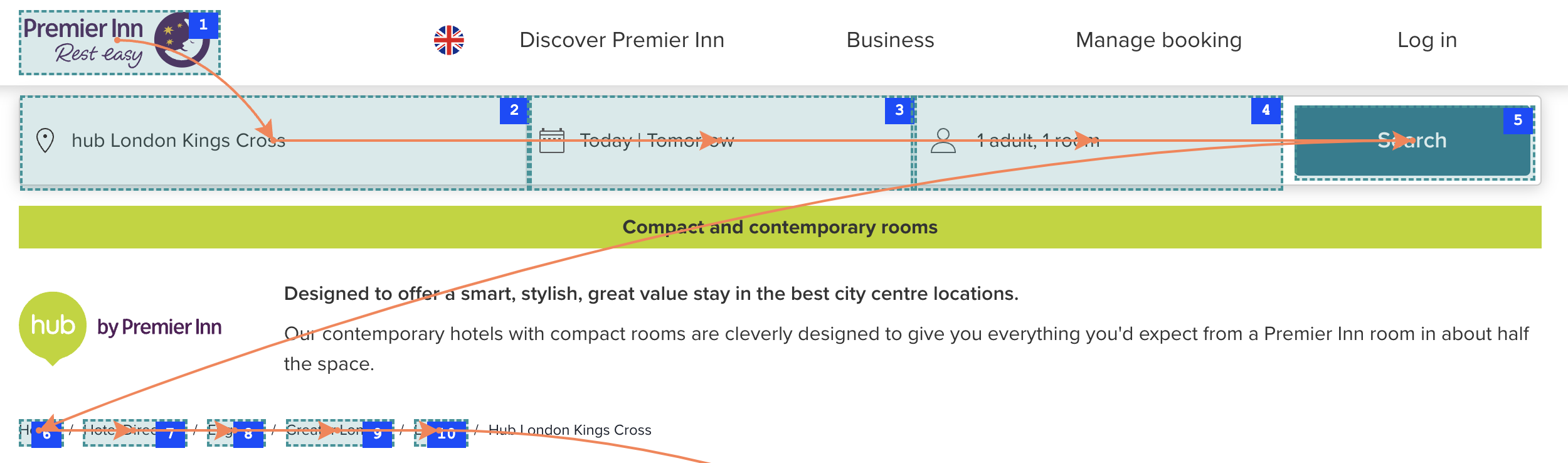
If we take a look at one of those navigation links which does not work for keyboard users we can see a similar story.
<div class="css-1wgzkpb">
    <div id="popover-trigger-:r1:"
        aria-haspopup="dialog"
        aria-expanded="false"
        aria-controls="popover-content-:r1:"
        class="css-jls80j">
            <p class="chakra-text css-1tk9twk">
                Discover Premier Inn
            </p>
    </div>
</div>
As with the previous example we can see the elements are not focusable. Unfortunately whilst they have added aria attributes, they have omitted the most basic functionality. As these aria attributes are not permitted on generic elements these will not be communicated to a screen-reader.
Again, this is a simple fix and can be done by updating the code to use the correct element.
<div class="css-1wgzkpb">
    <button id="popover-trigger-:r1:"
        aria-haspopup="dialog"
        aria-expanded="false"
        aria-controls="popover-content-:r1:"
        class="css-jls80j">
            <p class="chakra-text css-1tk9twk">
                Discover Premier Inn
            </p>
    </button>
</div>
Tabindex
You may have come across the tabindex attribute. The order in which a user tabs through a page's HTML elements (links, buttons and form controls for example) is called the ”natural tab order”.
Very occasionally you may need to add an element to that tab order which would not normally be there. In this case you can use a zero value in the tabindex attribute to do this.
Note. Tabindex should only be added to elements which need to be focusable in order for them to be interacted with. You also do not need to add tabindex to an element which can already take focus (such as a button) - this is redundant.
For example here we have two buttons with a div element between them. A user would tab from the first button to the second:
<button>One</button>
<div>I'm plain text</div>
<button>Two</button>
But if we add a tabindex to the div element:
<button>One</button>
<div tabindex="0">I'm plain text</div>
<button>Two</button>
The div will now be included in the natural tab order. The user will now tab from the first button, then to the div, then the second button. As it stands this is not useful or accessible but it demonstrates the principal.
This is something you should only very rarely need to do. Whilst the div can now take focus it is neither announcing as a button or link to screen-readers and will not respond to keyboard clicks. You can start to see why it is always a good idea to use the correct element for the job.
But there are occasions where it can be helpful where no existing HTML element is appropriate. For example, creating a scrollable container (such as a div) will necessitate the container to be focusable to allow keyboard users to scroll the contents. Focusable controls should also have an accessible name for assistive technology and as an aria-label can only be applied to certain roles the div will need to be promoted to something like a role="region". As you can see this process has several ways of being incorrectly applied and causing more barriers.
Tabindex can also take two other types of values. A negative (-1) will allow the element to be programmatically focussed (using javascript) without being added to the natural tab order. This can be occasionally useful, but again rare.
The other value is a positive integer. These should be used even more rarely than our first example as they entirely usurp the natural tab order. This can cause a lot of confusion for users as well as being problematic to maintain in a codebase.
Tabindex: it rarely pays to be positive
How styling can impact functionality
Even when we think we have covered all the bases and have progressively enhanced our interface, it is important to test!
Below we have a product view with various links and buttons. Here I have used the ARC Toolkit's tab order highlight option which works in the same way to the other tools we have used so far.
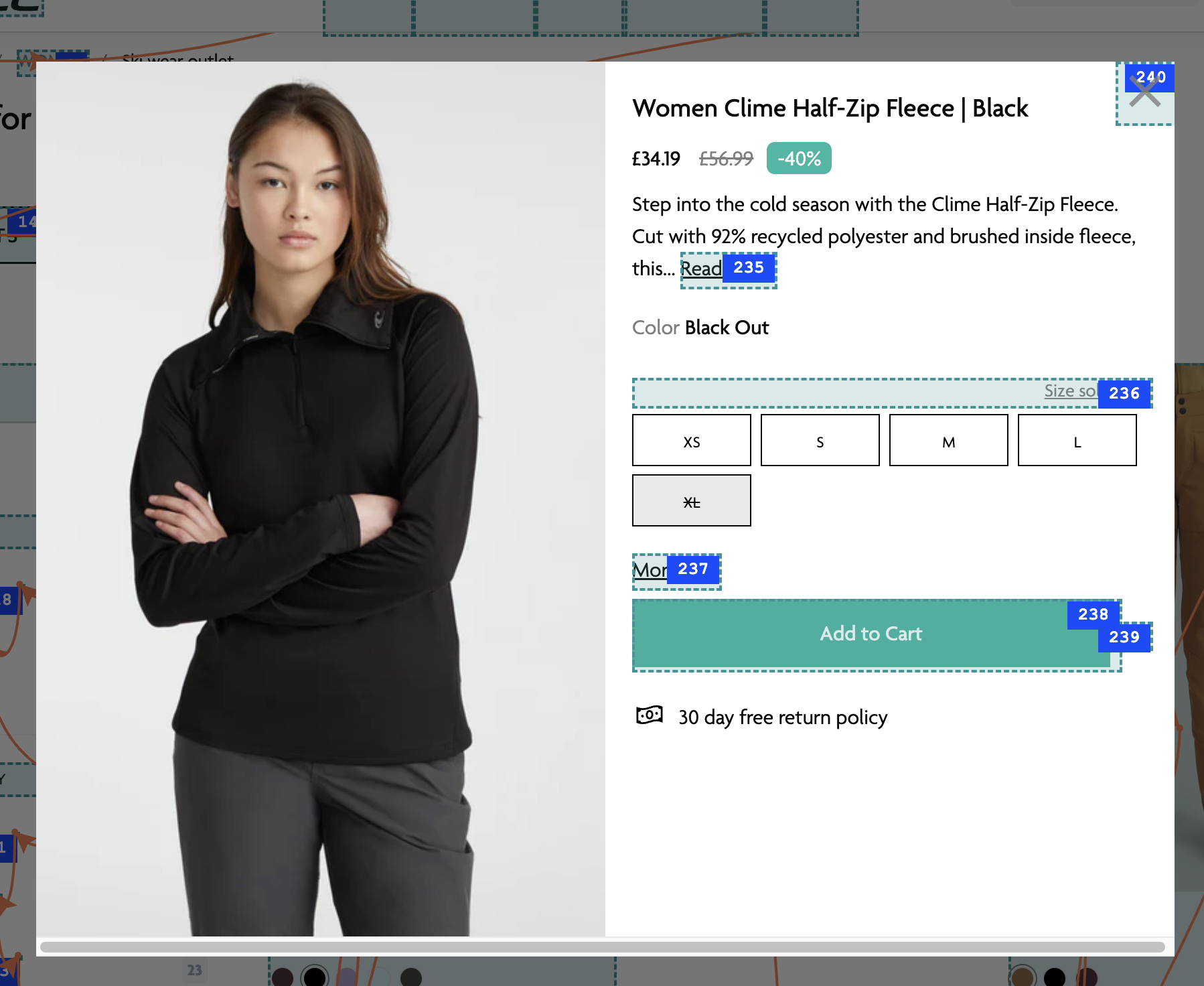
The sizing options are not showing as focusable items (confirmed by actual keyboard usage). Let's take a look at the HTML for them:
<label title="XS" for="XS" class="option_field">
    <input value="XS" type="radio" id="XS" name="SingleOption" class="list_option">
    XS
    <span class="checkmark"></span>
</label>
Everything looks ok here as an input has been used which should be focusable. The issue actually lies in the CSS used to hide the radio button:
.option_field input {
    display: none;
}
The use of display: none is the issue. This will remove the input from the rendered page. This then means there is effectively no input on the page to get focus.
This also has a knock-on effect for screen-reader users. No input in the page here means the label associated with it then becomes plain text. Screen-reader users will not be informed the sizes are selectable or be able to select one (just like the keyboard users).
To a screen-reader user the “XS” option will simply be announced as “XS”. The sold out size “XL” will also be read out just as “XL” - as the strikethough is not picked up by screen-readers and the disabled attribute on the input is unavailable as the input is not rendered.
That's a lot of inaccessible effects from some CSS!
The accessibility fix is simply amending the CSS to keep the input in the render but still hide it from sight:
.option_field input {
    position: absolute;
    opacity: 0;
}
Keyboard access is restored without affecting the visual appearance of the component:
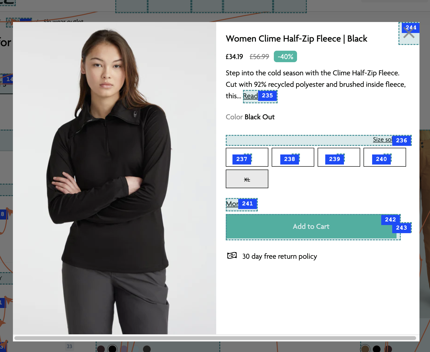
Now screen-reader information also improves.
The “XS” option is now announced as:
XS, tickbox, unticked, 1 of 5
and the “XL” option is announced as:
XL, dimmed, tickbox, unticked, 5 of 5
A screen-reader user now can tell which sizes are sold out, how many sizes there are and which one they have selected.
We would then need to ensure that focus indicators are being applied and actioning the inputs with keyboard has the desired effect.
Reachable but not operable
It is also possible to have a control be reachable via keyboard, but then not be able to action it.
This is normally due to an issue with keyboard events not being handled. When a click handler is added to a link or button element this will include event handlers for keyboard too. However when a click handler is added to a div or span (or other non-native control element) we need to add specific event handlers for keyboard ourselves.
One thing to be aware of is the difference between keyboard clicks and screen-reader clicks and why a screen-reader may be able to trigger something which a keyboard user could not.
When you press Enter on an element with a screen-reader, the element receives a (synthetic) click event rather than a keypress event.
So if your element is only listening for an onClick event you may well be able to access it using a screen-reader, but keyboard users will be left with nothing.
The Asda main navigation has a “More” link which for mouse users opens a drop-down with additional links.
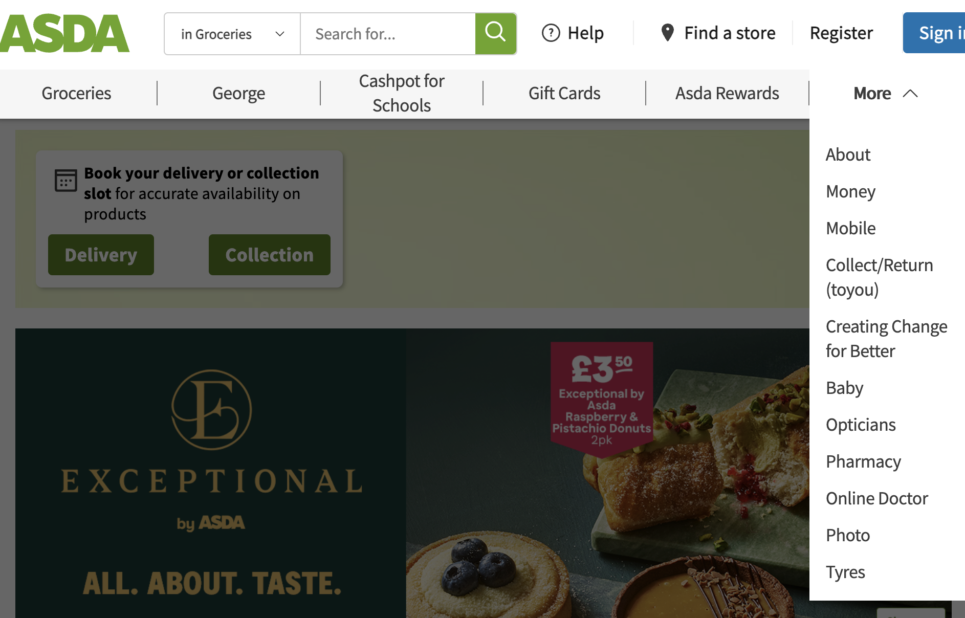
For keyboard users, whilst they can seemingly reach this, no amount of key pressing will open this menu.
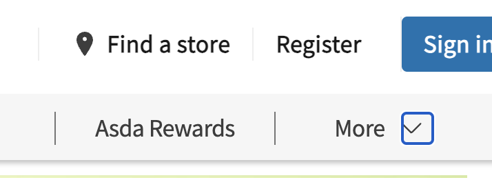
Let's examine how this control is coded:
<a class="sub-nav" id="nav-toggle">
    <span class="submenu-hamburger-label">More</span>
    <span role="button"
        tabindex="0"
        aria-label="More, list 11 items">
        <svg>...</svg>
    </span>
</a>
We have an a element without an href. Inside this is a span with role="button" and tabindex="0" attributes.
So what is happening? Well, as the a element is missing an href it is not classified as a link and nor will it capture focus. This means the keyboard focus skips past that and lands on the internal span thanks to its tabindex attribute having added it to the natural tab order.
The issue for the keyboard users is that the javascript event handlers on the span are only accounting for a click event. As we have already mentioned, on a span (even with a role="button") this will not include keyboard events.
The fix for this is to change the focus point from the span to the a element. Alternatively additional keyboard event listeners could be added, but we should always be using the correct element where possible. We also really want to remove the confusion of the nested controls and the repetition of text which that brings.
Let's remove the following attributes from the span:
role- as we no longer want this to pretend to be a buttontabindex- as we no longer want this to get focus (we will be using the link)aria-label- as it was mis-representing this as a list when it had its role set as a button, and we no longer need this with our changes
We should also add some ARIA (aria-expanded and aria-haspopup) to help screen-reader users determine how this operates (which will need to be updated when the menu opens).
This results in the following:
<a class="sub-nav" id="nav-toggle"
    href="#"
    aria-expanded="false"
    aria-haspopup="true">
    <span class="submenu-hamburger-label">More</span>
    <span>
        <svg>...</svg>
    </span>
</a>
We could probably tidy this up some more and ideally I'd want to use a button as it is not really a link, but this is a definite improvement.
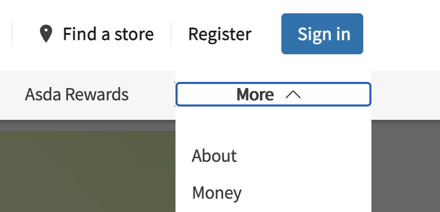
Now the focus goes to the link (and is much larger and more visible as a result) and a keyboard user can action it. Additionally a screen-reader user gets the information they should.
Read more about ARIA and accessible names.
Worth noting that although this is a change to markup and that it greatly improves not only keyboard and screen-reader accessibility, there does not need to be any change in how the component looks to the user.
Functionality wrap-up
- use native HTML controls (inputs, links, buttons) as a first choice when you expect a user to click on something
- make sure
aelements have anhrefeven if you are using javascript to handle clicks - if you need to use javascript make sure you cater for keyboard as well as mouse activation
- you don't get keyboard event handlers for free with generic roles (
divandspan) - do not hide
inputsif you expect the user to interact with them
Improving our tests to check for good keyboard accessibility
Logical tab order
Typically for a left-to-right language such as English, we expect focus order to follow the natural reading order, that is for it to move from left to right as it progresses down the page. If we deviate from this reading order expectation with our focus order it can be disorientating for the user and they have a larger chance of losing sight of the focus indicator.
Tabindex
As we have already touched on, it is possible to manipulate the focus order using the tabindex attribute with a positive number value.
Here is an example of where this can go wrong. On the Tesla Powerwall site, content halfway down the page has been given a positive tabindex.
<button
    role="tab"
    aria-selected="true"
    aria-controls="energy-carousel-panel-0"
    tabindex="1">
        <span role="heading">
            Store Extra Energy
        </span>
        <p class="tcl-carousel-v2__toggle-panel-copy">
            When your solar system ...
        </p>
</button>
This makes this content the first item which will be focused on the page, even before the logo or primary navigation. But this also means that this section will then be “skipped” as the user moves down the page, making for a confusing experience.
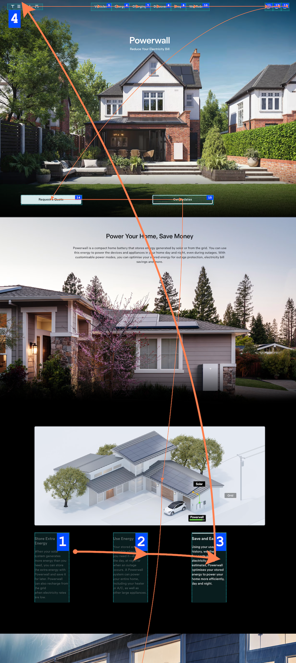
This is likely a mistake rather than a concious decision. The component in question is a tablist which normally has a “roving tabindex”. Rather than using tabindex="1", this should have been using tabindex="0" for the active tab and tabindex="-1" for the inactive tabs. However it shows the pitfalls accompanying the use of tabindex.
Source order vs visual order
There is another way in which we can inadvertently jumble up the focus order for the keyboard user, and that is by manipulating the visual order of our content.
Keyboard focus always follows the order of focusable items as they appear in the source code. When we apply CSS to that code it can visually alter the placement of content (and those focusable items), but this does not change the order in which they receive focus.
Let's look at a very much simplified example.
Here we have a HTML list of 5 buttons labelled one to five. When we tab through them the focus order follows the visual order from top to bottom, one to five.
Then we add some CSS, in this case display:grid, to reposition the third button at the top of the list. Now when we perform the same test, the focus still follows the same order, one to five, despite the third button appearing at the top of the list.
As you can see the focus follows the source order, not the visual order. This also affects screen-reader users in the same way, but not just for focuable items as screen-reader software reads all content.
Keyboard traps
These are relatively rare, but when found can be a complete blocker for a user. They occur when a user reaches an element or component and they cannot exit it using keyboard commands. They are often the result of javascript event handlers not accounting for people using keypresses to navigate.
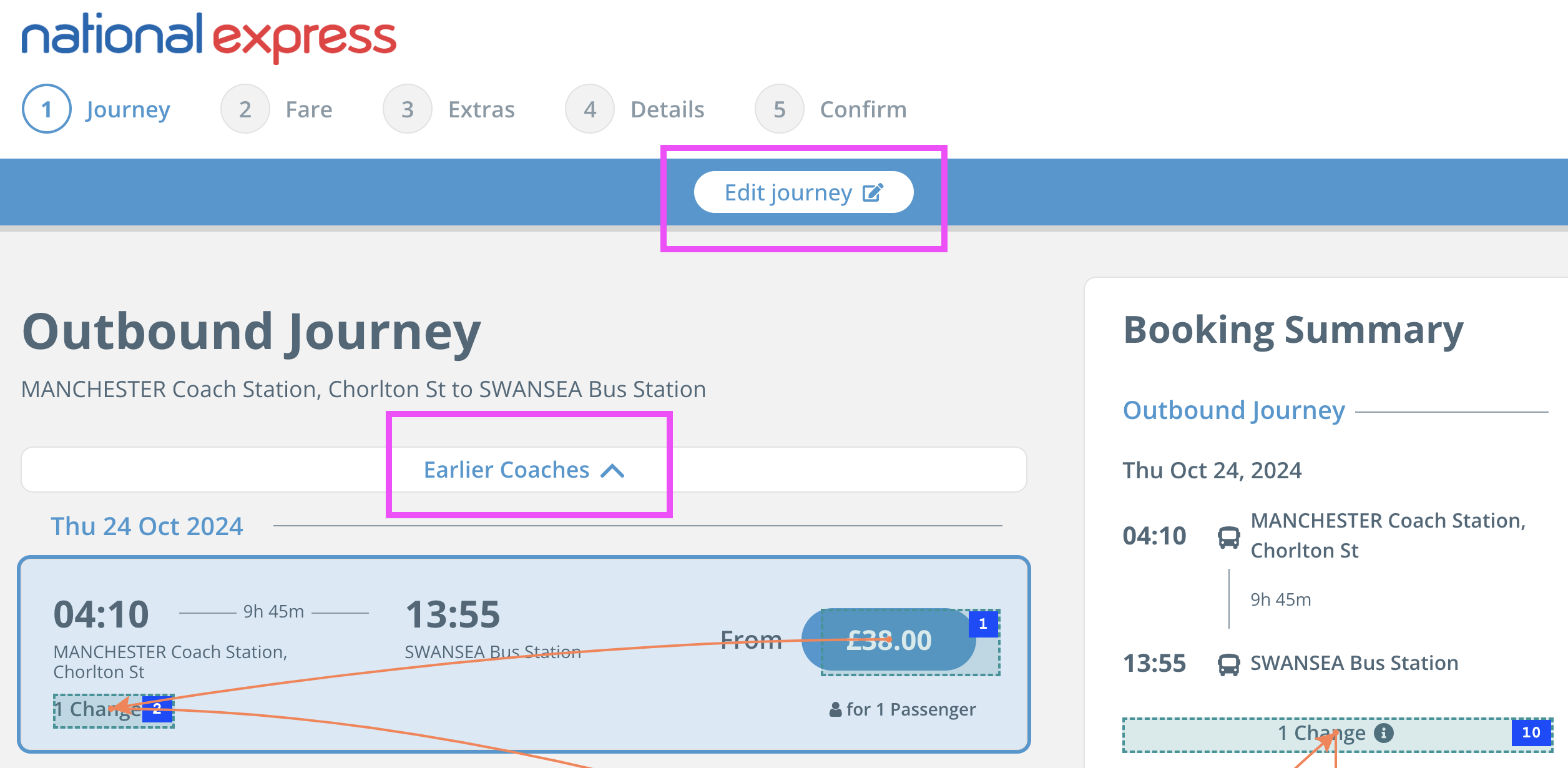
For example, the National Express homepage has a journey planner at the top of the page. Below it there is also a lot of additional content, including timetables, booking management tools and more.
The user focus gets caught by the first input of the journey planner. The user cannot exit the input without entering data due to javascript event listeners which move the focus straight back to the input if no entry has been made. They cannot even use one of the options in the drop-down as they are not reachable via keyboard.
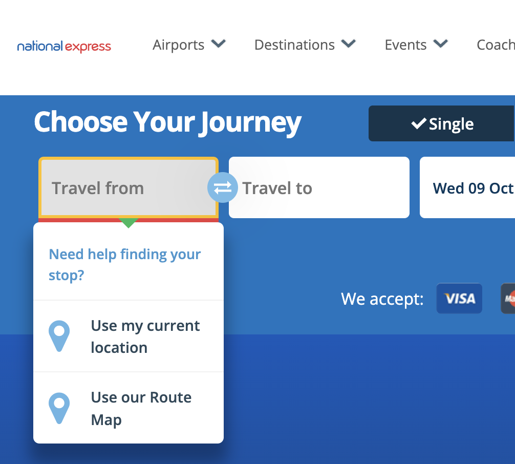
Similarly, even if they enter a valid stop they are immediately moved to the "Travel to" field which then prevents the user from moving back to the previous field to make any correction.
This is compounded by the result page where the “Edit journey” option is not reachable by keyboard.
This type of failure is simple to avoid if those designing and building them account for the different ways a user may interact with it.
Preventing doubling up
Something which will frustrate a keyboard user is where multiple elments are used to link to the same resource.
Let's take a look at this site navigation.

Note the “Help” and “Find a store” links which have the icons alongside? For a keyboard user there are two tab stops for each of those:
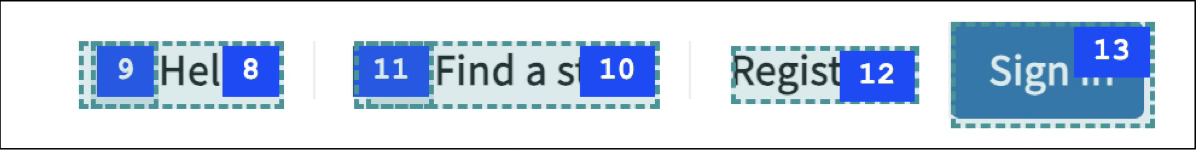
This is not ideal as we are asking the user to do twice the work they should. So why is this happening? If we take a look at the code we can see:
<a href="http://storelocator.asda.com">
    <span role="button" tabindex="0" aria-label="">
        <svg class="asda-icon">...</svg>
    </span>
    Find a store
</a>
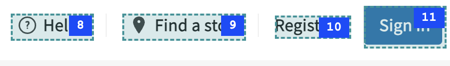
Here we have the link, but inside is a span which has been made into a button using ARIA (unfortunately the latter is also missing an accessible name). There is no need for this secondary control, so we can simplify this to the following without loss of functionality:
<a href="http://storelocator.asda.com">
    <span>
        <svg class="asda-icon">...</svg>
    </span>
    Find a store
</a>
Which when applied to both links give us a much cleaner tab order:
Another place where doubling up is often seen is in card components. Here is a typical example with the links highlighted:
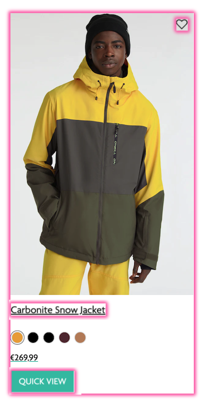
and the (simplified) HTML:
<a href="...">
    <img src="1827b921f1.jpg" alt="Carbonite Snow Jacket ">
    <h2 class="product-link__title">
        <a href="...">
            Carbonite Snow Jacket
        </a>
    </h2>
    ...
    <div class="product-price-wrapper">
        €268.99
    </div>
    <button>Quick View</button>
    <a href="#">
        <span class="visually-hidden">Add to Wishlist</span>
    </a>
</a>
We can see the card has been entirely contained by a link to make the whole card clickable. The issue this creates is adding a repetition of links as this is the same link target as the one which wraps the heading. The other issue with a wrapping link like this is also that its accessible name becomes the link's contents - in this case the entire card contents - and is announced to a screen-reader as:
"Carbonite Snow Jacket Carbonite Snow Jacket Carbonite Snow Jacket 1 / 5 2 / 5 3 / 5 4 / 5 5 / 5 €169.99 QUICK VIEW Add to Wishlist"
As the link wrapping the entire card is only meant for mouse users, we can devolve that to a javascript event on the card wrapper instead, triggering the link on the heading. This allows us to then remove that link element. Something like this:
let cardWrapper = document.querySelector(".card-wrapper");
let cardLink = cardWrapper.querySelector("h2 > a");
cardWrapper.addEventListener('click', function(){
    cardLink.click();
});
The functionality of having the entire card clickable will remain for mouse users, but keyboard and screen-reader users will benefit.
Removing this duplication has the potential to remove a lot of unnecessary keypresses for users as these cards are used to display products in grids.
Managing focus when content updates
When content is removed from the page and the user has their focus on one of the elements which is removed it is important that the user's focus is placed elsewhere thoughtfully. If not then it is likely that their focus will drop back to the top of the page. This will be both disorientating but also mean they will need to make their way down to where they were all over again.
This is especially important when we look at things like:
- closing dialogs
- deleting items from a list
- adding new content to a section which causes the section to be re-rendered
Here is an example of how a dialog can be dismissed leaving the user back at the top of the page:
Here the user moves through the flight planning form on the RyanAir website. After entering airport and date information, the number of adults and children is entered using a small dialog.
Once the passengers have been added in the dialog the user clicks the done button to close the dialog. Their focus is then dropped back to the top of the page, instead of back on the form input, forcing them to navigate the form again.
Because the dialog the user's focus was on has been removed from the page (either through CSS or by removing the element itself) the focus drops back to the top of the page. What should happen is the javascript should place the focus back onto the trigger for the dialog, in this case the passenger input. This helps the user orientate themselves and allows them to either edit the data they just entered or proceed to the next control.
Whilst browsers are beginning to assist with focus management, it is essential for us to be mindful of any effects on a user's focus when a page is updated.
Did we WCAG?
Despite this being a very simple accessibility test on the surface, you can see the complexities it can throw up, as well as pointers to how assistive technology such as screen-readers can be impacted.
If we take a look at the WCAG guidelines we can point to a lot of criteria which the issues we have described above could be failed against:
- 1.3.1 Info and relationships
- 1.3.2 Meaningful sequence
- 2.1.1 Keyboard
- 2.1.2 No keyboard trap
- 2.4.1 Bypass blocks
- 2.4.3 Focus order
- 2.4.7 Focus visible
- 2.4.11 Focus not obscured (minimum)
Wrap-up
As we have seen with our examples keyboard accessibility is something which is frequently overlooked, despite these examples being from sites which you might expect have thorough testing procedures.
Keyboard accessibility is something which is simple to test and requires no specialist software. It is a fundamental part of making a website usable by many groups of users, and even acts as a pointer towards deeper accessibility issues which can affect assistive technology users.
With no need for specialist software and simple testing techniques keyboard accessibility should be embedded into every team's accessibility processes.