Users can move directly to an input in a few ways, for example by using the Rotor, clicking on a link in an error summary, or navigating by shortcut keys or even tabbing.
So if we have a hint or error message alongside that field we need to make sure they don't miss out on this important information. Just like labels these need to be programmatically tied to the input they refer to. We do this using the aria-describedby attribute.
Activity - how aria-describedby sounds
Use VO + Cmd + J to move directly to the input below.
When you move to the input, there should be a slight pause and then you will hear the hint and error messages.
Sonoma update
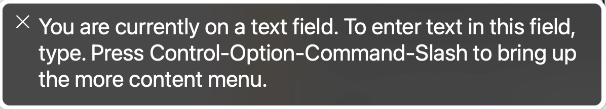
The new version of MacOS (tested on 14.1.2 with Safari 17.1.2) introduced a change to how aria-describedby is read out.
As part of an API update the elements associated with aria-describedby now have to be specifically requested by Voiceover users.
So now instead of hearing the hint and error above you will hear “Press control-option-command-slash to bring up the more content menu”.
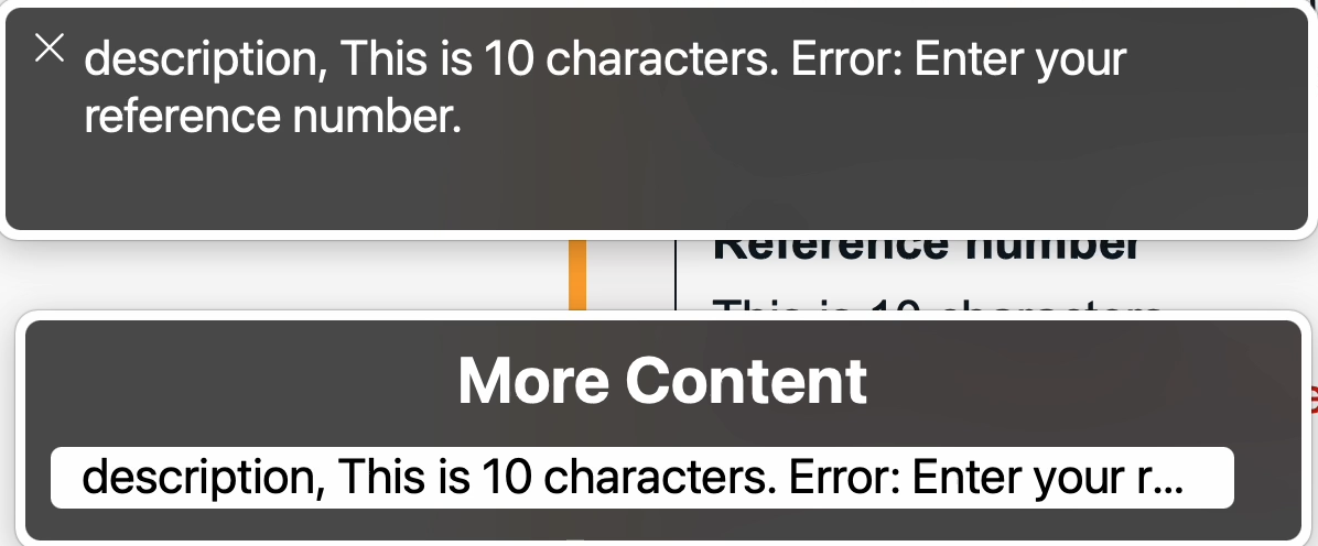
Doing this will bring up a second dialog titled “More content” which lists the additional content available.
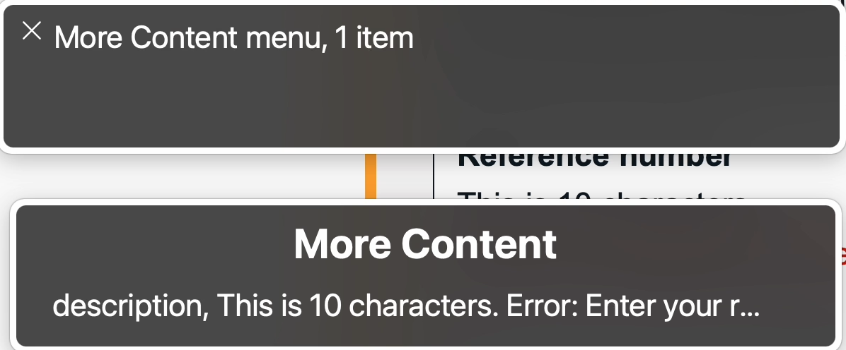
You can then arrow down on the second dialog to read out the additional content.
Obviously this is not an ideal change, but the recommendation at the moment would still to be carry on using aria-describedby as before as other screen-readers still expose it by default and it might be that there is a further update to the API to bring it back to the original behaviour.
We relate hints and error messages by using the aria‐describedby attribute, passing it the id of the element it refers to. The order in which they are read out depends on the order the ids appear in the aria‐describedby attribute. It should be the order they are presented on screen.
Insight: Here the error message is being prefixed by the hidden content “Error:” for screen‐reader users as they might not be able to perceive the different visual styling.
For standalone inputs the aria is placed on the input itself. For grouped inputs the aria is placed on the fieldset.
Hints and error messages should not be added to the label itself as this will make the label too long (and hinder speech recognition selection) and in the case of error messages it will alter the accessible name of the input which is generally not desirable.
Once in a set of form fields, as users are likely to jump from field to field, any unassociated content which is placed between fields is likely to be missed. If you have content like this which is not an error or hint, it is best to place it before the form fields begin.
Key takeaway
Always associate hints and error messages with the relevant input so they are read out when the user moves to the input.