Landmarks are what major areas of a page are called. They are assigned using either specific elements such as nav or main or using ARIA roles. There are particular rules around when and when not to use landmarks and roles.
Navigating landmarks
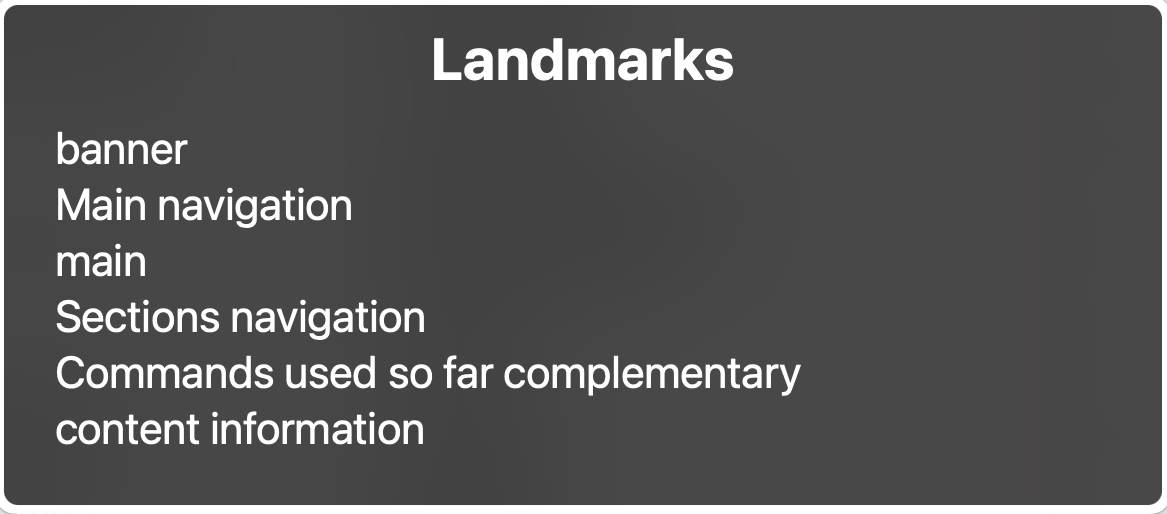
You will have seen a couple of landmarks already on the previous page - main and banner. The dialog will have shown you another called contentinfo which is the footer, two navigation elements (one in the banner and one in the sidebar) and a complementary landmark which contains the command listing. They've been outlined on this page so you can see them better.
Activity - using the Rotor to navigate landmarks
You can view all the regions on a page by opening the Rotor with VO + U and using left/right arrow keys to find the landmarks view.
You should see 6 landmarks which match the ones highlighted. Move up and down the list to show each one, hit Enter to move to the footer, then open the dialog again and use the landmarks to jump to the banner.

Having landmarks mean screen‐reader users can jump around the page quickly, for example easily get to the main content of a page, or jump to the navigation. As with anything though, having too much of something can remove the advantage it brings, so don't be tempted to mark up everything with landmarks.
Screen‐readers are the main beneficiaries of landmarks as they are not exposed to other users.
Labelling landmarks
Notice that the navigation landmarks have been further labelled as "Main" and "Sections" using ARIA attributes. Where you have more than one navigation element like this we need to give them labels so the user knows what the purpose of each is. Without this additional labelling the user would have to move to the element and read the contents to find out if it was the one they wanted.
This labelling can also help with contextualising the contents - for example a paging navigation might be confusing as the links inside will be purely numbers, but with a meaningful label on the containing navigation element the user knows what these will do. On this page we have added some helpful labels to the sidebar content too.
Key takeaway:
If you have multiple landmarks of the same type, adding labels will help differentiate them.
