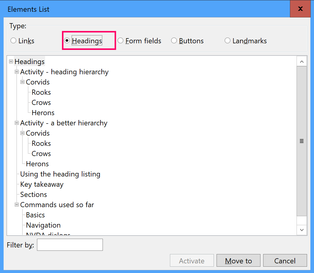
Headings are of particular importance to screen‐reader users as they provide both a mental structural outline of the document and a way of navigating around it quickly.
It is important that when assigning heading levels that care is taken to consider purely the document structure. The visual size and weight can be added with css later to conform to the design.
For example using a particular heading element just because of how it has been styled can lead to content not making sense to a screen‐reader user as they might be getting a different message to the visual one.
Activity - heading hierarchy
Take a look at the group of headings below. The size of the headings tells us that “Herons” are not a subsection of “Corvids”. Screen‐reader users cannot perceive the visual styling and so have to rely on the semantics of the elements.
Move through the content in the first example with NVDA, but concentrate on the announcements and ignore the visual.
Because the headings are not set to communicate the same hierarchy the content requires, a screen-reader user may interpret the information in a way not intended - for example that a heron is a type of corvid.
Corvids
All about corvids …
Rooks
All about rooks …
Crows
All about crows …
Herons
All about herons …
Activity - a better hierarchy
Now move through the content in the example below with NVDA. In this example which looks identical to the previous one we have used the correct headings.
Corvids
All about corvids …
Rooks
All about rooks …
Crows
All about crows …
Herons
All about herons …
This is why screen‐readers will tell the user the level of heading they are on.
Using the heading listing
If you look at the headings category in the elements list dialog NVDA + F7 you will see the markup tells us the hierarchy of this group as a tree view and this structure is derived from the heading levels used. If these levels are incorrect it can alter the meaning of a document by suggesting things are related when they are not and the tree view will reflect this.

Quick navigation
When you are on a page you can use h to jump from one heading to the next heading.
Adding in shift will take you to the previous heading.
From now on you can jump to the first heading on a page using this shortcut (be sure to make sure you are at the top of the page first by using Ctrl + Home).
Key takeaway
When testing, check the page structure and heading levels match. Don't use a heading element or particular level just for the visual styling which has been applied to it.
