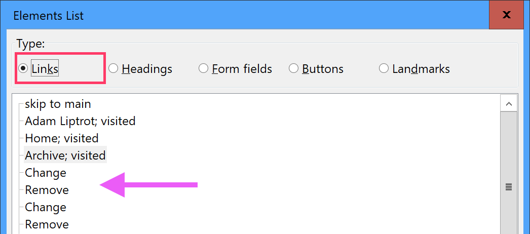
As we've already seen, screen‐readers can extract all occurrences of certain elements like headings and links into a list for the user to choose from.
But if you have two links with different urls but with the same link text, the user might not be able to determine which one they should click on.
Below are two lists with links in.
Activity - contextual links
Open the link listing dialog NVDA + F7 to view the links on this page.
Poorly marked-up links
The first list has standard links - containing just the visible text. When you view these in the dialog you won't know which “Change” or “Remove” link refers to which person. They all seem identical.

Well marked-up links
In the second list we've added some hidden contextual information to make the links more explanatory. Now the user can clearly see what each link does. Now they can action them knowing what the link will do.
- Sydney Russell Change Sydney Russell Remove Sydney Russell
- Michael Cain Change Michael Cain Remove Michael Cain

If you find you are needing to add hidden copy to help out screen‐reader users it is a good idea to review the design and see if either having that content exposed would help all users, or if the design could be adjusted to make the hidden content redundant.
In the cases above adding the contextual information is probably the best solution without cluttering up the interface with repetitive information.
Always add hidden copy after the visible text to make it as accessible as possible for speech-recognition users.
Quick navigation
When you are on a page you can use Tab to jump to the next focussable item (including links), k to jump to the next link, u to jump to the next unvisited link, or v to move to the next visited link, adding in shift to reverse the direction.
Key takeaway
Check all the links on your page in the links dialog. Can you tell what each one will do without looking at the page? Consider adding some contextual copy if you cannot.
